
Color Survey Results. Who in the rainbow can draw the line where the violet tint ends and the orange tint begins?
Distinctly we see the difference of the colors, but where exactly does the one first blendingly enter into the other? Data Driven Journalism. Facebook Stories - People using Facebook in extraordinary ways. Ajax & Jquery - wwValue. Design, free psd, Icons, vectors. Website templates. Wordpress optimization. Unique scrolling website. jQuery Plugins and techniques.
The top trends of web design are managing content in a completely different way as we always used it. Now we can put data visualization to the next level by showing whatever we want in a right way with parallax and sliding/scrolling effect [...] VizWiz - Data Visualization Done Right. Jared Ficklin: New ways to see music (with color! and fire!) Kuler.
#08b9c9 hex color. In a RGB color space, hex #08b9c9 is composed of 3.1% red, 72.5% green and 78.8% blue.
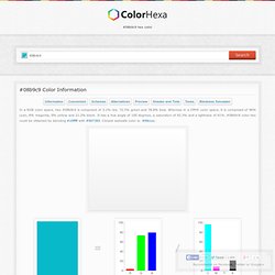
Whereas in a CMYK color space, it is composed of 96% cyan, 8% magenta, 0% yellow and 21.2% black. Colr.org. Cartograma. Un cartograma es un mapa o diagrama que muestra datos de cantidad asociados a respectivas áreas, mediante la modificación de los tamaños de las unidades de enumeración.
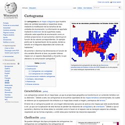
La información es aportada mediante la distorsión de las superficies reales, utilizando cada superficie de enumeración como un símbolo proporcional, el cual aumenta o disminuye en función de los valores correspondientes. Un ejemplo podría ser la representación de los países, donde su tamaño en el diagrama dependiera del número de habitantes.[1] Al aumentar o disminuir las dimensiones en función de otra variable diferente al área, se pueden obtener mapas con un aspecto disparatado y chocante, lo que afectará a la comunicación cartográfica.[1] Don't Make Me Think! A Common Sense Approach to Web Usability (0029236723101): Steve Krug, Roger Black.
A podcast on data visualization with Enrico Bertini and Moritz Stefaner. Progressive <canvas> pie charts. Peity (sounds like deity) is a jQuery plugin that converts an element's content into a <svg> mini pie 2/5 donut 5,2,3 line 5,3,9,6,5,9,7,3,5,2 or bar chart 5,3,9,6,5,9,7,3,5,2 and is compatible with any browser that supports <svg>: Chrome, Firefox, IE9+, Opera, Safari.
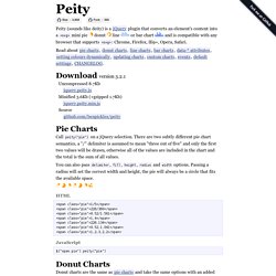
Download version 3.2.1 Uncompressed 8.7Kb jquery.peity.js Minified 3.6Kb (+gzipped 1.7Kb) jquery.peity.min.js Source. Blurred Background for Dialogs (Extreme GUI Makeover 2007) Shannon, Chris and I showed many cool effects during this year’s Extreme GUI Makeover session, at JavaOne 2007.
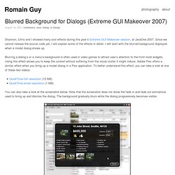
Since we cannot release the source code yet, I will explain some of the effects in detail. I will start with the blurred background displayed when a modal dialog shows up. Blurring a dialog’s or a menu’s background is often used in video games to attract user’s attention to the front most widgets. Rounded Corners and Shadow for Dialogs (Extreme GUI Makeover) At JavaOne 2007, the Extreme GUI Makeover demo showed a semi-translucent dialog over a blurry background.
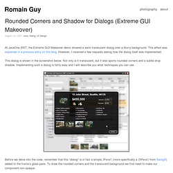
This effect was explained in a previous entry on this blog. However, I received a few requests asking how the dialog itself was implemented. This dialog is shown in the screenshot below. Transparency. HomeContents In this part of the Java 2D , we will talk about transparency.
We will provide some basic definitions and several interesting transparency effects. Transparency explained. NASA Maps in your Swing App. Posted by joshy on October 12, 2006 at 10:35 AM PDT Short short version: Not Awesome Awesome!
Short version. Mini-Challenge 1 Description for Contestants v2.doc. The Bank of Money and its Role on BankWorld v2.doc. Spring Data – Part 4: Geospatial Queries with MongoDB. Introduction Every location-based service [1] has to solve the following problem: find all venues within a given distance from the current location of the user.
Long before the advent of mobile devices, geographic information systems (GIS) [2] had to deal with this (and other) problem(s). The NoSQL [3] datastore MongoDB [4] supports geospatial queries [5] (i.e. queries based on coordinates) out of the box. For a better understanding of the things to come, I recommend reading this article on Spring Data Mongo DB for an introduction to both MongoDB and the corresponding Spring Data API. Planar Maps Let’s start with a simple example consisting of four points in a plane. Let’s insert these points into a collection named location:
20 Fresh JavaScript Data Visualization Libraries. There are plenty of JavaScript libraries out there for rendering your otherwise plain and boring numerical data into beautiful, interactive, and informative visualizations. The beauty of using JavaScript for data visualization is that, if created correctly, your data will be highly accessible (usually via HTML tables). A long time ago (2008), I wrote about JavaScript solutions for graphing and charting data and this article revisits the topic with twenty more JavaScript libraries that you can use to bring your data to life.
Network Visualization. While we're on the topic of academic papers and how they're linked, Johan Bollen et. al used clickstream data to draw detailed maps of science, from the point of view of those actually reading the papers. That is, instead of relying on citations, they used log data on how readers request papers, in the form of a billion user interactions on various web portals. Maps of science derived from citation data visualize the relationships among scholarly publications or disciplines. They are valuable instruments for exploring the structure and evolution of scholarly activity. Much like early world charts, these maps of science provide an overall visual perspective of science as well as a reference system that stimulates further exploration. University's Computer Network under Attack. 5 Phases of Data Analytics Maturation: Part 2.
This post is the 2nd part in a 2 part series. Last time we talked about how organizations use Tribal Elders and Static Reports to find answers to questions that they already know. Today we’ll talk about the other three phases of Data Analytics Maturation. Data Analytics Maturation Phase 3: Bigger Static Reports Answers to questions you don’t know Once the organization realizes that they need answers to questions that they don’t yet know, they start to extract all sorts of permutations on all of the data that they have and distribute those reports to the "need to knows" on a regularly scheduled basis. 5 Phases of Data Analytics Maturation: Part 1. Recently, while meeting with one of our clients, they mentioned their desire to provide their customer’s business team with the ability to run ad-hoc reports.
This notion spurred me to think about whether or not I thought this was a plan for success. Would having this additional analytics ability help the non-analyst be more effective at getting their job done? Over the next few days, we’ll be exploring the different stages of maturity that information workers go through as they try to become more effective and efficient at consuming and acting on information. Nicholas Felton. Cost of Living. Datavisualization.ch Selected Tools. Inscriptos Maestria 1c2012. Bitácora InfoVis Maestría 1c 2012.