Design Theory
> Davidelyk
> Reference
> Design
Exploring the Gestalt Principles of Design. Listen to the audio version of this article Negative space has long been a staple of good design.
Leaving white space around elements of a design is the first thing that usually comes to mind. But then there are designs that use that white space to infer an element that isn’t actually there (the arrow hidden between the E and X in the FedEx logo immediately comes to mind as an example). The human brain is exceptionally good at filling in the blanks in an image and creating a whole that is greater than the sum of its parts.
It’s why we see faces in things like tree leaves or sidewalk cracks. This principle is one of the most important underlying ideas behind the gestalt principles of visual perception. There are six individual principles commonly associated with gestalt theory: similarity, continuation, closure, proximity, figure/ground, and symmetry & order (also called prägnanz).
Laws of UX. Principles Of Effective Web Design Guidelines - Smashing Magazine. About The Author Vitaly Friedman loves beautiful content and doesn’t like to give in easily.
When he is not writing or speaking at a conference, he’s most probably running … More about Vitaly Friedman … Usability and the utility, not the visual design, determine the success or failure of a web-site. Since the visitor of the page is the only person who clicks the mouse and therefore decides everything, user-centric design has established as a standard approach for successful and profit-oriented web design. After all, if users can’t use a feature, it might as well not exist. Usability and the utility, not the visual design, determine the success or failure of a website. Please notice that you might be interested in the usability-related articles we’ve published before: Unlimited Downloads: 500,000+ HTML5 Templates, Mockups, Photos & Design Assets (ad)
Presentation
Out of the (Drop)Shadows. May 29, 2017 To say that I was disappointed when Apple released iOS7 in 2013 is an understatement.
To be on-trend, Apple had flattened their entire UI without any real reinforcing principles. This came with countless oversights to the user’s experience which took a backseat to dropping skeuomorphism. It was flat for the sake of flat. Compare this with Google’s Material Design which came shortly after. Just looking at the two design languages, it’s clear that Material took the better approach.
And now Microsoft, who were flat before flat was cool, have announced their new design language: Fluent Design. It is strange that the drop shadow is a visual relic that has managed to cling to UI design for decades. A Different Approach The fact is, we are surrounded by a world that is full of depth, and very little of it is defined by shadow. So how do we perceive depth when shadows aren’t involved?
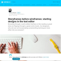
This lead me to another, lesser known type of depth perception. Creating the Effect. User Experience Engineering – Prototyping: From UX to Front End. Storyframes before wireframes: starting designs in the text editor. Just the other day I was talking to an experience designer in my team about this simple technique that I have used for years and never really thought about as a proper “technique” — maybe just intuition of someone who has designed more pages than they can remember.
Before jumping into wireframing (and spending time moving gray boxes and blocks of text around on the screen), or even sketching things on paper with the level of polish I would like people to see in my work, at some point I have decided to start my design process with what I later named as storyframes: a hybrid document between a script/story and a wireframe. The software I use for that? A text editor. Google Doc. Or Microsoft Word. The technique works especially well for landing pages, homepages, or long-scrolling pages that are trying to tell a unified, cohesive story. The big question I ask myself before jumping into the text editor software to “write” a page is: Interfaces are stories Storyframe example: the Dropbox homepage. How to design for emotions: a starter’s guide – Inside Dogstudio. Disclaimer : What first started as a pretty short post, quickly turned into a much more consistent piece than initially planned.
Make sure you can spend at least 20 minutes of your time to go through it . Just sayin’ Here at Dogstudio, we’re constantly talking about the importance of emotions in design and how it always had such a central position in our thinking. After more than a decade in the business, reading, and listening to numerous talks about the importance of data, stories, journeys and so on; I felt it was actually time to go beyond that point. Wait a minute! I am convinced design’s first role is all about solving issues and making our life easier through on point and smart decisions.
Above everything, I am convinced that all this energy we spend trying to align elements, respect grids, ensure legibility and usability in fonts, colors, balance, whatever, is part of a way bigger picture which is much deeper than a set of logical rules. The power of constraints.
