
CSPD Zoomed Comic. Ccreport.update.indd - vital-climate_change_update.pdf. f14ec01e-d1ed-11e3-8cc1-22000ab31218-original.jpeg (JPEG Image, 600 × 900 pixels) Access To Justice & Technology: Everyone, Anytime, Anywhere. “Eighty percent of low income people have trouble obtaining legal representation or otherwise accessing the civil court system to protect their property, family, and livelihood.”
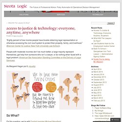
(Brennan Center for Justice, New York University Law School). People with moderate incomes don’t do much better; a large majority represent themselves, get help from someone who isn’t a lawyer, or do nothing when faced with a legal problem. (American Bar Association Standing Committee on the Delivery of Legal Services). As Margaret Hagan put it, visually: So What? On this question, we’re with English barrister Michael Mansfield: “At the heart of any notion of a decent society is not only that we have rights and protections under the law but that we can enforce those rights and rely upon those protections if needed.”
And with the often-quoted lines of Supreme Court Justice Lewis Powell, who said to the American Bar Association in 1976 when serving as its president: Collaborative Fund. International Women's Day: political rights around the world mapped. Discover the Böll Stiftung. BuildingOS — The Future of Energy Management — Lucid. CUP: Public Access Design. Housing_court_help.pdf. No_me_han_pagado.pdf. Community Development Project. The Top 20 Interactive Visualizations of 2013. Interactive websites are a great way to communicate visually. With modern browsers like Chrome, Firefox, and Safari, they now provide a nearly limitless multimedia canvas for designers, developers, journalists and animators to build interactive experiences.
News organizations, non-profits, companies, and even ambitious individuals are producing incredible digital multimedia experiences as ways to get their message seen. Here are 20 of the best interactive projects we discovered on Visual.ly this year, in five categories: maps, visual reports, data explorers, timelines and scrollers. Maps are a great way to showcase data that has any sort of location associated with it. The best maps help show spatial patterns or trends. 1. Point maps are a great way to display tons of information. 2. Flickr also has a great portfolio of precisely geolocated data, and a map makes a wonderful way to browse photos. 3. 4. 2013 Global Slavery Index by The Walk Free Foundation 5.
Where everyone in the world is migrating—in one gorgeous chart - Quartz. It’s no secret that the world’s population is on the move, but it’s rare to get a glimpse of where that flow is happening.
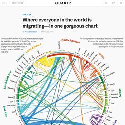
In a study released in Science, a team of geographers used data snapshots to create a broad analysis of global migrations over 20 years. The study was conducted by three geographic researchers from the Wittgenstein Centre for Demography and Global Human Capital in Vienna. Is personal. The Economic Policy Institute (EPI), a non-profit, non-partisan think tank, was created in 1986 to broaden discussions about economic policy to include the needs of low- and middle-income workers.
EPI believes every working person deserves a good job with fair pay, affordable health care, and retirement security. To achieve this goal, EPI conducts research and analysis on the economic status of working America. EPI proposes policies that protect and improve the economic conditions of low- and middle-income workers and assesses policies with respect to how they affect those workers.
Inter-American Human Rights System. The Inter-American System for the protection of human rights is one of the world’s three regional human rights systems, and is responsible for monitoring and ensuring implementation of human rights guarantees in the 35 independent countries of the Americas that are members of the Organization of American States (OAS).
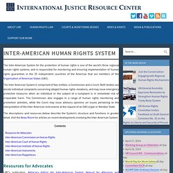
The Inter-American System is comprised of two entities: a Commission and a Court. Both bodies can decide individual complaints concerning alleged human rights violations, and may issue emergency protective measures when an individual or the subject of a complaint is in immediate risk of irreparable harm. The Commission also engages in a range of human rights monitoring and promotion activities, while the Court may issue advisory opinions on issues pertaining to the interpretation of the Inter-American instruments at the request of an OAS organ or Member State. The descriptions and resources below describe the System’s structure and functions in greater detail. Conference 2014. Shine on the web. Legal information design. Lincoln Memorial Interactive Gill_Lyons. They Killed Sister Dorothy. Writing an Argument. Flowchart-short-movie.jpg (JPEG Image, 1556 × 2200 pixels) - Scaled (41%)
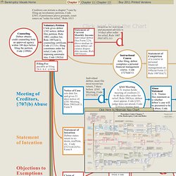
LoPucki's Bankruptcy Procedure Charts. Click Here to Minimize Nav Chart Bankruptcy Visuals HomeChapter 7Chapter 11Chapter 13Buy 2011 Printed Versions Please Wait . . .
Click and Drag the Chart. 2013: The Year in Interactive Storytelling. To Russia With Love. Mass Ideation. Introduction to Circos, Features and Uses // CIRCOS Circular Genome Data Visualization. Sagmeister & Walsh - About Us. Clients include: Corporate – Function Engineering, Standard Chartered Bank, Aishti Department Stores, 20/30 Apartment Building Beirut, Levis, P.F.O., Lobmeyer, Joik, HBO Studio productions, Toto, Energias de Portugal, AutoDesk, Adobe, Kunsthaus Bregenz, BBH ad agency, Publicis ad agency, IDEO, Sappi Paper, Red Bull, Vitra, Droga 5 ad agency, Crown Plaza, TBWA ad agency, Droog, BMW, Zumtobel Light systems 2003.

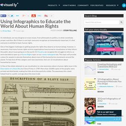
Why Consumers Turn To Small Dollar Credit Infographic. Fan the flame on Behance. Invisible Child: Dasani’s Homeless Life. Using Infographics to Educate the World About Human Rights. As individuals, we may disagree on many issues, from philosophy to politics, to what constitutes proper nutrition.
LIFT Impact Report 2013: Building Strong Foundations–Working to LIFT people out of poverty for good. This Brilliant Visualization Could Build A Better Reddit. There are places on reddit that you might never discover.

Though we’re all familiar with the main pages, there are countless subreddits--niche interests hiding a sub-URL away from plain sight. So while you could be the biggest fan of watching pus drain (reddit.com/r/popping for those with a strong stomach), you might never actually discover the like-minded community just waiting for you by visiting reddit.com/r/news. In response, Randy Olson and MSU Assistant Professor Zachary Neal have created redditviz, a map of subreddits connected, not by the obvious related reddits you might spot on a sidebar, but actual reddit user behavior. For eight months, their algorithm tracked where users posted across the network. About BKLYNR. All the Stops. The Arc of Law.
Out of Sight, Out of Mind: A visualization of drone strikes in Pakistan since 2004. Here’s Why Drug Policy Reform Is Gaining Momentum. How do governments know drug enforcement is working?
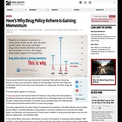
Generally by measuring seizures, arrests, and convictions—based on the assumption that the more drugs are confiscated, and the more drug users and dealers are imprisoned, the fewer drugs will be available. That assumption appears to be wrong. A new study by the International Centre for Science in Drug Policy finds that despite a tremendous increase in seizures, prices actually fell for most illegal drugs over the past 20 years—while purity increased. This raises serious questions about the effectiveness of international law enforcement efforts to reduce drug supply. The Back and Forth Over the Shutdown and Debt Ceiling - Graphic. A Short History of the Highrise. What Is the Higgs? - Interactive Graphic. Tomato Can Blues. In Climbing Income Ladder, Location Matters.
ATLANTA – Stacey Calvin spends almost as much time commuting to her job — on a bus, two trains and another bus — as she does working part-time at a day care center. She knows exactly where to board the train and which stairwells to use at the stations so that she has the best chance of getting to work on time in the morning and making it home to greet her three children after school. “It’s a science you just have to perfect over time,” said Ms. Calvin, 37. Her nearly four-hour round-trip stems largely from the economic geography of Atlanta, which is one of America’s most affluent metropolitan areas yet also one of the most physically divided by income.
Global Corruption Barometer 2013 - National results. On 9 July 2013, Transparency International launched the Global Corruption Barometer, the largest-ever global survey on people’s experience and views on corruption in 107 countries, including Bangladesh.
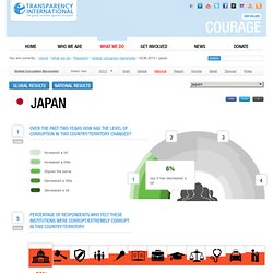
While the global launch was undertaken by the TI Secretariat in Berlin, Germany, National Chapters, including TI Bangladesh, launched the survey results in their own country. The survey shows that corruption is a serious problem around the world, and Bangladesh is no exception. Our survey asked respondents to rank levels of corruption in 12 institutions from on a scale from 1 to 5, where 1 means ‘not at all corrupt’ and 5 means ‘extremely corrupt’. Voting Rights Act Map - Graphic.
Was Alex Ferguson a Better Coach Than the N.B.A.’s Phil Jackson? - Interactive Graphic. Les chiffres-clés du mariage pour tous. New Gun Measures Considered by the Senate - Graphic. 2012: The Year in Graphics - Graphic. Interactive Globe: Small Arms Imports & Exports. How the Story of Trayvon Martin Went Viral. Data provided by Bitly, a Web service that shortens URLs for easier sharing, revealed dramatic spikes in the volume of clicked links relating to the killing of Trayvon Martin.
Initially, the story mostly drew a local audience. It erupted online following the release of 911 calls by the Sanford (Fla.) Police Department. Occupy-wall-street-infographic-960-1575.jpg (JPEG Image, 960 × 1575 pixels) - Scaled (48. News » Iran Infographic in the The Washington Post! Hyperakt's infographic on Internet Censorship in Iran is featured in an article, Iran's Web Censors vs. Google Reader, from The Washington Post. "Google's much-dreaded announcement on the coming demise of Google Reader has alarmed users in Iran - and drawn attention to the scale and complexity of online censorship there. " "According to Reporters Without Borders and the University of Pennsylvania's Iran Media Program, the Iranian Internet is watched by a number of overlapping regulatory bodies, some of which ultimately report to the Iranian Revolutionary Guard Corps.
" Amnesty International - 50th Anniversary Human Rights Infographic. Visualizing the Human Rights Issue Agenda. Infographics: The Times Newspaper (UK) on the Behance Network. Where the Bribes Are - Mintz Group FCPA Map. World-as-100-people_51505a8baf475.png (PNG Image, 1370 × 1370 pixels) - Scaled (65. Infographics.