
Understanding the Pareto Principle (The 80/20 Rule) Originally, the Pareto Principle referred to the observation that 80% of Italy’s wealth belonged to only 20% of the population.

More generally, the Pareto Principle is the observation (not law) that most things in life are not distributed evenly. It can mean all of the following things: 20% of the input creates 80% of the result20% of the workers produce 80% of the result20% of the customers create 80% of the revenue20% of the bugs cause 80% of the crashes20% of the features cause 80% of the usageAnd on and on… But be careful when using this idea! First, there’s a common misconception that the numbers 20 and 80 must add to 100 — they don’t! 20% of the workers could create 10% of the result. Also recognize that the numbers don’t have to be “20%” and “80%” exactly.
Life Isn’t Fair What does it mean when we say “things aren’t distributed evenly”? But that isn’t always the case: The 80/20 rule observes that most things have an unequal distribution. Of course, this ratio can change. Hi! What is Pareto chart? Definition from WhatIs. A Pareto chart, also called a Pareto distribution diagram, is a vertical bar graph in which values are plotted in decreasing order of relative frequency from left to right.
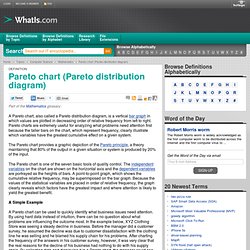
Pareto charts are extremely useful for analyzing what problems need attention first because the taller bars on the chart, which represent frequency, clearly illustrate which variables have the greatest cumulative effect on a given system. The Pareto chart provides a graphic depiction of the Pareto principle, a theory maintaining that 80% of the output in a given situation or system is produced by 20% of the input. The Pareto chart is one of the seven basic tools of quality control. The independent variables on the chart are shown on the horizontal axis and the dependent variables are portrayed as the heights of bars. A point-to-point graph, which shows the cumulative relative frequency, may be superimposed on the bar graph. A Simple Example See also: flowchart, histogram.
How to Make a Pareto Chart in Excel. Pareto Chart. Looking for more quality tools?
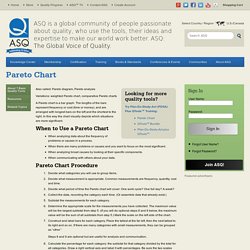
Try Plan-Do-Study-Act (PDSA) Plus QTools™ Training: Also called: Pareto diagram, Pareto analysis Variations: weighted Pareto chart, comparative Pareto charts A Pareto chart is a bar graph. The lengths of the bars represent frequency or cost (time or money), and are arranged with longest bars on the left and the shortest to the right. When to Use a Pareto Chart When analyzing data about the frequency of problems or causes in a process. Pareto Chart Procedure Decide what categories you will use to group items. Steps 8 and 9 are optional but are useful for analysis and communication. Calculate the percentage for each category: the subtotal for that category divided by the total for all categories. Pareto Chart Examples Example #1 shows how many customer complaints were received in each of five categories. Example #1 Example #2 Excerpted from Nancy R. Create a Pareto Chart Analyze the occurrences of up to 10 defects.