background preloader

Carto Etats-Unis

Facebook Twitter

How far you can get from downtown in rush hour traffic - Washington Post. Educational Attainment in America. Mesmerizing maps show where the most educated Americans live. Untitled. Untitled. A New York, riches et pauvres plus éloignés que jamais. Les New-Yorkais sont appelés à élire leur nouveau maire, mardi. Le bilan social du sortant, Michael Bloomberg, est très critiqué. LE MONDE GEO ET POLITIQUE | • Mis à jour le | Par Stéphane Lauer (New York, correspondant) Voilà des mois que Bill de Blasio raconte une histoire aux New-Yorkais : le « conte de deux cités » (allusion au roman du même nom de Charles Dickens), l'une, celle des riches, l'autre, celle des pauvres. Le candidat démocrate à la mairie de New York a fait des inégalités son thème principal de campagne. Avec un certain succès. En septembre, il a remporté haut la main la primaire de son parti en prenant ses distances avec la politique menée en la matière par le maire actuel, l'indépendant Michael Bloomberg.

Voir notre infographie : New York, le "conte des deux cités" Bill de Blasio joue sur du velours. Lire aussi : Bill de Blasio, le démocrate qui renvoie aux New-Yorkais une image positive d'eux-mêmes C'est à Manhattan que la disparité est la plus criante. Block by Block, Brooklyn’s Past and Present. On my weekly walk to get groceries, I pass a row of brownstones — some well-kempt and majestic, some fossil-like and crumbling — bookended by a gleaming, square-windowed silver tower. 
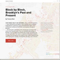
It’s an architectural contrast of a kind that’s commonplace throughout Brooklyn. The borough’s a patchwork of the old and new, but traces of its history aren’t spread evenly. There are 320,000-odd buildings in Brooklyn, and I’ve plotted and shaded each of them according to its year of construction. The result is a snapshot of Brooklyn’s evolution, revealing how development has rippled across certain neighborhoods while leaving some pockets unchanged for decades, even centuries.

Take a look The NYC Department of City Planning recently released, for free, its PLUTO data set, from which the majority of this data is drawn. Thomas Rhiel is a founding editor of BKLYNR. Where Are The Jobs? Where Are The Jobs? 
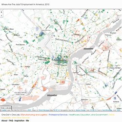
Employment in America, 2010 Leaflet | Jobs: Map data from US Census LEHD, Imagery by Robert Manduca under CC BY 4.0, Background: Map tiles by Stamen Design, under CC BY 3.0. Data by OpenStreetMap, under ODbL. One Dot = One Job. Manufacturing and Logistics - Professional Services - Healthcare, Education, and Government - Retail, Hospitality, and Other Services.