
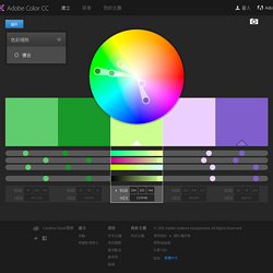
Front-End Developers Taiwan Public Group. ScrollMagic ♥ Demo. Skrollr - parallax scrolling for the masses. 前端工程師分享:十大好用易上手 HTML 5 前端框架. 色彩配置. 色彩規則 類比單色三元群補色複合濃度自訂 設為基色設為基色基色設為基色設為基色 Name.
Tooltipster - The jQuery Tooltip Plugin. Styling your tooltips with a custom look ⇑ Tooltipster makes it very easy to go from one of the packaged themes and customize a few properties of your choice.

To do so, we recommend that you create a so-called "secondary theme" which will override some properties of a packaged theme. Create a new css file and include it in your page. Inside the file, declare your customized rules like this: For your secondary theme to be applied, provide an array of themes instead of just one. Changing the size of the arrow might be the only challenging customization but it's doable!
Updating a tooltip's content ⇑ It's easy as pie to update a tooltip's content - whether it's open or closed. $('#myelement').tooltipster('content', 'My new content'); // or when you have the instance of the tooltip: instance.content('My new content'); Tooltipster plays a subtle animation when the content changes. Using AJAX to generate your tooltip content ⇑ Forcing or disabling sides ⇑ // ... is the same as ...' 1) Open triggers. HTML Templates. News or Magazine This template puts a focus on bold images, perfect for a magazine style site with eye catching content.
Your stories are easy to find with large feature blocks. See Demo Real Estate or Travel Big thumbnails with a space for captions and descriptions along with an informative header make this the perfect template for real estate or hotel booking. See Demo Ecommerce Homepage Building an online store? See Demo Agency Bring your work to the forefront with this sleek template that's perfect for agencies or freelancers. Shuffle.js. You can order the elements based off a function you supply.
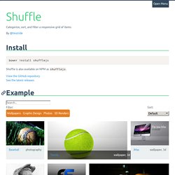
In the demo above, each item has a data-date-created and data-title attribute. When the select option menu changes, a sort object is passed to shuffle. <select class="sort-options"><option value="">Default</option><option value="title">Title</option><option value="date-created">Date Created</option></select> <figure class="picture-item" data-groups='["photography"]' data-date-created="2010-09-14" data-title="Baseball">…</figure> The opts parameter can contain two properties. reverse, a boolean which will reverse the array. by is a function that is passed the element wrapped in jQuery.
Calling sort with an empty object will reset the elements to DOM order. Check out the demo. Masonry. UIkit. Codeply. POZE. Online Image Optimizer. SplitShire - Free Stock Photos & Images for commercial use. Life Of Pix - Free Stock Photos & Images - Photography. New Old Stock. Free Refe Real Life Photos. Jay mantri. Free & premium stock photos.
WebSocket 簡單介紹與 jQuery 實作應用 - MUKI space* 聽說這篇好像 4 月就跟大家預告要寫了,結果現在已經 5 月了(默。
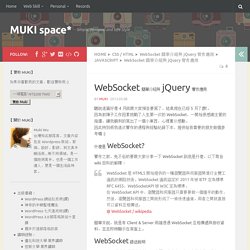
因為前陣子工作因素挑戰了人生第一次的 WebSocket,一開始很感謝主管的指導,讓我順利的寫出了一個小東西,心裡萬分感動。 因此特別將我這次實作的過程與經驗紀錄下來,提供給有需要的朋友做個參考囉 :) 什麼是 WebSocket? 實作之前,免不俗的要跟大家分享一下 WebSocket 到底是什麼,以下取自 wiki 百科的解釋: WebSocket 是 HTML5 開始提供的一種瀏覽器與伺服器間進行全雙工通訊的網路技術。 簡單來說,就是有 Client & Server 兩端透過 WebSocket 互相傳遞與接收資料,並且即時顯示在頁面上。 WebSocket 語法說明 WebSocket 的大架構其實很簡單又直覺,他也有一些既有的事件,我們只要知道確定哪些事件發生時,該做什麼事情? WebSocket 已經建立好許多 function ,我們可以直接用他的 function,當然也不一定要全部 function 都用到,或是可以做點小修改,像我主管給我的範本就跟官網提供的有一點點不一樣(但基本上的呼叫是大同小異的) 第 5 行:老實說我覺得所有語法中最重要的就是第 5 行的 var wsUri = " 改成 13 行:websocket.onopen這個事件是用來判斷前面的 wsUri 是否有順利抓到,如果有抓到表示 onopen,可以利用console.log或是alert做個標記:console.log("連線成功");第 16 行:跟第 13 行的事件對照就很清楚的知道,websocket.onclose是用來表示當連線中斷時,會出現什麼訊息或事件。
WebSocket 主要就是這四個事件,所以其實不難。 簡單參考架構 主資料夾 ├ effect.js ├ websocket.client.js ├ websocket.master.js ├ websocket.client.html ├ websocket.master.html. CSS3 Media Queries 詳細介紹與使用方法,Responsive Web Design 必備技術 – 樂在設計. 上一篇我們介紹了 Responsive Web Design 之後,這次要來詳細介紹 CSS3 Media Queries 了。
在上一篇中,我們提到 Responsive Web Design 的實作方式有大半都是利用 CSS3 Media Queries 來達成。 而顧名思義 Media Queries 就是要在支援 CSS3 的瀏覽器中才能正常工作,IE8 以下不支援。 Bootstrap Themes. Twbs/bootstrap at v4-dev. React Color. Duncan 's Blog. React.js + Parse 實做簡易留言板 « 弦而時習之. 前一陣子 SITCON 文創組冬季訓練最後一天,我安排了這個課程給我們的新成員。

雖然 SITCON 文創組看似是個需要「技術」的團隊,不過現實上我們倒是花很多時間在思考跟設計上,沒辦法找到設計相關科系的新成員稍稍遺憾。 不過因為有製作網站的需求,因此安排了這個課程,透過學習 React.js 以及結合 Parse 去熟悉一些基本的前端技巧。 注意事項: 文中的範例全部都以 CoffeeScript 撰寫本文不會提及 Browserify 的配置與應用(當天有介紹過,練習時是使用我配置好的 gulp task)這是在不考慮 UI/UX 以及美術的前提下製作的文中不會解釋太多 React.js / Flux 的基本概念(請上官網 or ReactJS.tw 社團學習) 那麼,就開始吧! 拆分元件 React.js 的 Component(元件)的概念,某種程度上是需要重新定義大家腦中 HTML / JS / CSS 配合的概念,而這個應用方式在很多時候其實能夠幫我們解決不少問題。 而 Component 該怎麼拆分呢? 我們可以利用 Component 重新去定義一個 HTML 元素的效果 Ex. 建構一個留言板我們會需要幾個元件: 留言板主體(通常會叫做 Application 或者 App) 留言顯示區域 單篇留言留言表單 以一個最低限度結構的留言板來說,至少需要這幾種元件才能夠構成。 其實仔細看,會發現基本上也就跟常見的 MVC 框架在拆分 View 的技巧感覺很類似。 不過就如同前面所說的,有時候 Component 也用於「重新定義」某個 HTML 的元素效果。 架構 以 React.js 本身來說,實際上是不足以製作一個完整的 WebApp 的,因此才加入了 Flux 這套理論(我想不適合視為 Library / Framework 而是跟 MVC 類似的理論比較恰當) 原本的 React.js 其實只有定義了 Component 以及來自外部的「屬性」表現內部的「狀態」而已,但是若要跟 API 溝通並且進行讀取與寫入資料該如何表現呢?
這時候透過 Flux 所定義的架構就可以很輕鬆的實踐。 Flux 架構是一個單向的流程,不管如何一定會從 Actions 開始出發(有時候也會回到 Actions)但是絕不會有返回的狀況 建構元件 主體(Application) 圖片最佳化 — Web Fundamentals. TinyPNG – Compress PNG images while preserving transparency. FullPage.js One Page Scroll sections Site Plugin. Free High-Resolution Photos. Welcome.