
10 Tools for Creating Infographics and Visualizations. The author's posts are entirely his or her own (excluding the unlikely event of hypnosis) and may not always reflect the views of Moz.

Hello there! I'm Miranda Rensch, Product Manager at SEOmoz and lover of visual communication. Communicating visually is one of the most effective ways to explain complex concepts and relationships, and can be a great way to explain your services/products and create valuable site content. I often use diagrams and whiteboarding in order to communicate new features and concepts internally with my team. I've compiled a list of tools you can use to create visualizations, or simply use to communicate visually with your teammates. Tools for creating simple infographics and data visualizations 1.
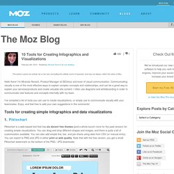
Piktochart is a web-based tool that has six decent free themes (and a whole bunch more for the paid version) for creating simple visualizations. 2. Easel.ly is another free web-based tool for creating infographics. 3. DAYTUM. Parks of the World: A Comparison of Urban Green Space. OCAD University. 50 Great Examples of Data Visualization. Wrapping your brain around data online can be challenging, especially when dealing with huge volumes of information.

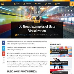
And trying to find related content can also be difficult, depending on what data you’re looking for. But data visualizations can make all of that much easier, allowing you to see the concepts that you’re learning about in a more interesting, and often more useful manner. Below are 50 of the best data visualizations and tools for creating your own visualizations out there, covering everything from Digg activity to network connectivity to what’s currently happening on Twitter. Music, Movies and Other Media Narratives 2.0 visualizes music.
Liveplasma is a music and movie visualization app that aims to help you discover other musicians or movies you might enjoy. Tuneglue is another music visualization service. MusicMap is similar to TuneGlue in its interface, but seems slightly more intuitive. Digg, Twitter, Delicious, and Flickr Internet Visualizations. Industry Trends Infographic. Family Tree Infographic on the Behance Network. 30 Superb Examples of Infographic Maps. As you search the web you’ll come across a wide range of interactive and graphical maps.

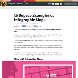
Deciding when, where and how to integrate or display a map on your site is the first step, the second should be what technology and illustrations to use. If you’re all about interaction, JQuery, Ajax, or Flash are all effective technologies that hold their own ground. Map illustrations are a dime a dozen however, a strong and balanced display of graphics, information, and colors is what makes an infographic stand out and reach its target audience effectively. As designers, we’re constantly searching for ways to improve and style our designs, this is exactly what the following 30 infographics and sites display below; the breaking of rules. Sites with Interactive Maps Illustrative Infographics Compiled exclusively for WDD by Liz Fulghum. Did we miss any great examples? Infographics & Data Visualizations. Digital Journalism – How News is Sourced with Social Media [Infographic] Walmart5-final1.jpg (JPEG Image, 960 × 740 pixels)
Na0519_tuition_1500.gif (GIF Image, 1500 × 2923 pixels) - Scaled (28. 12 Infographics About Running to Motivate You Into Shape. There are plenty of national days and even months these days, during which we celebrate all kinds of things — not very many of them encouraging healthy living or exercise.

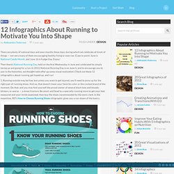
(Case in point: June is National Candy Month, and June 16 is Fudge Day. Enjoy.) Then there’s National Running Day, held on the first Wednesday in June and celebrated by simply lacing up and going for a run. In 2013, National Running Day is on June 5, and to encourage you to join in the festivities, we thought we’d offer up some visual motivation. Check out these 12 infographics about running, get hyped up, and run! 1. 2. 3. 4.