
Distilled Demographics: Urbanization. Robert Muggah: The biggest risks facing cities. Paul Hessburg: Why wildfires have gotten worse. How streets, roads, and avenues are different. Superblocks: How Barcelona is taking city streets back from cars. Tangram Sandbox. Projects — Transit Oriented. Menu Mini Metros 220 metro and light rail systems from around the world, shrunken and simplified.
Read more about this project here. Buy Prints & Mugs of this Design Full Poster - Color Full Poster - Black & White Full Poster - Spectrum US & Canada Mini Poster - Color US & Canada Mini Poster - Black & White US & Canada Mini Poster - Spectrum US & Canada Mug - Color US & Canada Mug - Black & White US & Canada Mug - Spectrum prev / next Back to Projects Mini Metros City Transit Transit App Icons Subways Liveries Philadelphia Transit Map Commuting Greater Greater Washington Logos Subway Icons Washington Commuter Rail I Love Canadian Transit SCMAGLEV Technical Illustrations The Northeast Maglev. An Urbanizing Planet. The largest migration in history: China's migrant workers. The Pickle Index. IMAGE: Two heads of whole zha cai with chilli paste; photograph by Sjschen via Wikipedia.
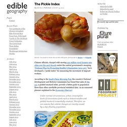
Chinese officials, charged with moving 250 million rural farmers into cities over the next decade under the central government’s sweeping “National Plan for Promoting Healthy Urbanization (2011-20),” have developed a “pickle index” for measuring the movement of migrant workers. According to the South China Morning Post, the country’s National Development and Reform Commission has found that sales of zha cai, a pickled mustard tuber, provide a better guide to population flows than often unreliable provincial statistical data.
As an unnamed planner explained to the Economic Observer: Under normal circumstances, urban consumption levels of convenience foods such as instant noodles and pickled mustard is essentially constant. Therefore, we can assume that volume changes are mainly caused by a city’s floating population. IMAGE: Packaged zha cai, via. Urbanization and the evolution of cities. Mapping Where We Live. Showing where we live is, of course, one of the oldest and most useful reasons to create a map.
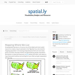
As we bask in the “Big Data” era, the trend for mapping population is increasing simply because there are more data points out there, the bulk of which are generated by people. Population distribution is important because, as xkcd wittily illustrates, if you were to map these points without accounting for it you often just get a population density map. Or worse still, you think you are creating a map that represents the whole world, but instead you only get the parts of it where people are connected to the internet. Such maps are considered unsurprising by many (in spite of their hype) because simple maps of raw counts rarely offer surprising insights in the phenomena the map is trying to articulate.
For examples of this there are some great maps (and data) of Wikipedia entries vs population density here. The first map (above) one I produced from NASA’s population grid. Crowded Earth: Where is everyone going to live? Watch the world change over three decades. TIME and Space | By Jeffrey Kluger Editors note:On Nov. 29, 2016, Google released a major update expanding the data from 2012 to 2016.
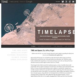
Read about the update here. Spacecraft and telescopes are not built by people interested in what’s going on at home. Rockets fly in one direction: up. Telescopes point in one direction: out. That changed when NASA created the Landsat program, a series of satellites that would perpetually orbit our planet, looking not out but down. Over here is Dubai, growing from sparse desert metropolis to modern, sprawling megalopolis. It took the folks at Google to upgrade these choppy visual sequences from crude flip-book quality to true video footage. These Timelapse pictures tell the pretty and not-so-pretty story of a finite planet and how its residents are treating it — razing even as we build, destroying even as we preserve. Chapter 1: Satellite Story | By Jeffrey Kluger But in 1966, Udall and his staff had an idea.
Strava Global Heatmap. Suburbs. How public spaces make cities work. Bill Nye: The City of the Future. Brilliant designs to fit more people in every city. The surprising math of cities and corporations. Making sense of maps. EarthCam - Webcam Network.