
Presenteer.js. Introduction Presenteer.js a very flexible HTML5 presentation tool that works in one line of code, but is configurable with constructor options and many callbacks.
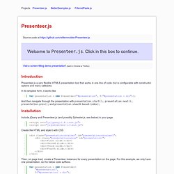
In its simplest form, it works like And then navigate through the presentation with presentation.start();, presentation.next();, presentation.prev(); and presentation.show(0-based-index); Installation Include jQuery and Presenteer.js (and possibly Sylvester.js, see below) in your page. Create the HTML and style it with CSS Then, on page load, create a Presenteer instances for every presentation on the page. I set followElementTransforms to false to make Presenteer not follow element transforms. And set followElementTransforms: true. Constructor options Apart from the followElementTransforms constructor argument, there's many more options and callbacks. Where canvas is a selector or jQuery element of the canvas on which the presentation is placed.
The list of elements on the canvas is specified in the elements argument. Navigation 1.
Parallel coordinates. Parallel coordinates is a common way of visualizing high-dimensional geometry and analyzing multivariate data.
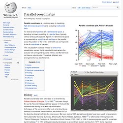
This visualization is closely related to time series visualization, except that it is applied to data where the axes do not correspond to points in time, and therefore do not have a natural order. Therefore, different axis arrangements may be of interest. History[edit] Parallel coordinates were often said to be invented by Philbert Maurice d'Ocagne (fr) in 1885,[1] but even though the words "Coordonnées parallèles" appear in the book title this work has nothing to do with the visualization techniques of the same name (the book only describes a method of coordinate transformation, see fulltext PDF of the book by clicking the link in the references). Higher dimensions[edit] Adding more dimensions in parallel coordinates (often abbreviated ||-coords or PCs) involves adding more axes. Statistical considerations[edit] Reading[edit] Picviz Labs. Clustergram: visualization and diagnostics for cluster analysis (R code) About Clustergrams In 2002, Matthias Schonlau published in “The Stata Journal” an article named “The Clustergram: A graph for visualizing hierarchical and .
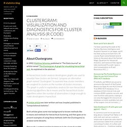
As explained in the abstract: In hierarchical cluster analysis dendrogram graphs are used to visualize how clusters are formed. I propose an alternative graph named “clustergram” to examine how cluster members are assigned to clusters as the number of clusters increases. This graph is useful in exploratory analysis for non-hierarchical clustering algorithms like k-means and for hierarchical cluster algorithms when the number of observations is large enough to make dendrograms impractical. A similar article was later written and was (maybe) published in “computational statistics”. Both articles gives some nice background to known methods like k-means and methods for hierarchical clustering, and then goes on to present examples of using these methods (with the Clustergarm) to analyse some datasets.
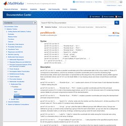
Parallel coordinates plot - MATLAB. Parallelcoords(X)parallelcoords(X,...,'Standardize','on')parallelcoords(X,...,'Standardize','PCA')parallelcoords(X,...,'Standardize','PCAStd')parallelcoords(X,...,'Quantile',alpha)parallelcoords(X,...,'Group',group)parallelcoords(X,... parallelcoords(X) creates a parallel coordinates plot of the multivariate data in the n-by-p matrix X.
Data Visualization, Design and Information Munging // Martin Krzywinski / Genome Sciences Center. Data Visualization for the Web. Introduction to Circos, Features and Uses // CIRCOS Circular Genome Data Visualization. Processing.org. Hive Plots - Linear Layout for Network Visualization - Visually Interpreting Network Structure and Content Made Possible. Hive Plots - Linear Layout for Network Visualization - Visually Interpreting Network Structure and Content Made Possible.
Microbial evolution. EBI researchers have changed our view of 4 billion years of microbial evolution.
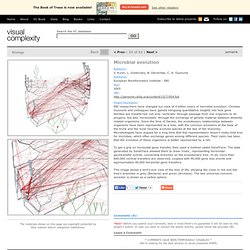
Christos Ouzounis and colleagues have gained intriguing quantitative insights into how gene families are transferred, not only 'vertically' through passage from one organism to its progeny, but also 'horizontally' through the exchange of genetic material between distantly related organisms. Since the time of Darwin, the evolutionary relationships between organisms have been represented as a tree, with the common ancestors at the base of the trunk and the most recently evolved species at the tips of the branches.
Microbiologists have argued for a long time that this representation doesn't really hold true for microbes, which often exchange genes among different species. Their claim has been that the evolution of these organisms is better represented by a net. To get a grip on horizontal gene transfer, they used a method called GeneTrace.