
Quelles alternatives au slider pour la page d'accueil de votre site web ? Pourquoi l'usage de carrousels sur votre site est une mauvaise idée. Accueil » Blog » Agence UX » Pourquoi l’usage de sliders (carrousels) sur votre site est une mauvaise idée Pourquoi l’usage de sliders (carrousels) sur votre site est une mauvaise idée Pourquoi l’usage de sliders sur votre site est une mauvaise idée.

Par slider, on entend les bannières diaporamas pouvant contenir des images, du texte, des liens, des animations et qui défilent sur un site internet. On parle aussi de slideshow, ou de carrousel. Contrast Checker. You are here: Home > Resources > Contrast Checker <p><strong>This tool requires Javascript.
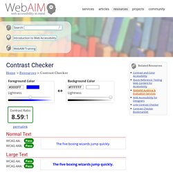
</strong></p> Normal Text WCAG AA: Pass WCAG AAA: Pass The five boxing wizards jump quickly. Large Text Graphical Objects and User Interface Components Explanation Enter a foreground and background color in RGB hexadecimal format (e.g., #FD3 or #F7DA39) or choose a color using the color picker. WCAG 2.0 level AA requires a contrast ratio of at least 4.5:1 for normal text and 3:1 for large text. Large text is defined as 14 point (typically 18.66px) and bold or larger, or 18 point (typically 24px) or larger. Hint: Colorzilla is an excellent tool for extracting the color value from any page element.
Use our link contrast checker to evaluate links that are identified using color alone. Alternatives de menu hamburger. En ce qui concerne l'interface utilisateur controversée, le… 2.
Tabs Similar to tabbed menus on the bottom of the screen, tabs at the top of the screen are a decent alternative. They allow users to have direct access to different features, as well as receive visual cues as to where they are within an app. They may also be more intuitive, as they work similarly to tabs on a browser. However, since they’re located on the upper ⅓ of the screen, they’re not quite as accessible as tabs on the bottom screen are. 3. Vertical lettering is a brand-new trend these days. Checkout this website with the trendy vertical lettering navigation bar! Livre Blanc Emailing Responsive Design.
Architecture de l'information. Après le succès des premières sessions 2015 et 2016, nous proposons une nouvelle session début 2017.
Les activités (quiz, exercices, échanges) ont été modifiées pour cette session et une séquence optionnelle sur l'architecture de l'information en Afrique est proposée. À propos du cours. Mooc Digital Media. Entre Design doing et Design system. Qu’est-ce que le « design doing » ?
Au-delà de l’opposition au « design thinking », faut-il y voir un attachement au « faire », au « prototypage », au « penser par le faire » ? Jean-Louis Frechin répondra à ces questionnements en évoquant Jean Prouvé, pleinement inscrit dans cette posture comprise entre la pensée et le faire. Un guide pour devenir UX designer - Designers Interactifs - Medium. C’est un fait, L’UX design génère un impact qualitatif et financier important.
En tant qu’activité professionnelle elle suscite un fort engouement dans les économies où le poids du secteur numérique est important, depuis 2012. Call-to-Action Button Generator - Design buttons & download as CSS PNG. Font Size Guidelines for Responsive Websites (2020 Update) You’re reading Font Sizes in UI Design: The Complete Guide.
Quickly navigate to other chapters: Intro · iOS · Android · Web · Principles So you’re designing a website and want to know (roughly) what font size to use? Perfect. This is the page for you. If you’re more concerned with mobile or desktop, you can skip straight to those sections. Mobile Web Typography Guidelines. Myth #13: Icons enhance usability - UX Myths. Many researchers have shown that icons are hard to memorize and are often highly inefficient.
The Microsoft Outlook toolbar is a good example: the former icon-only toolbar had poor usability and changing the icons and their positioning didn’t help much. What did help was the introduction of text labels next to the icons. It immediately fixed the usability issues and people started to use the toolbar. In another study, the team of UIE observed that people remember a button’s position instead of the graphic interpretation of the function.
In most projects, icons are very difficult to get right and need a lot of testing. Research findings and articles on the usefulness of icons: Améliorez votre formulaire d'inscription avec des champs de texte blanc cassé. When designing an app, most designers put all their effort into the content pages but overlook the sign-up form.
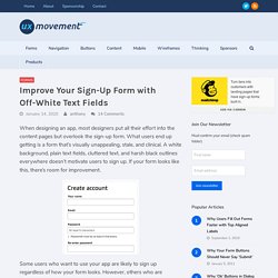
What users end up getting is a form that’s visually unappealing, stale, and clinical. A white background, plain text fields, cluttered text, and harsh black outlines everywhere doesn’t motivate users to sign up. If your form looks like this, there’s room for improvement. Some users who want to use your app are likely to sign up regardless of how your form looks. Solid Vs. Icônes de contour: quelles sont les plus rapides à reconnaître? When building a mobile app, there comes a time when you have to decide whether to use solid or outline icons. Which style is better for user experience? Some think the difference between them is just a matter of preference, but research shows there’s more to it than that–one style has a faster recognition rate than the other. Knowing when to use solid or outline icons will make it easy for your users to navigate your mobile app. They’ll be able to recognize your icons faster and select the right options. A research study, “Filled-in vs. Solid icons were generally faster to recognize than outline icons, but with a few exceptions.
Characteristic Cues. Comment Créer un Bon Bouton d'Appel à l'Action ? Lisibilité web : choix typographiques & design des contenus - C-Marketing.