
#ui #ux #interface #design #close #window... Keynote Cocktail Videos. 7 unbreakable laws of user interface design. GoodUI. Designing Mobile Magic Moments - Greg Nudelman [UXI Studio 2013] Designing for MicroMoments - Stephen Anderson [UXI Studio 2013] A frequently-updated compendium of web app first-run experiences. A frequently-updated compendium of web app first-run experiences. Why Japanese Web Design Is So Bad. In the mind’s eye of many people Japan is a land of tranquil Zen gardens, serene temples, and exquisite tea ceremonies.
Both traditional and contemporary Japanese architecture, books and magazines are the envy of designers worldwide. IPD Database Lists: Please Log In. ADCADE. With HTML5, you have the ability to update live creative across all of your banner sizes.
This on-the-fly capability means that no matter where your ads are hosted, once they’re live, the control is always in your hands. Our ads generate high levels of dwell time and engagement. Will the Mobile Graphical User Interface Overtake the Desktop? In the October 2011 Wired, Steven Levy writes about how the scroll bar has disappeared in Apple’s latest desktop operating system, code-named Lion.
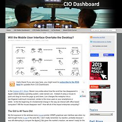
Instead of using a mouse to point and drag to move the page up and down, Lion changes the metaphor into a two-fingered multi-touch movement, similar to the move used on your smartphone or tablet. Is this the beginning of a fundamental change in the way we interact with office based computers? Will the mouse disappear next?
How will all of this impact enterprise computing? The GUI is 40 Years Old. Case study: The new radio 538.nl by Supersteil. אפיון ועיצוב עמודי נחיתה. United Pixelworkers — Welcome. Free UX Sketching And Wireframing Templates For Mobile Projects. Today we are happy to release two printable UX sketching and wireframing templates, designed by Pixle81 for Smashing Magazine’s readers.
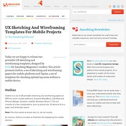
This article presents Outline, a set of sketching and wireframing papers for mobile platforms and Tapsize, a set of templates for checking optimal tap areas without a mobile device. Outline Outline is a set of 28 printable sketching and wireframing papers (in PDF) for seven mobile platforms: Android, BlackBerry, iOS (iPad and iPhone), Meego, Symbian, webOS, Windows Phone 7. The set consists of a few combinations, such as actual size, 10 devices fit to a page, and landscape layout. Note: Print the sheets at actual size (i.e. do not resize). As a bonus, Outline includes an Illustrator file displaying the mobile devices. Outline paper set Windows Phone 7 and 8 panorama template Android 4.x template Tapsize With Tapsize, you can determine the optimal tap area without having an actual device. Optimal Workshop.
Jane McGonigal: Gaming can make a better world. Create Free iPhone App Using Online Interface Builder. Fred’s 10 Rules for Working With Axure. P>I’ve been working with Axure for seven years now, and I’ve learned a thing or two about working with it efficiently.
What follows are 10 rules that will help you build your Axure prototypes efficiently too. Rule #1: De sign Outside of Axure Axure is fantastic with its ability to make it easy for designers to make small to moderate changes throughout an entire prototype. Rule #2: Plan Before You Prototype. Training. Changethis.com/manifesto/6.HowToBeCreative/pdf/6.HowToBeCreative. Netcraft Bytes :) » חווית משתמש על בירה על החוף - סיכום האירוע.
The Personality Layer. Today we’ll have a look at a few projects in which the consistent use of the well-known term “emotional design” can result in a great personality.
Positive attitude often leads to people sharing and even advocating for your product with their peers. “Oh hai Smashing Magazine!” That’s one of the dozen ways that Flickr welcomes its users upon signing in every time. It’s an easily overlooked detail, one that the service would work without flawlessly. Yet this detail is a big part of Flickr’s particular design character that would be missed if it wasn’t there. This is how Flickr greets its users, changing the language upon every sign-in. 12 Fresh and Free UI PSDs. It’s always good to have UI elements on hand when you need them.
And it is even better when designers are kind enough to develop beautiful UI psd’s and give them away for free to other designers. Here at WDL we like to keep you updated with freebies that you can use on upcoming projects, so today we gathered 12 free UI psd’s to add to your library. Storyboard a User Story or Requirement Using PowerPoint. With storyboarding, you turn your ideas and goals into something visual.
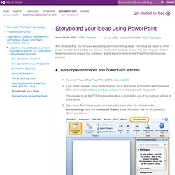
Your ideas are easier for other people to understand, so they can give you constructive feedback, sooner. You can bring your ideas to life with storyboard shapes, text, animation, and all the other features that PowerPoint Storyboarding provides. If you don't have Office PowerPoint 2007 or later, install it.If you haven't installed Visual Studio Premium 2012, VS Ultimate 2012 or VS Test Professional 2012, you'll need to install one of these versions to create and modify storyboards.
Www.methodbrain.com/posters/dsia-ux-design-practice-verticals.pdf. DSIA Portal of Information Architecture. Helping agencies deliver a great customer experience. Web Design Showcases From Various Industries - Smashing Magazine. This overview features a hand-picked and organized selection of the most useful and popular Smashing Magazine’s articles related to Web Design Showcases and published here over all the years.
Can User Experience Be Beautiful? An Analysis Of Navigation In Portfolio Websites When users land on your website, they typically read the content available. Then, the next thing that they will do is to try and familiarize themselves with your website. Children's Websites: Usability Issues in Designing for Kids. Usability of Websites for Teenagers. Designing Web Registration Processes for Kids.
Since the term “kids” is so broad and subject to interpretation, and since kids grow so significantly in cognitive/technical ability in short periods of time, this article focuses specifically on kids ages six through eight.
Designing websites for kids is a fascinating, challenging, rewarding, and exasperating experience: You’re trying to create a digital experience for people who lack the cognitive capacity to understand abstraction. You’re trying to establish brand loyalty with people who are influenced almost exclusively by their peers. LabReport/DigitalNativesGenderIssue_LabReport.pdf. The Education Arcade. Ogilvy Notes. Usability.gov. Designing Websites for Kids: Trends and Best Practices. Tutorials. Playful UX Design: Building A Better Game. Advertisement I sincerely believe that the user experience community should add game design to its toolbox of competencies. If we’re truly committed to creating satisfying user experiences, then there’s no reason why games, which can satisfy people so richly, should be excluded. Operating successfully in the games domain means learning a new set of competencies, and I don’t want to oversimplify the challenges of designing high-quality game experiences.
However, if you’re in a position to jump in and start designing, then I can at least offer a primer to help you steer clear of some of the most common mistakes. Определение доминирующих тонов на изображении. Уроки композиции. UX Storytelling - מה הסיפור שלך? Digital Product Strategy & Design. תחרויות חווית משתמש. הספריה. Institute of Customer Experience. Usability consulting and training with Human Factors International. Intro to Lean UX methods. Lean UX: Getting out of the deliverables business. Design Principles: The Philosophy of UX. Юзабилити - есть такая профессия.