
Data Illustrator: Create infographics and data visualizations without programming. Charticulator. Apache Superset (incubating) — Apache Superset documentation. Amazon Quicksight. Data Visualisation & Storytelling. Grafana - The open platform for analytics and monitoring. Keshif: Data Made Explorable. BrainScope. SpotIQ - AI-Driven Analytics for Humans. RAWGraphs. Datavisual. The ultimate list of Custom Dashboards and BI tools to Track your Metrics and Gather Insights [Updated] - Blendo. How many touch points do you have with your customers?
![The ultimate list of Custom Dashboards and BI tools to Track your Metrics and Gather Insights [Updated] - Blendo](http://cdn.pearltrees.com/s/pic/th/ultimate-dashboards-insights-158850266)
One, three, four, ten? Companies analyze their data in their websites, their email campaigns, their support, and sales team. These data usually reside in different places. Exploratory. Deck.gl. Sign in - Google Accounts. Cluvio. Tweetping. VizSweet by Information is Beautiful. Free Infographic Maker.
Chart Maker - BEAM. Atlas Insights - your most important data wherever you are. Embedding projector - visualization of high-dimensional data. Dataiku. Big Data Business Intelligence & Visualization. Natural Language Generation. Data Clip. Hyecoo. Datavisual. Datawrapper.
Quid. RevEx. Search Query Boolean operators Operators are: + (this term must be present) - (this term must not be present).
All other terms are optional. For example, this query: quick brown +fox -news fox must be present news must not be present quick and brown are optional — their presence increases the relevance The familiar operators AND, OR and NOT are also supported Proximity searches While a phrase query (eg "john smith") expects all of the terms in exactly the same order, a proximity query allows the specified words to be further apart or in a different order with a number specifying the maximum distance between them: "fox quick"~5 Fuzziness We can search for terms that are similar to, but not exactly like our search terms, using the “fuzzy” operator: quikc~ brwn~ foks~ Wildcards Wildcard searches can be run on individual terms, using ?
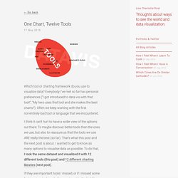
Regular Expressions Regular expression patterns can be embedded in the query string by wrapping them in forward-slashes ("/"):/joh? Boosting. Big Data and Visual Analytics - Silk. Datazar - A Data Library for Everyone. SankeyMATIC (BETA): A Sankey diagram builder for everyone. MindTheGraph: Create beautiful Life Science infographics. Bookworm. Timeline JS3 - Beautifully crafted timelines that are easy, and intuitive to use. Datavisual. Mirador. Grafana.net - Services, Support, Plugins & Dashboards. Grafana - Graphite and InfluxDB Dashboard and graph composer. Redirecting... One Chart, Twelve Tools · Lisa Charlotte Rost. 17 May 2016 Which tool or charting framework do you use to visualize data?
Everybody I’ve met so far has personal preferences (“I got introduced to data vis with that tool!” , “My hero uses that tool and she makes the best charts!”). Often we keep working with the first not-entirely-bad tool or language that we encountered. I think it can’t hurt to have a wider view of the options out there: To maybe discover better tools than the ones we use; but also to reassure us that the tools we use ARE really the best (so far). If they are important tools I missed, or if I missed some features in a tool or a better way to get to the bubble chart, or if I’m wrong about a thing or two, or if you completely disagree with my opinion about these tools (which, I’m sure, will happen): Let me know on Twitter or via email (lisacharlotterost@gmail.com)! The Data & the Visualization Form To visualize data, you need data. Excel We start with the most common software to use charts.
Lyra I like Lyra. IBM Watson Analytics. Orange Data Mining. Project Jupyter. ShiViz. What am I looking at?
In the visualization: Time flows from top to bottom. The left panel shows the log and the middle panel displays a DAG of the partially ordered vector timestamps recorded in the input log. A vertical line with a box at the top is a process timeline. This represents a single thread of execution (e.g., a process). How do I interact with the visualization? The visualization supports the following actions: Show process name or event info Click on a process box or an event circle. How is this tool useful? Here are four use-cases that ShiViz helps to support: Understanding the communication graph.
Create Interactive Online Presentations, infographics, animations & banners in HTML5 - Visme by Easy WebContent. RHSD - Red Headed Step Data. Data USA. GitHub - airbnb/caravel: Caravel is a data exploration platform designed to be visual, intuitive, and interactive. Caravel: Airbnb’s data exploration platform — Airbnb Engineering & Data Science. At Airbnb, we love data, and we like to think that analytics belongs everywhere.
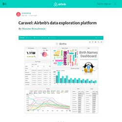
For us to be data-driven, we need data to be fluid, fast flowing, and crystal clear. As a vector for data exploration, discovery, and collaborative analytics, we have built and are now open sourcing, a data exploration and dashboarding platform named Caravel. Caravel allows data exploration through rich visualizations while performing fast and intuitive “slicing and dicing” against just about any dataset. Data explorers can easily travel through multi-dimensional datasets while creating and sharing “slices”, and assemble them in interactive dashboards.
Dynamic Visual Data Exploration. Beaker Lab. Beaker Notebook. Visualize any Text as a Network - Textexture. Big Data Analytics & Visualization. iCharts.