
Trump Wants a Border Wall. See What’s in Place Already. Chang’e-4 Lands on the Moon. Human Terrain. Visionscarto. Vampire. OldNYC: Mapping Historical Photographs of New York City. Pulse Lab Jakarta. London Medieval Murder Map — Violence Research Centre. GeoGuessr - Let's explore the world! Different US Election Maps Tell ‘Different Versions of the Truth’ Pulse Lab Jakarta. Sasha Trubetskoy – My freshest maps and writing. This Game Lets Players Build Their Own NYC Subway. A new game lets players and transit wonks tailor the city’s extensive but imperfect system to their needs—or overhaul it completely.
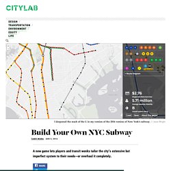
New Yorkers need no reminders that their subway system has its issues. Despite being the most extensive one in the country, the transit system is not easily accessible to everyone (especially those living in the far reaches of the city’s outer boroughs). Commuting by train often involves Hunger Games-style scrambles for spots in a teeming subway cars.
Roadless Forest. CDC WONDER. David Rumsey Historical Map Collection. CityGeographics: urban form, dynamics and sustainability – Urban visualisation and spatial analysis research blog by Duncan A Smith. LuminoCity3D - Urban Density and Dynamics Map Explorer for Great Britain. Istanbul Maps. Harvard Mellon Urban Initiative. How far you can get from downtown in rush hour traffic - Washington Post. American Panorama: a next generation atlas for the Digital Scholarship Lab. American Panorama. Persuasive Maps. Mapping cultural heritage in the city of Sofia. A project by Morphocode. The Deleted City 3.0. Roman Roads – Sasha Trubetskoy. If you think this would make a cool poster, follow this link and send me a few bucks.
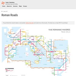
I’ll email you a crisp PDF for printing! It’s finally done. Surprise Maps: Showing the Unexpected – UW Interactive Data Lab – Medium. In 1977, Jerry Ehman — an astronomer working with the SETI project to seek out alien life — came across an interesting radio signal, one needle in the haystack of all of the electromagnetic signals that SETI monitors.
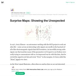
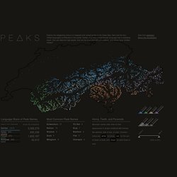
An incredibly strong radio signal, one that matches many of the parameters we’d expect to see if aliens were really trying to communicate with us. So impressed was he with this data, that he circled the signal in red ink and wrote “Wow!” In the margins; it’s been called the “Wow!” Visits - Explore the places you have visited. Peaks. Peaks is a visualization that explores the origin of mountain names in Switzerland.
Visitors can explore the map and interact with the data through the filters on the right. At the bottom, there are three guided narratives. The piece is best experienced in a modern desktop browser (screenshot). If it doesn’t display properly, here’s a 2min walk-through. Exploring the data and finding the story. Cartographies of Time: A Visual History of the Timeline. I was recently asked to select my all-time favorite books for the lovely Ideal Bookshelf project by The Paris Review’s Thessaly la Force and artist Jane Mount.
Despite the near-impossible task of shrinking my boundless bibliophilia to a modest list of dozen or so titles, I was eventually able to do it, and the selection included Cartographies of Time: A History of the Timeline (public library | IndieBound) by Daniel Rosenberg and Anthony Grafton — among both my 7 favorite books on maps and my 7 favorite books on time, this lavish collection of illustrated timelines traces the history of graphic representations of time in Europe and the United States from 1450 to the present, featuring everything from medieval manuscripts to websites to a chronological board game developed by Mark Twain.
The first chapter, Time in Print, begins with a context for these images: * Cue in Visual Storytelling and graphic designer Francesco Franchi on representation vs. interpretation. Build better buildings with indoor maps. The U.S. construction industry generates 37 million blueprints each year. 90% of contractors keep those blueprints on paper.
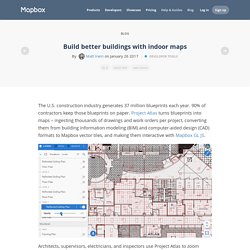
Project Atlas turns blueprints into maps – ingesting thousands of drawings and work orders per project, converting them from building information modeling (BIM) and computer-aided design (CAD) formats to Mapbox vector tiles, and making them interactive with Mapbox GL JS. Architects, supervisors, electricians, and inspectors use Project Atlas to zoom through entire buildings, toggle and interact with data layers, get alerts when plans change, tag items that need fixing, and notify workers when entering hazardous areas. The application helps eliminate the industry average 7% overhead for rework (aka do-overs) from unclear or changed blueprints. In less than six months, the Project Atlas team used Mapbox open source code and online documentation to build an application that’s changing the way buildings get built.
Project Atlas. Visualizing MBTA Data. Log In. The Struggle for Light and Air in America’s Largest City BY QUOCTRUNG BUI and JEREMY WHITE You’re looking at a map of all of the shadows produced by thousands of buildings in New York City over the course of one day.
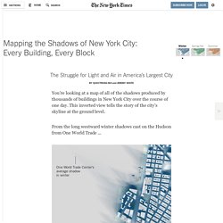
This inverted view tells the story of the city’s skyline at the ground level. From the long westward winter shadows cast on the Hudson from One World Trade ... 7 maps that will change how you see the world – World Economic Forum – Medium. A Japanese architect has won a prestigious award for creating a new map, because it shows the world as it really is.
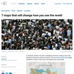
The AuthaGraph World Map angles continents in order to show their true distance from one another. Image: AuthaGraph World Map Hajime Narukawa won the Good Design Award, beating over 1,000 entries in a variety of categories. “The AuthaGraph World Map provides an advanced precise perspective of our planet,” explain the organizers of the award. This Map of the World Just Won Japan’s Prestigious Design Award. The 2016 Good Design Award results were announced recently with awards going to over 1000 entries in several different categories.

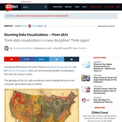
But the coveted Grand Award of Japan’s most well-known design award, given to just 1 entry, was announced today. Last year the winner was a personal mobility chair and the year before that it was a robotic arm. Stunning Data Visualizations. The geology of the US, with sumptuous hand-shading that puts most computer-generated maps to shame: Here's a map of different national origins: In the fiscal chart below, a lot of history is illustrated using data: The light blue spike in the lower right is the US Civil War (1861-1865), which prompted the introduction of a "temporary" progressive income tax (the light pink blob in the lower left) that was originally supposed to expire in 1866!
Visualizing Cities. Αρχική Σελίδα - Athens Social Atlas. Addressing the world. Atlas. Accenture Disaster Visualization. Mapping The World Around You. Zooming In On History. MIT Senseable City Lab. How Officials Distorted Flint’s Water Testing. Local and state officials claimed for months that tests showed that Flint’s water had safe levels of lead. But the officials used flawed testing methods, making the levels of lead in the water supply appear far less dangerous than they were. Three of those officials were charged with crimes on Wednesday, accused of covering up glaring deficiencies in two rounds of lead testing conducted in 2014 and 2015.
Testing in 2014 Few sites resampledOfficials were legally required to test all of the 2014 sites again, but they revisited very few sites. All were known to have low lead levels. MIT Senseable City Lab.
Maps Mania. Building Inspector by NYPL Labs. Unaffordable country: where can you afford to buy a house? The Mekong river: stories from the heart of the climate crisis. Digital Cartography [132]