
Google Cloud Platform Webinars. So You Want a (Visualization) Ph.D.? – Multiple Views: Visualization Research Explained. One of the best ways to get involved in visualization research is to get a Ph.D.
In this post, I outline reasons for pursuing a Ph.D., what you should expect from the program, and how to apply. Throughout this post, I try to view these questions through the lens of visualization. In a way, I’m a poor choice for writing a guide on getting a Ph.D., because I more or less stumbled into pursuing my own Ph.D. in the first place. What is visualization research? What should it be? – Multiple Views: Visualization Research Explained. When you hear the term “visualization research,” what comes to mind?
Many people think of Tufte when they think about deep reflection on visualization. For example, ask any visualization researcher how many times their description of what they do has been met with a comment about how great Tufte’s books are. We agree, Tufte’s books are great resources! His guidelines, like maximizing the data-ink ratio or avoiding chart junk, are helpful maxims when you are starting to design a visualization and become aware of the large space of possibilities, even to show a simple data set. Yet Tufte’s suggestions can break down in many realistic design scenarios. Teaching Data Visualization to Kids. Think of all the things you learned in elementary school: How to read.
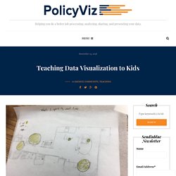
How to write. How to count. How to do add, subtract, multiply, and divide. These are all learned skills, things that we are not innately born knowing how to do. Just like these, reading graphs is a skill. Dump the PowerPoints and do data properly — or lose money. Experimental feature or Give us your feedback Thank you for your feedback.

What do you think? An unknown intruder breaks into your organisation and steals work that took your entire workforce more than 20 days to produce. The Rise of the Data Engineer – Maxime Beauchemin – Medium. I joined Facebook in 2011 as a business intelligence engineer and by the time I left in 2013, I was a data engineer.

I was not promoted or assigned a new role, we simply came to realize that the work we were doing was transcending classic business intelligence and that the role we had created for ourselves was a new discipline. As my team was at forefront of this transformation, we were developing new skills, new ways of doing things, new tools, and more often than not turning my back to traditional methods. We were pioneers. We were data engineers!
No, really, pi is wrong: The Tau Manifesto by Michael Hartl. Papers. Ethics. Most liked Data & Analytics - SlideShare. Tutorials. Labs. Courses. The Rise of Data-Driven Decision Making Is Real but Uneven. Connecting with the Dots - on data visualization, empathy, and representing people with dots. Dots or people—what do you want your readers to think?

(Ryan Norton via Flickr.) Jake Harris on data visualization, empathy, and representing people with dots One of my favorite movies is the classic 1949 thriller “The Third Man.” The story is about a writer who arrives in gloomy post-war Vienna on the promise of a job only to instead unravel a criminal conspiracy to peddle diluted—and thus ineffective—antibiotics. In a pivotal scene during a clandestine meeting on the top of a Ferris wheel, the hero confronts a duplicitous friend about his lack of conscience and angrily asks if he has ever seen one of the victims of the tainted medicine he sells. Big Data 101: Data Visualization For All. As companies try to make sense of the vast amounts of data they’ve collected, data visualization becomes crucial.

The contextualization and execution of this information is really where the money is—but how do you get started? Change is a challenge for any company, but the businesses who adapt are the ones who tend to thrive. One of the major changes companies are faced with today is the vast amounts of data available at their fingertips and the insights all this information can provide. While businesses know this data is a gold mine, many are having trouble finding strategic ways to sift through so much information and present it in an impactful way.