
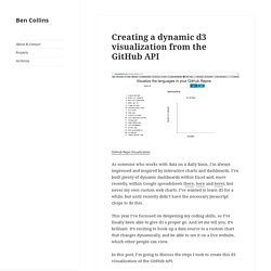
CollectiveSun® Creating a dynamic dashboard in Google Spreadsheets to track sales for a digital product launch. Earlier this year I worked with The Write Life team to develop some behind-the-scenes sales data analysis during their 3-day digital bundle sale.

The team wanted a simple way of gauging progress and seeing how the different sales channels fared as the sale took place. The final dashboard I designed looked and worked like this (view the Google Sheet), and below I’ll show you how I created it: Introduction The Write Life (TWL) is an awesomely popular resource site for writers looking for hints, tips, recommendations and inspiration on a variety of topics. (Full disclosure: this website was founded by my wife, Alexis Grant). I worked with the TWL team beforehand to set some sales targets that we thought were achievable, based on our knowledge of the different channels (i.e. where the sales would come from) and some calculations on conversion rates.
My solution was to create a dashboard that was dynamic so the team could easily see progress and act accordingly. Creating a dynamic d3 visualization from the GitHub API. As someone who works with data on a daily basis, I’m always impressed and inspired by interactive charts and dashboards.
I’ve built plenty of dynamic dashboards within Excel and, more recently, within Google spreadsheets (here, here and here), but never my own custom web charts. I’ve wanted to learn d3 for a while, but until recently didn’t have the necessary Javascript chops to do this. This year I’ve focussed on deepening my coding skills, so I’ve finally been able to give d3 a proper go. And let me tell you, it’s brilliant. It’s exciting to hook up a data source to a custom chart that changes dynamically, and be able to see it on a live website, which other people can view.
In this post, I’m going to discuss the steps I took to create this d3 visualization of the GitHub API. Data Visualization Tutorial and a Primer on Selections. D3.js Tips and Tricks. D3.js Demo. Jan Milosh janmilosh.com Clone the repo: github.com/janmilosh/d3js-presentation View online: janmilosh.github.io/d3js-presentation What is D3.js?
D3.js (d3js.org) stands for Data-Driven Documents, a JavaScript library for data visualization. It was created by Mike Bostock, based on his PhD studies in the Stanford University data visualization program. Mike now works at the New York Times who sponsors his open source work. Read D3 Tips and Tricks. Alex Rothenberg - Learning D3.js by Building a Chart. If you’re doing any JavaScript you’ve probably heard of d3.js.
In fact Github Graphs are built with it so even if you weren’t aware, I’m sure you’ve seen it there. But maybe you haven’t been sure how to get started using it yourself. Overview. Background In Square’s new engineer onboarding program, which we call NEO, we offer short courses and lectures on a variety of tools that we use at Square.

We started to collect notes from our course on D3.js and found the notes were well-suited for a tutorial — and worth sharing. Introduction The tutorial provides a quick intro to D3.js, a Javascript library for creating data visualizations in the browser. D3 is built on top of common web standards like HTML, CSS, and SVG. D3 makes web-based visualizations easier by “automating the hard bits you already understand,” as opposed to “hiding the hard bits” (hat tip @andy_matuschak).
Again, the tutorial is not a deep dive — we want you to learn how to learn D3 and gain a high-level understanding of this useful tool. D3.js Data Visualization Freelancer And Consultant. Basic Building Blocks. Modern Browsers The five modern web browsers are Internet Explorer, Firefox, Safari, Chrome and Opera.
DashingD3js.com will focus on the web browsers that use WebKit. WebKit is a layout engine software designed to allow web browsers to render web pages WebKit powers the Apple Safari and Google Chrome browsers. We will use Google Chrome for the rest of the sections for the Web Inspector Developer Tool. The web browser's main function is to display a web resource. The web browser requests a resource from the server using the Uniform Resource Identifier (URI) of the resource. After the browser receives the requested resource it must interpret and display the resource. The Hypertext Markup Language (HTML) resource is the main markup language for displaying web pages.
Inside of the tags, different attributes can be given. 1<tag attribute1="value1" attribute2="value2">Hello World! The starting HTML webpage we will use is: Basic Building Blocks. Using JSON to Simplify Code. The Goal In this section, you will understand how using JSON can simplify your D3.js code as well as your JavaScript code.
We will cover previous examples, how to bind JSON objects to the __data__ attribute and how we can use JSON to clean up the code for easier comprehension. Previous Example of Three Circles In the Using the SVG Coordinate Space section, we created and styled three circles using D3.js Running the above JavaScript code in the JavaScript Console gaves us this: This example used the data to set the cx, cy and style fill for each circle.
However, as you probably noticed, the cx and cy units were the same. Also - perhaps more dangerous, was that the if statements had hard coded values. Hard coded values are never a good idea, because if our data changes, then we would have to change our code in several places. Binding JSON Objects to the __data__ Attribute Using our example above (the three circles) and the JSON notation, we could write our data array as follows: Which gives us this: Digital Geography. Basics D3 D3 selections javascript js leaflet library OpenLayers programming Tutorial webmap Since a while I am programming with the JavaScript library D3.js … and … I am addicted to it!
As I would like to present some tutorials on D3’s fantastic possibilities to create and design webmapping solutions … I think it would be good to give you a description on the things that I would identify as elementary. Caution! This tutorial could be a little bit too detailled for you, when you are a skilled JavaScript programmer! I am sorry for that! Data Visualization Tutorial and a Primer on Selections. Get Help via Video Chat You will be connected with Lars via Google Hangouts where you can share your screen.

Fun with D3 Maps - Mike McDearmon. D3-Inkscscape tutorial. Building a tree diagram in D3.js - Pixel-in-Gene. In the past few weeks, I have spent some time evaluating some visualization frameworks in Javascript.
Interactive Data Visualization for the Web. Copyright © 2013 Scott Murray Printed in the United States of America. O’Reilly books may be purchased for educational, business, or sales promotional use. Online editions are also available for most titles ( For more information, contact our corporate/institutional sales department: 800-998-9938 or <corporate@oreilly.com>. Nutshell Handbook, the Nutshell Handbook logo, the cover image, and the O’Reilly logo are registered trademarks of O’Reilly Media, Inc. Interactive Data Visualization for the Web, the cover image of a long-tail bushtit, and related trade dress are trademarks of O’Reilly Media, Inc. D3.
<div id="js_warning"><strong>JavaScript is turned off, so this page won’t be very interactive. </strong> Switch JavaScript back on in your web browser for the full experience. </div> These tutorials have been expanded into a book, Interactive Data Visualization for the Web, published by O’Reilly in March 2013. Path Transitions. When implementing realtime displays of time-series data, we often use the x-axis to encode time as position: as time progresses, new data comes in from the right, and old data slides out to the left. If you use D3’s built-in path interpolators, however, you may see some surprising behavior: Why the distracting wiggle?
There are multiple valid interpretations when interpolating two paths. Here’s the relevant code from the above chart: D3.js Tips and Tricks. Bl.ocks.org - d3noob. Loading; one moment please… How to Make Choropleth Maps in D3. Tutorials · mbostock/d3 Wiki. Wiki ▸ Tutorials Please feel free to add links to your work!! Tutorials may not be up-to-date with the latest version 4.0 of D3; consider reading them alongside the latest release notes, the 4.0 summary, and the 4.0 changes. Introductions & Core Concepts Specific Techniques. Read D3 Tips and Tricks. Why Data Visualizations. A picture is worth 1000 words A proverb is a simple and concrete saying popularly known and revered, which expresses a truth, based on common sense or the practical experience of humanity.
The proverb "A picture is worth 1000 words" is one you have probably heard more than once. Let’s Make a Bar Chart. Say you have a little data, an array of numbers: var data = [4, 8, 15, 16, 23, 42]; Interactive Data Visualization for the Web. Read D3 Tips and Tricks. Edit fiddle. Creating a table linked to a csv file. D3 And JavaScript: Working With JSON. D3.js Tutorial Table of Contents. Hashbang. d3.js ~ Three Little Circles.