
R Graphics Cookbook, 2nd edition. R Graph Catalog. Ggplot2 graphics companion. Ggplot2tor. Top 50 ggplot2 Visualizations (With R Code) What type of visualization to use for what sort of problem?
This tutorial helps you choose the right type of chart for your specific objectives and how to implement it in R using ggplot2. This is part 3 of a three part tutorial on ggplot2, an aesthetically pleasing (and very popular) graphics framework in R. This tutorial is primarily geared towards those having some basic knowledge of the R programming language and want to make complex and nice looking charts with R ggplot2.
Part 1: Introduction to ggplot2, covers the basic knowledge about constructing simple ggplots and modifying the components and aesthetics.Part 2: Customizing the Look and Feel, is about more advanced customization like manipulating legend, annotations, multiplots with faceting and custom layoutsPart 3: Top 50 ggplot2 Visualizations - The Master List, applies what was learnt in part 1 and 2 to construct other types of ggplots such as bar charts, boxplots etc. Top 50 ggplot2 Visualizations - The Master List 1. 2. 3. 4. Why I use ggplot2. If you’ve read my blog, taken one of my classes, or sat next to me on an airplane, you probably know I’m a big fan of Hadley Wickham’s ggplot2 package, especially compared to base R plotting.

Not everyone agrees. Among the anti-ggplot2 crowd is JHU Professor Jeff Leek, who yesterday wrote up his thoughts on the Simply Statistics blog: …one place I lose tons of street cred in the data science community is when I talk about ggplot2… ggplot2 is an R package/phenomenon for data visualization. It was created by Hadley Wickham, who is (in my opinion) perhaps the most important statistician/data scientist on the planet. It is one of the best maintained, most important, and really well done R packages. Comparing ggplot2 and R Base Graphics. In R, the open source statistical computing language, there are a lot of ways to do the same thing.
Especially with visualization. R comes with built-in functionality for charts and graphs, typically referred to as base graphics. Ggplot flipbook. Ggplot(data = college_majors %>% mutate(Unemployed = ifelse(Unemployed == 0, 1, Unemployed))) + aes(Total) + aes(y = Unemployed) + aes(label = paste0(Major, "\n$", Median, " annual" )) + aes(col = Median/1000) + scale_x_log10(breaks = c(1000,10000, 100000), labels = c(1000,10000, 100000)/1000) +
Using ggplot2 in packages. This vignette is intended for package developers who use ggplot2 within their package code.
As of this writing, this includes over 2,000 packages on CRAN and many more elsewhere! Programming with ggplot2 within a package adds several constraints, particularly if you would like to submit the package to CRAN. In particular, programming within an R package changes the way you refer to functions from ggplot2 and how you use ggplot2’s non-standard evaluation within aes() and vars(). Referring to ggplot2 functions As with any function from another package, you will have to list ggplot2 in your DESCRIPTION under Imports and refer to its functions using :: (e.g., ggplot2::function_name): Esquisse: Explore and Visualize Your Data Interactively. The purpose of this add-in is to let you explore your data quickly to extract the information they hold.
You can only create simple plots, you won’t be able to use custom scales and all the power of ggplot2. This is just the start! Practical ggplot2. The R package ggplot2 provides a powerful and flexible approach to data visualization, and it is suitable both for rapid exploration of different visualization approaches and for producing carefully crafted publication-quality figures.
However, getting ggplot2 to make figures that look exactly the way you want them to can sometimes be challenging, and beginners and experts alike can get confused by themes, scales, coords, guides, or facets. This repository houses a set of step-by-step examples demonstrating how to get the most out of ggplot2, including how to choose and customize scales, how to theme plots, and when and how to use extension packages. The examples shown are based on the book “Fundamentals of Data Visualization.” However, there are minor differences between the figures here and the ones in the book. Most importantly, the book uses the Myriad Pro font family, which is not freely available. Designing ggplots. Ggplot2 Quick Ref: size. Most geoms have a "size" parameter.
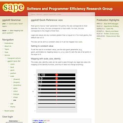
For points, the size corresponds to their diameter. For lines, the size corresponds to their width. For text, the size corresponds to the height of their font. Legal size values are any numbers greater than or equal to 0. For most geoms, the default size is 0.5. The size can be set to a constant value or it can be mapped via a scale. Ggplot2 extensions. Creating ggplot2 Extensions. Intro to ggridges. Claus O.
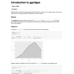
Wilke Ridgeline plots are partially overlapping line plots that create the impression of a mountain range. They can be quite useful for visualizing changes in distributions over time or space. Geoms The ggridges package provides two main geoms, geom_ridgeline and geom_density_ridges. Ridgelines The geom geom_ridgeline can be used to draw lines with a filled area underneath. library(ggplot2) library(ggridges) data <- data.frame(x = 1:5, y = rep(1, 5), height = c(0, 1, 3, 4, 2)) ggplot(data, aes(x, y, height = height)) + geom_ridgeline() Negative heights are allowed, but are cut off unless the min_height parameter is set negative as well.
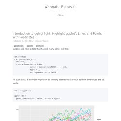
Intro to gghighlight: Highlight ggplot's Lines and Points with Predicates. Suppose we have a data that has too many series like this: set.seed(2) d <- purrr::map_dfr( letters, ~ data.frame(idx = 1:400, value = cumsum(runif(400, -1, 1)), type = ., stringsAsFactors = FALSE)) For such data, it is almost impossible to identify a series by its colour as their differences are so subtle. library(ggplot2) ggplot(d) + geom_line(aes(idx, value, colour = type))
Gghighlight 0.2.0. Gghighlight 0.2.0 is on CRAN a while ago. This post briefly introduces the three new features. For basic usages, please refer to “Introduction to gghighlight”. keep_scales To put it simply, gghighlight doesn’t drop any data points but drops their colours. This means, while non-colour scales (e.g. x, y and size) are kept as they are, colour scales get shrinked.
Ggfreehand. Gcc_ggplot. Ggbrush. GitHub ggfittext. Population pyramids with ggplot2. Population Pyramids - ggplot2. Making Back-to-Back Histograms. A colleage of mine asked me how to do back to back histograms (instead of on top of each other). I feel as though there should be a function like voilin plot from the vioplot package. Voilin plots are good for displaying data, but the violin must have the left and right (or top and bottom) of the violin to be from the same distribution, and therefore are symmetrical. Many times people want to compare two distributions. Ggrough - Convert ggplot2 charts to roughjs. Sinhrks/ggfortify. Ggstatsplot. Ggdist cheatsheet. Ggpage version 0.2.0 showcase. Ggpage version 0.2.0 In this post I will highlight a couple of the new features in the new update of my package ggpage. first we load the packages we need, which is tidyverse for general tidy tools, ggpage for visualization and finally rtweet and rvest for data collection. GgTimeSeries.
Scatterpie for plotting pies on ggplot2. Plotting pies on ggplot/ggmap is not an easy task, as ggplot2 doesn’t provide native pie geom. The pie we produced in ggplot2 is actually a barplot transform to polar coordination. This make it difficult if we want to produce a map like the above screenshot, which was posted by Tyler Rinker, the author of R package pacman. The question remained unsolved until he discover that ggtree can do it. Ggplot Quality Control Charts. The ggQC package is a quality control extension for ggplot. Use it to create XmR, XbarR, C and many other highly customizable Control Charts. Additional statistical process control functions include Shewart violation checks as well as capability analysis. If your process is running smoothly, visualize the potential impacted of your next process improvement with a Pareto chart. To learn more, read on! Waffle 1.0 Font Awesome 5 Pictograms and More. The {waffle} package got some 💙 this week and now has a substantially improved geom_waffle() along with a brand new sibling function geom_pictogram() which has all the powerful new features of geom_waffle() but lets you use Font Awesome 5 brand and solid glyphs to make isotype pictograms.
The ggforce Awakens (again) After what seems like a lifetime (at least to me), a new feature release of ggforce is available on CRAN. ggforce is my general purpose extension package for ggplot2, my first early success, what got me on twitter in the first place, and ultimately instrumental in my career move towards full-time software/R development. Despite this pedigree ggforce haven’t really received much love in the form of a feature release since, well, since it was released.
Accelerate your plots with ggforce. By Edgar Ruiz In this post, I will walk you through some examples that show off the major features of the ggforce package. The main goal is to share a few ideas about customizing visualizations that you may find useful in your everyday work. A Flurry of Facets. The remainder of the release centers around facets and a few geoms that has been made specifically for them.
Ggeconodist: A Different Look At Distributions. Despite being a full-on denizen of all things digital I receive a fair number of dead-tree print magazines as there’s nothing quite like seeing an amazing, large, full-color print data-driven visualization up close and personal. Ggtext: Improved text rendering for ggplot2. Signs. Pixel art of ggplot2 faceting using geofacet. I just discovered an interesting ggplot2 extension, geofacet, that supports arranging facet panels that mimics geographic topoloty.
Ggannotate. Ggpattern. Ggpattern provides custom ggplot2 geoms which support filled areas with geometric and image-based patterns. Reading the articles/vignettes on the package website is probably the best way to get started. Ggfx: Say Goodbye to "Good Taste" Rayshader: Introducing 3D ggplots with rayshader. As rayshader gracefully rotates into its second year, I’m happy to announce the release of a feature I've been teasing for a while: 3D ggplots! It's been a long time coming, but the wait was worth it--I promise.
Creating this feature was a logical extension of rayshader’s core competency–using elevation matrices to generate raytraced 3D maps of topographic data. Ggplot2 Theme Elements. Ggplot2 Theme Builder. Intro to ggthemes. Tuning ggplot themes. The ggthemr package. Thematic. Ggplot2 tech themes, scales, and geoms. Hrbrthemes: Opinionated, typographic-centric ggplot2 themes and theme components. Tvthemes: ggplot2 palettes and themes from your favorite TV shows! Scientific Journal and Sci-Fi Themed Color Palettes for ggplot2. Ggpomological: A Pomological ggplot2 Theme. How the BBC Visual and Data Journalism team works with graphics in R. GgCyberPunk. Naming Manual Colors with ggplot2. Paletteer: Hundreds of color palettes in R. Creating corporate colour palettes for ggplot2. Studio Ghibli Colour Palettes. Swatches package to read palette files.
Override.aes : Controlling legend appearance. Change fonts in ggplot2, and create xkcd style graphs. Adding Custom Fonts to ggplot in R. Ggplot2: multiple legends for the same aesthetic. Changing Glyph in legend in ggplot2. Alternatives to Simple Color Legends in ggplot2. How to format plots for publication using ggplot2 (with some help from Inkscape) Axis guide — guide_axis. Add Labels Directly in ggplot2: Secondary Axis Trick. Lubridate/ggplot date helpers. Subplots in maps with ggplot2. Arranging subplots with ggplot2. Ggplot2 Easy way to mix multiple graphs on the same page.
Patchwork: The Composer of ggplots. Patchwork: Alignment Across Multiple Pages. Patch it up and send it out. Insetting a new patchwork version. Patchwork: ggplot2 plot combiner. Reversing the order of a ggplot2 legend. Filling Ordered Facets From the Bottom Row. Function to label facets with letters in ggplot2. Convert plot to grob and ggplot object. Add Text Annotations to ggplot2 Faceted Plot. Math Expressions with Facets in ggplot2. Ggbillboard. Multi-level labels with ggplot2. Ggh4x: Extended Facets. Create smooth animations in R with tweenr.
Gganimate has transitioned to a state of release · Data Imaginist. Gganimate Wiki. Intro to gganimate. Shading between two lines – ggplot. Setting individual axis limits with facet_wrap and scales = "free" in ggplot2. Change colour of density plots in ggplot2. How to add texture to fill colors in ggplot2? Remove leading 0 with ggplot2. Using great circles and ggplot2 to map arrival/departure of 2014 US Open Tennis Players – Adventures in Analytics and Visualization. Images as x-axis labels.