
LUX - RISE Lab. Data Visualization Techniques. For Students. Microsoft Releases Power BI In Jupyter Notebooks. Microsoft has released Power BI in Jupyter notebooks.
“You can now tell compelling data stories with Power BI in Jupyter notebooks,” according to the company. With the new package, you can embed Power BI reports, dashboards, dashboard tiles, report visuals or Q&A in Jupyter notebooks easily.
Microsoft DA-100 Exam Practice Test Questions - Exam-Labs. Microsoft DA-100 Practice Test Questions, Microsoft DA-100 Exam Practice Test Questions Looking to pass your tests the first time.

You can study with Microsoft DA-100 certification practice test questions and answers, study guide, training courses. With Exam-Labs VCE files you can prepare with Microsoft DA-100 Analyzing Data with Microsoft Power BI exam practice test questions and answers.
Power BI sur Microsoft Learn. La datavisualisation pour tous : comment bien choisir sa solution de dataviz ? The Data Visualisation Catalogue. What Makes A Good Data Visualization? — Information is Beautiful. Hi there.
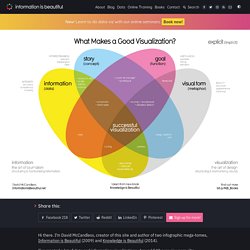
I’m David McCandless, creator of this site and author of two infographic mega-tomes, Information is Beautiful (2009) and Knowledge is Beautiful (2014). I’ve created a lot of data and information visualizations. Around 540 over six years. Roue chromatique, un générateur de palettes de couleurs. Color Hex - ColorHexa.com. Choropleth Maps. A Choropleth Map is a map composed of colored polygons.

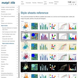
It is used to represent spatial variations of a quantity. This page documents how to build outline choropleth maps, but you can also build choropleth tile maps using our Mapbox trace types. Youtube. Style sheets reference — Matplotlib 3.4.2 documentation. This script demonstrates the different available style sheets on a common set of example plots: scatter plot, image, bar graph, patches, line plot and histogram,
Jupyter Notebook Viewer. Seaborn: statistical data visualization — seaborn 0.11.1 documentation. Choosing color palettes — seaborn 0.11.1 documentation. Seaborn makes it easy to use colors that are well-suited to the characteristics of your data and your visualization goals.
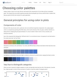
This chapter discusses both the general principles that should guide your choices and the tools in seaborn that help you quickly find the best solution for a given application. General principles for using color in plots. Jupyter Notebook Viewer. Visual Vocabulary. Creating corporate colour palettes for ggplot2. @drsimonj here to share how I create and reuse corporate color palettes for ggplot2.
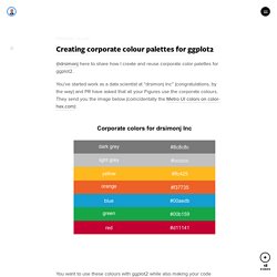
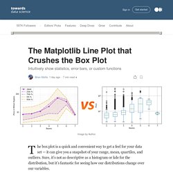
You’ve started work as a data scientist at “drsimonj Inc” (congratulations, by the way) and PR have asked that all your Figures use the corporate colours. They send you the image below (coincidentally the Metro UI colors on color-hex.com): Towardsdatascience. Line plots with distributions The main goal here is to overlay the various levels — mean, range, etc — as lines on a single plot.
We’ll start by extracting these values for each value of ‘Rooms’. This is right up the alley of the pandas groupby() function.