
Amazon. Tochi.96. Tochi.96. Juice Labs - Chart Chooser. Perception in Visualization. Note: An extended version of this web page has been accepted for publication in IEEE Transactions on Visualization and Computer Graphics.
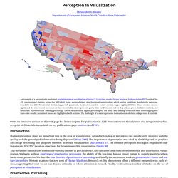
A reprint of this article is available on my publications page (abstract and PDF). Introduction Human perception plays an important role in the area of visualization. An understanding of perception can significantly improve both the quality and the quantity of information being displayed [Ware 2000]. The importance of perception was cited by the NSF panel on graphics and image processing that proposed the term "scientific visualization" [McCormick 87]. This document summarizes some of the existing theories in psychophysics, and discusses their relevance to scientific and information visualization. Preattentive Processing For many years vision researchers have been investigating how the human visual system analyses images. Feature Integration Theory Color. The right graph. Graph Selection Matrix. How to Visualize and Compare Distributions. There are a lot of ways to show distributions, but for the purposes of this tutorial, I’m only going to cover the more traditional plot types like histograms and box plots.
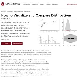
Otherwise, we could be here all night. Plus the basic distribution plots aren’t exactly well-used as it is. Before you get into plotting in R though, you should know what I mean by distribution. It’s basically the spread of a dataset. For example, the median of a dataset is the half-way point. What happens in between the maximum value and median? Want more? If you don’t have R installed yet, do that now. Box-and-Whisker Plot This old standby was created by statistician John Tukey in the age of graphing with pencil and paper. The method might be old, but they still work for showing basic distribution. To get started, load the data in R. Remove the District of Columbia from the loaded data.
Oh, and you don’t need the national averages for this tutorial either. Multiple box plot for comparision. Histogram Look, ma! Rug. In praise of connected scatter plots. I guess that it's safe to assume that whoever visits this website is already familiar with Hans Rosling's presentations.
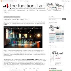
This is one of my favorites, taken from his BBC documentary The Joy of Stats (watch it here): Rosling is a master storyteller. To give context to his data, he blends with his own graphics and he speaks like a sportscaster —that's actually the analogy he used when I interviewed him for The Functional Art. He uses bubble scatter plots very effectively and animates them.
Who would have thought that a graphic form that a decade ago was rarely seen outside of academic publications could become so popular? The question that came to my mind when I saw Rosling's first presentation at TED was: Would it be possible to do something like that without animation or interaction? Driving Shifts Into Reverse (Hannah Fairfield for The New York Times). And this one was published today. Driving Safety, in Fits and Starts (Hannah Fairfield for The New York Times). Intro to cycle plots. Edward Tufte forum: Sparkline theory and practice Edward Tufte. Sparkline theory and practice Edward Tufte A sparkline is a small intense, simple, word-sized graphic with typographic resolution.
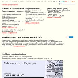
Sparklines mean that graphics are no longer cartoonish special occasions with captions and boxes, but rather sparkline graphics can be everywhere a word or number can be: embedded in a sentence, table, headline, map, spreadsheet, graphic. Data graphics should have the resolution of typography. See Edward Tufte, Beautiful Evidence, 46-63. Sparklines: recent applications Sparklines in Steven Heller and Véronique Vienne,100 Ideas that Changed Graphic Design (Lawrence King Publishing, 2012), p. 196: Apple Watch sparkline, announced September 9, good but should show more detail, more data texture. Tutorial here for creating SVG-based sparklines with d3.js. Implementing angular.js directives for d3.js and nvd3.js, tutorial here.
Below, sparklines in Twitter analytics, good but routinely longer time periods and more intense detail would be better. Bullet Graph Design Spec.