
5 ways to measure learning engagement. Within the world of Learning & Development (L&D), learning engagement is the ultimate stamp of approval.

Creating a successful learning engagement strategy requires not only an in-depth understanding of how your employees prefer to learn, but also a strong understanding of your current learning engagement levels. Before you can undertake a refresh of your learning engagement strategy, or perhaps the creation of your first one, it’s important to understand how your current management of workplace learning works, in terms of how effective it is and how engaged your learners currently are. How can learning engagement be measured? While learning engagement is frequently measured on the basis of completion rates, for a true insight into the effectiveness of your strategy, you need to broaden your view.
Here are our top ways to measure learning engagement within your organisation. 1. 2. 3. 4. Bad Design vs. Good Design: 5 Examples We can Learn From. Looking at examples of bad design alongside counter-examples of good design is not only fun but also draws important lessons for designers.
They highlight pitfalls for designers to avoid and let us understand how to translate design theories into solutions that work in the real world. Jared Spool, the American writer, researcher and usability expert, once said: “Good design, when it’s done well, becomes invisible. It’s only when it’s done poorly that we notice it.” So, let’s look at five examples of obviously bad designs, shine the light on how good design makes it work, and distil some lessons so we can all create great and invisible experiences for our users. 1. The Bad: Parking Signs in Los Angeles Parking signs in Los Angeles (LA) have been the epitome of information overload for decades. How to prevent users download videos? Lightbox Effect. As noted in the comment below by Christopher Gaudreau, this will not work on iOS devices.
In the web design world, you might come across a site that has photos/images where if you click on the image, a larger version of that appears front and center, and the rest of the website is grayed out behind it temporarily...until you close the image to return to the webpage. Adding Zoom In Canvas LMS. Adding Zoom Room in Canvas PDF - Screen-Shots.pdf.
General Accessibility Design Guidelines. Various state and federal laws have requirements aimed at making education accessible to as many people as possible.
For instance, making sure that classrooms are wheelchair accessible would be an effort to comply with these laws and policies. Online classes need to be accessible as well. This document outlines some general best practices when designing a course for accessibility concerns. Additional help can be found at Creating Accessible Electronic Content. Specific Canvas-related accessibility help can found in the Accessibility within Canvas document. Generally, the layout of a page should be simple, clean, and uncluttered. Using Tabs in Your Canvas Course. Homepage Design with Simple Tables. I've been feeling adventurous and decided to see what tables can do on the Canvas homepage (and yes, I’m aware of the complications and frustrations of tables on Pages).
Journey Through Google Analytics: Part 1. From Google Analytics Terms of Service7.

Privacy.You will not and will not assist or permit any third party to, pass information to Google that Google could use or recognize as personally identifiable information. You will have and abide by an appropriate Privacy Policy and will comply with all applicable laws, policies, and regulations relating to the collection of information from Visitors. You must post a Privacy Policy and that Privacy Policy must provide notice of Your use of cookies that are used to collect data. Canvas Instructor Cheat Sheet. Creating an inviting course home page. The course home page is a critical navigation waypoint for students.
As course designers, we can choose from numerous style ideas to make the course home page inviting and intuitive for our students. This is a stripped-down version of a course home page I'm currently using. I created this home page using a table, and I used the "btn btn-info btn-large" attribute for the buttons. The functionality of this home page style is compatible with mobile devices, but the buttons themselves won't appear in the app. This is how the same home page looks in the Canvas App on an iPad. The image below shows examples of other button styles. The button code is inherently versatile. <p><a class="btn-large btn-block btn btn-danger btn" style="width: 100%;" title="Click here to view the Course Announcements" href="/courses/[insert-course-number]/announcements" target="_blank"><strong>Course Announcements</strong></a></p> At many schools, teachers are tasked with creating their courses and course home pages.
How do I embed iFrame videos using the Rich Con... Home Sweet Homepages without Tables. Lately I've been busy as a bee, cross pollinating between the tips Stefanie Sanders shared in Creating an inviting course home page and the HTML Snippets Gerol Petruzella shared in Columns Without Tables: code-snippet.
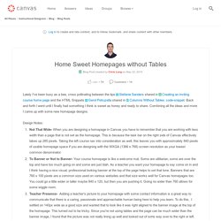
Back and forth I went until I finally had something I think is sweet as honey and ready to share. Combining all the ideas and more I came up with some new homepage designs. Design Notes: Not That Wide- When you are designing a homepage in Canvas you have to remember that you are working with less width than a page that is not set as the homepage. This is because the task bar on the right side of Canvas effectively takes up 285 pixels. Update: I've included a new version (v2) that lines up as 3 columns on most desktop/laptops and has the buttons aligned vertically going down the left side of the page. v1: Laptop (WXGA 1366 x 768) v1: Phone 6 (Mobile Browser) v1: iPhone 6 (Mobile App) v2: Laptop (WXGA 1366 x 768) v2: Phone 6 (Mobile Browser) v2: iPhone 6 (Mobile App)
Export Student Email. Top 10 Best Practices for SharePoint Document Management - Superfluid. Key Benefits: Minimising data conflicts by turning on the require check out featureAllowing for co-authoring of Microsoft Office documents when the require check out feature is turned offMaintain data integrity 8.

Document Library Permissions In document libraries, the permissions recommended to be set up is to adhere to using SharePoint groups rather than granting users access directly to the library. This minimises admin overhead from a permissions management perspective. Controlling who has access to specific content in document libraries using the SharePoint security model 9.
When document libraries include metadata and files are tagged appropriately, document library views can be set up to present the content in different ways that will help users find content quicker and easier. Views can also provide a great reporting feature on the content in the library.