
Projet manga. Mapes web vectorials - D3js. Outillage pour les datavisualisations - WikiEtalab. La mission Etalab, placée sous l’autorité du Premier ministre au sein du SGMAP, a pour mission d’accompagner l’ouverture des données publiques de l’Etat et des administrations. RAW. Raw. Three Big Qs in Big Data. The Big Data battle is still on, most of organizations haven’t seen clear symbol to declare victory yet, though everyone is talking about “V” words these days: Volume, Velocity, Variety, and look for big Value; if switch the angle a bit, how to see Big Data in the lens of “Q”?
1. Quantity The growth of Data is exponential: The volume of business data worldwide is expected to double every 1.2 years. Data is growing at 40% compound annual rate, reaching nearly 45 ZB by 2020. Every day, 2.5quintillion bytes of data are created, with 90% of the world’s data created in the past two years, also, data production will be 44 times greater in 2020 than in 2009. But what exactly is the difference between “a lot” of data and “big data”? Perhaps Big Data might not necessarily be that 'big'. 2. There’s no “perfect” data in Big Data world, the accuracy and compromise will continue to coexist across the span of information management. 3. Why is this important? “What are the problems we need to solve?
Bootstrap CSS from Twitter.
Tutorials. Christopheviau. Intro Data-Driven Documents, or D3 for short, is a new visualization library to build visualizations in SVG.
But in my opinion, it's also the best javascript multipurpose SVG library when it comes to animation, interaction and above all for binding data to graphics. The community is very responsive, source code is very clean and the API is well written. There is not a lot of tutorials to learn D3 yet. But they are very good introductions and you can find plenty of examples packaged with the source code or hidden in forums. Simple example. Fundamentals. Last updated 2015 September 10 These tutorials address an older version of D3 (3.x) and will no longer be updated.
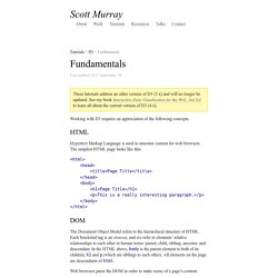
See my book Interactive Data Visualization for the Web, 2nd Ed. to learn all about the current version of D3 (4.x). Working with D3 requires an appreciation of the following concepts. Hypertext Markup Language is used to structure content for web browsers. The simplest HTML page looks like this: <html><head><title>Page Title</title></head><body><h1>Page Title</h1><p>This is a really interesting paragraph. The Document Object Model refers to the hierarchical structure of HTML. Web browsers parse the DOM in order to make sense of a page’s content. Cascading Style Sheets are used to style the visual presentation of HTML pages. CSS styles consist of selectors and rules.
h1 /* Selects level 1 headings */ p /* Selects paragraphs */ .caption /* Selects elements with class "caption" */ #subnav /* Selects element with ID "subnav" */ We connect selectors and rules using curly brackets: D3.js - Data-Driven Documents.
Code Playground. 38 tools. As we enter the Big Data era, it becomes more important to properly expand our capacity to process information for analysis and communication purposes.
In a business context, this is evident as good visualisation techniques can support statistical treatment of data, or even become an analysis technique. But also, can be used as a communication tool to report insights that inform decisions. Today there are plenty of tools out there that can be used to improve your data visualisation efforts at every level. Below we list a non-exhaustive list of resources. Javascript Libraries Circular Hierarchy – D3.js Python Libraries Kartograph.py – Mapsigraph – Node-link, treesMatplotlib – Most types of statistical plotsPycha – Pie chart, bar chart, area chartNetworkX – Node-link Java / PHP Web Applications TileMill – Running Map Programming Languages Hyperbolic Tree – NYTimes 365/360 Generated with Processing Desktop Applications.
Arbor.js. Les 20 meilleurs outils de datavisualisation au banc d’essai. Que vous soyez absolument novice ou codeur amateur, il existe aujourd’hui sur le web une impressionnante palette d’outils (presque) gratuits pour réaliser des datavisualisations.
Banc d’essai. Note : j’ai volontairement éliminé les outils (a) entièrement payants (b) trop moches pour être utilisés dans des rédactions (c) en Flash. Ce billet n’est consacré qu’aux outils de “visualisation”, et non de scraping ou de traitement des données (un autre billet suivra bientôt). ↑1 » Pour les novices/pressés : le clé-en-mains Ces outils gratuits ou freemium permettent de générer des graphiques ultra-rapidement en copiant-collant des données d’un tableur.
Le meilleur – Datawrapper : Simple d’utilisation, sobre, rapide, Datawrapper est tout à fait satisfaisant pour la plupart des visualisations courantes. Les + : la possibilité de personnaliser les couleurs, de mettre en évidence une série, la navigation par onglets entre les différentes séries. Les challengers : Ils ne nous ont pas convaincu :