
Mapping technologies. Interactive - NatGeoMag Population. The World of Seven Billion The map shows population density; the brightest points are the highest densities.
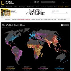
Each country is colored according to its average annual gross national income per capita, using categories established by the World Bank (see key below). Some nations— like economic powerhouses China and India—have an especially wide range of incomes. 7B people & you: What's your number? Sources: All population data are based on estimates by the UN Population Division and all calculations provided by the UN Population Fund.
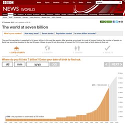
The remaining data are from other sections of the UN, the Global Footprint Network and the International Telecommunications Union. Want to find out more? Visit the UN Population Fund's detailed population calculator, 7 billion and me. Notes on the data: Only birth dates after 1910 can be accommodated and only countries with populations of more than 100,000 people are included. World's Best Countries.
Global Adaptation Index. Timeline of Major Events & Trends on Datavisualization. Peter von Stackelberg designed this complex timeline of social, technological, economic and political events and trends from 1750 to 2100.
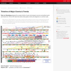
Each time series shows graphs, events and categories on a common scale. The purpose of the timeline is to provide a visual tool for looking at events across a relatively long period of time and identify patterns and interrelationships involving a broad range of factors. Identification of patterns is particularly important when attempting to look at the future of complex social, technological, economic, and other systems. Some thoughts behind the design process.Stephen Lark uploaded a zoomable version to Zoomorama. Global Migration Patterns: the Flows of People to and from Countries. Global Migration Patterns [mpg.de] by the German Max Planck Institute for the Study of Religious and Ethnic Diversity contains a set of interactive instruments that visualize the latest global migration data.
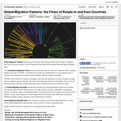
The "International Migration Flows shows the different flows to - and from - selected OECD-countries between the years 1970-2007. It illustrates the concept of "Superdiversity", or how during the last 2 decades more people than ever have moved between different locations worldwide. The outer circle shows the number of emigrants, with each bar represents a country of origin and each color conveying a unique continent. The inner circle shows the number of immigrants. One can "zoom" into the data by choosing a specific threshold, which truncates the bars to a maximum value.