
40 Maps That Will Help You Make Sense of the World If you’re a visual learner like myself, then you know maps, charts and infographics can really help bring data and information to life. Maps can make a point resonate with readers and this collection aims to do just that. Hopefully some of these maps will surprise you and you’ll learn something new. A few are important to know, some interpret and display data in a beautiful or creative way, and a few may even make you chuckle or shake your head. If you enjoy this collection of maps, the Sifter highly recommends the r/MapPorn sub reddit. 1. 2. 3. 4. Pangea was a supercontinent that existed during the late Paleozoic and early Mesozoic eras, forming about 300 million years ago. 5. 6. 7. 8. 9. 10. 11. 12. 13. 14. 15. 16. 17. 18. 19. 20. 21. 22. 23. 24. 25. 26. 27. 28. 29. 30. 31. 32. 33. 34. 35. 37. 38. 39. 40. *Bonus* World Map Tattoo with Countries Visited Coloured
Ciudades del Mundo juegos de geografia juegos-geograficos : Ciudades del Mundo : Sitio de juegos de geografia gratuitos en flash. Juegos de conocimientos sobre la geografia del mundo, Europa, España, México, Argentina, Chile, Perú, Colombia, Bolivia, Uruguay, Paraguay, Venezuela. pampido afroman2 kan todoacien Loredana Aidez nous à garder ce site gratuit.Parce que la gestion de jeux-geographiques nécessite de l'argent,nous faisons un appel aux dons. Cliquer-ici ¡Bienvenidos en la nueva versión de Ciudades del Mundo! Una Nueva versión con más de 100 ciudades nuevas. Pon el enlace en tu blog Copia y pega el código en tu blog Tus comentarios
32 maps that will teach you something new about the world EVER THOUGHT TO YOURSELF, “How many smaller countries could you fit into Australia?” Or possibly, “Which countries in the western hemisphere have legit secessionist movements?” Or, perhaps most pressing of all, “Where does it pay best to be a lifeguard?” We live in the age of the map now, so these are no longer questions you have to continue simply wondering about. Maps are spectacular at conveying a lot of information in a simple image. h/t: Thanks to the MapPorn subreddit for being a great resource for both finding maps and for getting criticism and analysis of those maps.
9 Excellent Free Map Creation Tools for Teachers and Students 1- Umapper UMapper is a great mapping tool for educators. It allows its users to create and manage interactive maps and geogames online. These maps can be shared with others or be embedded in blogs and websites 2- MapTiler This a tool that allows users to create overlay of standard maps like Google Maps, and Yahoo Maps and can also be visualized in 3D form. 3- Build A Map This is another cool tool for teachers to create maps. 4- World Map This one here is being developed by Center for Geographic Analysis at Harvard University and allows users to easily build their own mapping portal and publish it to the world or to just a few collaborators. 5- Map Faire This is a cool tool for teachers to create awesome maps and share them with their students. 6- MapFab This is a Google Maps editor that offers you a clever way to easily create and share your Google Maps . 7- Target Map 8- Scribble Maps This tool allows users to easily draw on maps and then share them with friends and colleagues. 9- Animaps
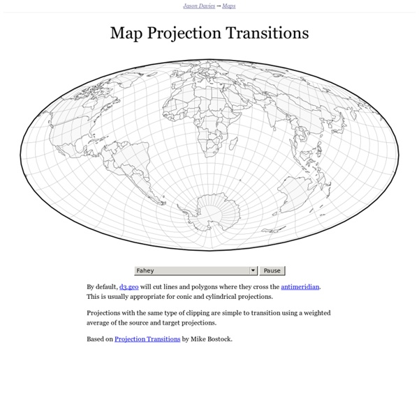
What’s the best map projection? | A User's Guide to the Universe Next term, I’ll be teaching a course in general relativity, and while preparing my notes on the curvature of space, I was reminded of a really fun paper I worked on with Rich Gott a few years ago. As you probably know, the earth is roughly a sphere, and if you try to wrap a piece of flat paper around it to make a map, you’re going to get a lot of crinkles and folds. In short, you can’t make a perfect map of the whole earth. There are some, like the Gall-Peters, that are area-preserving. Peters argued that the only way to properly appreciate the importance of places like Africa and South America in the world was to use the Gall-Peters projection. Area preserving maps are good in general, but obviously, if you’re going to preserve area, you’re going to sacrifice fidelity in another area: shape. Each of those blobby ellipsoids represent a perfect circle drawn on the earth with a radius of about 12 degrees (about 1300 km). So where does the general relativity come into it? Very good indeed!
Wind Map An invisible, ancient source of energy surrounds us—energy that powered the first explorations of the world, and that may be a key to the future. This map shows you the delicate tracery of wind flowing over the US. The wind map is a personal art project, not associated with any company. We've done our best to make this as accurate as possible, but can't make any guarantees about the correctness of the data or our software. Please do not use the map or its data to fly a plane, sail a boat, or fight wildfires :-) If the map is missing or seems slow, we recommend the latest Chrome browser. Surface wind data comes from the National Digital Forecast Database. If you're looking for a weather map, or just want more detail on the weather today, see these more traditional maps of temperature and wind.
Mercosur Argentina, Sede Permanente del Mercosur Cultural - Mercosur/CMC/N° 11/6 VISTO: El tratado de Asunción, el Protocolo de Ouro Preto, las Decesiones N° 2/95 y 11/96 del Consejo del Mercado Común y la Resolución N° 122/96 del Grupo Mercado Común. CONSIDERANDO: Que el nuevo rol de la cultura en la agenda internacional constituye un elemento estratégico en la formulación de las políticas de desarrollo regional, contribuyendo a profundizar la integración; Que el reconocimiento que los bienes y servicios culturales poseen una doble dimensión, por generar riqueza y ser portadores de identidad basándose en la diversidad cultural, contribuyen a afianzar el sentido regional; La importancia de que el MERCOSUR cuente con una instancia permanente de articulación de las políticas culturales de la región. El antecedente: II Reunión de la RECAM, con delegaciones de Argentina, Brasil, Uruguay, Bolivia y Chile, entre los días 13 y 15 de Junio de 2004 PARCUM, Parlamento Cultural del Mercosur ...
40 maps that explain the world By Max Fisher By Max Fisher August 12, 2013 Maps can be a remarkably powerful tool for understanding the world and how it works, but they show only what you ask them to. So when we saw a post sweeping the Web titled "40 maps they didn't teach you in school," one of which happens to be a WorldViews original, I thought we might be able to contribute our own collection. Some of these are pretty nerdy, but I think they're no less fascinating and easily understandable. [Additional read: How Ukraine became Ukraine and 40 more maps that explain the world] Click to enlarge.