
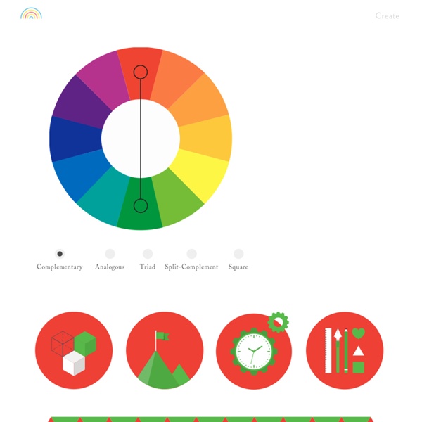
9 great color resources Colour is an integral element of design. And the web is full of endless resources and tutorials covering it. But, sometimes too much choice can be confusing. So we've picked this selection of the best resources that will really help you to get to grips with the subject. 01. Material Design Color Palette Generator - Material Palette material palette More Material Design chevron_right Palette preview Full Palette colors below Your Palette CSS SASS LESS SVG XML PNG POLYMER DOWNLOAD TWEET Dark primary color #7b1fa2
5000+ Free Photoshop Gradients Photoshop gradients are one of the many presets that can be use to create some really creative designs and effects in your photographs or any other graphics. Before you go ahead and dive into these colorful Photoshop gradients please pop your eyes into some other nice posts on Photoshop tutorials and Photoshop resources that we have here: Have a great day, and enjoy the SuperBowl! If you get a chance to help promote this post, we’d really appreciate it. Thanks for reading!
271 Years Before Pantone, an Artist Mixed and Described Every Color Imaginable in an 800-Page Book In 1692 an artist known only as “A. Boogert” sat down to write a book in Dutch about mixing watercolors. Not only would he begin the book with a bit about the use of color in painting, but would go on to explain how to create certain hues and change the tone by adding one, two, or three parts of water. 'Humanae' Portraits Match People of Different Ethnicities With Their Pantone Color Brazilian fine art photographer Angelica Dass‘ series Humanae identifies portrait subjects from around the world using the Pantone color system. Using an 11×11 pixel swatch from her subjects’ faces, Dass matches them to corresponding Pantone colors, creating an abundant and unique catalog of skin tones that reflects the world’s diversity beyond the categorizations we have long been confined to. We recently asked her more about the ongoing project.
Shape of eye's 'light pipes' is key to colour sorting Physicists have pinned down precisely how pipe-shaped cells in our retina filter the incoming colours. These cells, which sit in front of the ones that actually sense light, play a major role in our colour vision that was only recently confirmed. They funnel crucial red and green light into cone cells, leaving blue to spill over and be sensed by rod cells - which are responsible for our night vision. Key to this process, researchers now say, is the exact shape of the pipes. Color Inspiration from the Masters of Painting by COLOURlovers The world has seen thousands of artists and millions of great pieces of art, but we chose just a handful of pieces of art from some of greatest masters of painting to show a little of how they were inspired by color... or perhaps, how they inspire us with color. What colors inspire you? Check out Creative Market to find your color palette now.
Color Distribution, Printable and Otherwise - Modern Photoshop Color Workflow My friend and fellow author Russ Brown sent me an image of an Amazon milk frog, which he grabbed from the web somewhere. The interior of the mouth is a very unusual cyan. Whether this image portrays it accurately is unknown to either of us, as we have never seen this particular amphibian in person. 10 Commandments of Type and Color Articles, Infographic, Resources June 19, 2014 Here’s 2 really clever infographic featuring the 10 Commandments of Type and Color. It’s always good to have a steady foundations and some basic principles for your graphic design work! While not absolute rules, these infographics created by the lovely DesignMantic are very good guidelines to ensure that your work has a sense of aesthetics and that you can express the message the clearly.
The Mask Ghosts Through I’ve been one poor writer, lately, and I apologize for this. A swarm of workshops and courses took its toll in late spring and I am only starting to take control of my time again. I come back to this blog exactly two months after the last article, hopefully with something you may find interesting. First, a warning: please do not consider the content of this post as something carved in stone. Rather, take it as a work-in-progress on a sharpening technique that needs to be tested: it may either work or not, but I think it’s worth trying. There is an action available (link at the end of the post) and you’re free and very welcome to comment if you wish.