
InspireUX – User Experience quotes and articles to inspire and connect the UX community. Virtual Hosting Blog » Scientific Web Design: 23 Actionable Lessons from Eye-Tracking Studies. Usability 101: Fundamentals and Definition - What, Why, How (Jakob Nielsen's Alertbox) Eye tracking study reveals 12 website tactics. Eye tracking studies have revealed valuable information about how people read and interact with websites.
One study, Eyetrack III, published a summary of their eye tracking results for news sites. While this is just one eye tracking study focused on a particular type of site, I think there are instructive nuggets here for any informational website. In no particular order, here are 12 results I found particularly interesting. 1.Headlines draw eyes before pictures. This might be surprising for some people since the trend has been to add photos and graphics specifically to draw the eye. But the participants in this study looked at headlines, especially in the upper left of the page, before they looked at photos when they landed on a page. 2.
This means you should front-load your headlines with the most interesting and provocative words. 3. The implication is the same as before. 10 Tips to Create a More Usable Web. Whether it’s your portfolio, a blog, a marketing web site, or a collection of games, we all want to attract visitors to our website and to ensure that they have a pleasant experience.
Usability measures the level of a user’s experience and can be characterized by how easily a given task can be completed; whether it’s done with prior knowledge, or by having the user learn a new way to interact. I think Jakob Nielson probably explained it best when he said: “Usability is a quality attribute that assesses how easy user interfaces are to use. The word “usability” also refers to methods for improving ease–of–use during the design process.” Directory of Usability, Information Architecture, and User Experience Design Software. Design To Sell: 8 Useful Tips To Help Your Website Convert. Advertisement As we see more and more businesses move their services online, and even more that begin their life on the Web, a greater need arises for websites that are designed and built to sell.
A great-looking website may achieve the goal of shaping and delivering a strong brand, but its good looks alone aren’t enough to sell the products or services on offer. For that, you need to introduce the element of marketing. You may want to take a look at the following related articles: 1. Research shows that objects and images you see around you can prime you for certain behaviors. 30 Essential Controls. By Theresa Neil As Bill mentioned in an earlier post, we don’t want to limit this blog to just the principles and patterns found in the book.
For that you can check out our Explore the Book section. This is the second article in a three part series on patterns and principles for RIA design. Standard Screen Patterns: 12 patterns w/100 examplesEssential Controls: 30 controls for RIA design and developmentComponents for Commonly Requested Features: 15 patterns and examples Every designer has a set of controls they rely on to communicate an effective UI. Unfortunately, no single RIA framework offers all 30 of these.
The frameworks reviewed include: Flex, Laszlo, Silverlight and 12 Ajax frameworks and toolkits: ExtJS, Dojo, YUI, Google Web Toolkit, Prototype/script.aculo.us, JQuery, MooTools, MochaUI, SproutCore, LivePipeUI,IT Mill, Backbase. 01. Google’s Auto-Complete. » 10 Brilliant Multi Level Navigation Menu Techniques. Web-developers can create user-friendly horizontal or vertical navigation menus using CSS.
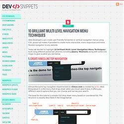
Javascript makes it possible to create more interactive, more responsive and more flexible navigation to any website. Today we wanted to highlight 10 brilliant Multi Level Navigation Menu Techniques built using different Javascript Libraries including jQuery, Mootools along with some CSS magic to give us what you see below. 1. Create Vimeo-like top navigation Almost the same top navigation implemented on Vimeo.com is created by Janko. The base for this tutorial is simple CSS drop down menu based on unordered list. As you can see the UL has four items. Demo | Download source code. Userfly. 10 Useful Techniques To Improve Your User Interface Designs.
Advertisement Web design consists, for the most part, of interface design.
There are many techniques involved in crafting beautiful and functional interfaces. Here’s my collection of 10 that I think you’ll find useful in your work. They’re not related to any particular theme, but are rather a collection of techniques I use in my own projects. Without further ado, let’s get started. 1. Links (or anchors) are inline elements by default, which means that their clickable area spans only the height and width of the text. Obviously, the larger the clickable area is, the easier it is to click on the link because there is less of a chance of missing it. Make sure to also add a healthy dose of padding to the links, because converting a link into a block only affects its behavior and width; adding padding ensures that the link is high enough and has some room to breathe.