
Visualization. How to Make an Interactive Network Visualization. Networks!

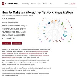
They are all around us. The universe is filled with systems and structures that can be organized as networks. Recently, we have seen them used to convict criminals, visualize friendships, and even to describe cereal ingredient combinations. We can understand their power to describe our complex world from Manuel Lima's wonderful talk on organized complexity. Now let's learn how to create our own. In this tutorial, we will focus on creating an interactive network visualization that will allow us to get details about the nodes in the network, rearrange the network into different layouts, and sort, filter, and search through our data.
In this example, each node is a song. Try out the visualization on different songs to see how the different layouts and filters look with the different graphs. Technology This visualization is a JavaScript based web application written using the powerful D3 visualization library. jQuery is also used for some DOM element manipulation. Functions. Visual.ly infographics. 25 Best Infographics Of 2011 That Are Still Relevant Today. The year of 2011 went very fast for us in the development world and I am sure some of you accomplished important things for your career during this year.

But besides our personal achievements, the whole industry managed to reach something that was unthinkable around 10 years ago. To show you how the web progressed during the past year, I collected a series of infographics from the internet and hope, by the end of this article, you will realize what huge potential this year of 2012 has. Most of the images are not in full here, so you might want to click on them and read the whole infographic for an overall understanding of the presentations. 1. 60 seconds on the web This one shows what happened on the web during 2011 in a timeframe of 60 seconds, if we minimize the whole year to it. 600 new YouTube videos, almost 700,000 search queries on Google and Facebook status updates and close to 100,000 tweets should say enough about what power the internet holds nowadays. Source 2. Source 3. Visualising Data » Resources.
Gapminder. Hans Rosling: Let my dataset change your mindset. The Joy of Stats. About the video Hans Rosling says there’s nothing boring about stats, and then goes on to prove it.

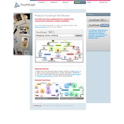
A one-hour long documentary produced by Wingspan Productions and broadcast by BBC, 2010. A DVD is available to order from Wingspan Productions. Director & Producer; Dan Hillman, Executive Producer: Archie Baron. Data Visualization. SEO Keyword Graph Visualization. Use this free Java application to explore the connections between related websites.

Try it now! Enter keywords or a URL, and click 'Graph it! ' See Getting Started below for more details. Getting Started Make sure you have the latest version of java, at least Java 1.5 Type in your search keywords or a URL, and press "Graph It! " Sample Searches: LinkedIn Swarm.