
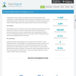
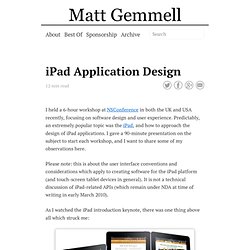
Flat vs flat: a comparison of Windows Phone and iOS 7 app designs. As iOS app developers embrace the new flat UI conventions of iOS 7, many popular apps got a flat-design makeover. At the same time many of these apps also have a sibling Windows Phone app. Android Fragmentation Report July 2013. 11,868Distinct Android devices seen this year 3,997Distinct Android devices seen last year 682,000Devices surveyed for this report. 47.5%Samsung's share of those devices. 8Android versions still in use 37.9%Android users on Jelly Bean Fragmentation is both a strength and weakness of the Android ecosystem.
When comparisons are made between Android and iOS the issue of different API levels, and the vastly different devices running them, is often emphasised. In this report we examine the extent of Android fragmentation and analyse its impact on both users and developers. The Problem: Android devices come in all shapes and sizes, with vastly different performance levels and screen sizes.
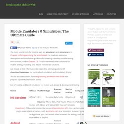
3.5 Inches by Dustin Curtis. I’ve been wondering why Apple chose to make the iPhone 4’s screen 3.5-inches when other comparable phones with Android and Windows Phone 7 have larger, more inviting screens.

When you first see a phone with a 4-inch or larger screen, it seems like a much better experience. I thought it was a technical decision, and it could be, but since switching to an Android phone – a Samsung Galaxy S II, the “best Android phone you can buy, anywhere” – 15 days ago, I have realized another huge downside of larger screens: when holding the phone with one hand, I can’t reach the other side of the screen with my thumb.
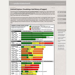
Touching the upper right corner of the screen on the Galaxy S II using one hand, with its 4.27-inch screen, while you’re walking down the street looking at Google Maps, is extremely difficult and frustrating. Android Orphans: Visualizing a Sad History of Support. The announcement that Nexus One users won’t be getting upgraded to Android 4.0 Ice Cream Sandwich led some to justifiably question Google’s support of their devices.
Useful code snippets to develop iPhone friendly websites - CatsWhoCode.com. Detect iPhones and iPods using Javascript When developing for the iPhone and the iPod Touch, the first thing we have to do is obviously detect it, so we can apply specific code or styles to it.
Activity. Bjango ✎ Marc Edwards. How To Build A Mobile Website - Smashing Magazine. Advertisement Today, too many websites are still inaccessible. In our new book Inclusive Design Patterns, we explore how to craft flexible front-end design patterns and make future-proof and accessible interfaces without extra effort. Hardcover, 312 pages. How to fit your website for the Apple iPad « x7 Labs. Important note, updated: Apple has released very limited information about the iPad at the Safari Dev Center.
This article is written on the assumption that previous guidelines for Safari on iPhone OS apply to version 3.2 and the iPad. Step 0: Design for 980 pixels and do nothing The width of the iPad screen when held in portrait orientation is 768 pixels. Icon Design Guidelines. An icon is a graphic that takes up a small portion of screen real estate and provides a quick, intuitive representation of an action, a status, or an app. When you design icons for your app, it's important to keep in mind that your app may be installed on a variety of devices that offer a range of pixel densities, as mentioned in Devices and Displays. But you can make your icons look great on all devices by providing each icon in multiple sizes. When your app runs, Android checks the characteristics of the device screen and loads the appropriate density-specific assets for your app. Because you will deliver each icon in multiple sizes to support different densities, the design guidelines below refer to the icon dimensions in dp units, which are based on the pixel dimensions of a medium-density (MDPI) screen.
Launcher The launcher icon is the visual representation of your app on the Home or All Apps screen. iPad Application Design » Matt Legend Gemmell. I held a 6-hour workshop at NSConference in both the UK and USA recently, focusing on software design and user experience.
Predictably, an extremely popular topic was the iPad, and how to approach the design of iPad applications. I gave a 90-minute presentation on the subject to start each workshop, and I want to share some of my observations here. Please note: this is about the user interface conventions and considerations which apply to creating software for the iPad platform (and touch-screen tablet devices in general). Mobile Emulators and Simulators - The ultimate guide to mobile developers. The most useful tools for mobile web are emulators and simulators.
In Chapter 4 of Programming the Mobile Web I’ve made an extensive description and installation guideline for creating a desktop mobile testing environment. And in Chapter 13, I’ve also reviewed other solutions for mobile testing, including four device remote lab solutions. I’ve mixed all this information to create this ultimate guide to 37 download resources for hundreds of emulators and simulators. Enjoy! This list includes content from Programming the Mobile Web book with frequent updated information & links. Installation and Usage Guide. iPhone, Android, Windows and BlackBerry mobile development tutorials. PhoneGap. Push Pop Press. Our Choice will change the way we read books.

Supporting Multiple Screens. Android runs on a variety of devices that offer different screen sizes and densities.
For applications, the Android system provides a consistent development environment across devices and handles most of the work to adjust each application's user interface to the screen on which it is displayed. At the same time, the system provides APIs that allow you to control your application's UI for specific screen sizes and densities, in order to optimize your UI design for different screen configurations.
UI Guidelines for mobile and tablet web app design. Official user interface (UI) and user experience (UX) guidelines from the manufacturers, links to which you can find below, are a source of inspiration for mobile web and app design.
Here, you will find guidelines, samples, tips, and descriptions of common mistakes.