
Basic Patterns For Mobile Navigation: Pros And Cons. About The Author Nick Babich is a developer, tech enthusiast, and UX lover. Top 6 Help Design Patterns for iPhone Apps. User Experience Designers usually aim to make application interfaces intuitive and easy to use without relying on help or a manual to guide the user through how to use the app.
However, there are times when an interface is most effective and efficient to use once some initial behaviors are learned. In these cases, designing an application to be completely intuitive upon first-time use can be impractical or detrimental to repetitive use. There are also times where a quick introduction on how to use an app simply makes the user feel more comfortable interacting with it for the first time, and is not a reflection of a poorly designed interface. iPhone applications that introduce new, innovative interaction models or that allow the user to access a wide range of information or complete several tasks often use first-time use help screens to help users learn how an app works. 1. A demo animates a series of screens showing the primary functions of the application.
Hold the Phone: A Primer on Remote Mobile Usability Testing User Experience Magazine. In recent years, remote usability testing of user interactions has flourished.
The ability to run tests from a distance has undoubtedly broadened the horizons of many a UXer and strengthened the design of many interfaces. Even though mobile devices continue to proliferate, testing mobile interactions remotely has only recently become technologically possible. 14 Testing Tools for Mobile UX. Below, you will find 14 tools that will help you test various features of your app and obtain real-time feedback.
The tools will help you discover where your users are struggling and, thus, how to improve your app. Advanced mobile prototyping in Axure RP Pro: tips and examples. The most useful tips and tricks to prototype mobile interfaces using Axure RP Pro.
Please note: this article was created in September 2013. The information is still valid for the most, but the new Online Axure Training course contains more detailed and up-to-date information. In this training course, I explain what are the rules to make mobile prototypes fit any devices, without creating a different version for each device. This was missing in the original article. Because of the flexibility it offers compared to other tools, Axure RP Pro is still a top winner when it comes to mobile prototyping. After spending many hours of testing on my own projects, I created a list of the most important aspects to take into consideration. Mobile UX. Effective Design for Multiple Screen Sizes. So you're a designer and have been tasked with the design of a mobile web site.
Chances are, unless you're designing for only one device you're quickly going to be faced with a common problem experienced by designers who work with mobile devices; figuring out what screen size to actually design for. For instance: The iPhone is 320 pixels wide by 480 pixels high.Many Nokia N-Series devices are 240 pixels wide by 320 pixels high.Newer devices often support a landscape mode where the width and height are spontaneously reversed.Older (yet still popular) Nokia devices have displays ranging from 176 by 208 pixels up to 352 by 416 pixels.Blackberry screen resolutions range anywhere from 160 x 160 pixels all the way up to 324 x 352 pixels.
Welcome to dotMobi. 8 Useful Interface Design Techniques for Mobile Devices. You can be the best web designer in the industry, but if you do not know how to properly lay things out and create a great interface for mobile devices, you will fail in such a task.
With that said, designing for mobile devices is quite different from designing for mainstream devices such as your PC as screen sizes and resolutions play a big part in how much space you can utilize, and how it performs. Therefore, we cover eight useful interface design techniques for mobile devices that will help you get started on your quest for designing for mobile platforms. Layout, Layout, Layout The layout of the design is what sums it up for accessibility, usability, and overall readability for users on mobile devices.
UI Guidelines for mobile and tablet web app design. Official user interface (UI) and user experience (UX) guidelines from the manufacturers, links to which you can find below, are a source of inspiration for mobile web and app design.
Here, you will find guidelines, samples, tips, and descriptions of common mistakes. Many of the guidelines focus on native application development, but we can apply most parts of them to mobile web design too. Remember to provide the best possible experience on each platform. Porting long-scroll content to a small-screen; a different approach to sticky in-page navigation. Top 6 Help Design Patterns for iPhone Apps. The type system. Inspired UI - Mobile Apps Design Patterns [iPhone] Android Interaction Design Patterns. A Comprehensive Guide To Mobile App Design. About The Author. Basic Patterns For Mobile Navigation: Pros And Cons. Touch Gesture Reference Guide. The Touch Gesture Reference Guide is a unique set of resources for software designers and developers working on touch-based user interfaces.
Usability - Is there any difference in element minimal sizes on 10 and 24 inch touch screens? Mobile Design Patterns - Pttrns. UI Design Do's and Don'ts. Usability - What is the optimum button size of touch screen applications? Touch Target Sizes. People interact with touch-based user interfaces with their fingers.
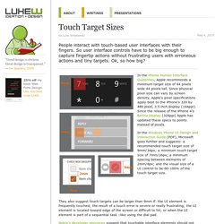
So user interface controls have to be big enough to capture fingertip actions without frustrating users with erroneous actions and tiny targets. Ok, so how big? In the iPhone Human Interface Guidelines, Apple recommends a minimum target size of 44 pixels wide 44 pixels tall. Since physical pixel size can vary by screen density, Apple's pixel specifications apply best to the iPhone's 320 by 480 pixel, 3.5 inch display (164ppi). Since the release of the iPhone 4's Retina Display (326ppi) Apple has updated these specs to points instead of pixels.
In the Windows Phone UI Design and Interaction Guide (PDF), Microsoft goes further and suggests: a recommended touch target size of 9mm/34px; a minimum touch target size of 7mm/26px; a minimum spacing between elements of 2mm/8px; and the visual size of a UI control to be 60-100% of the touch target size. Accessibility. Screen readers may automatically announce a control’s type or state through a sound or by speaking the control name before or after the accessibility text.
Search Search field Download over Wi-Fi only Download over Wi-Fi is selected. Misused mobile UX patterns – Zoltan Kollin. If you are an experienced designer, you probably agree that being inspired by others is not stealing in UI design. It’s best practice research. It’s using design patterns. It’s following the guidelines. It’s making sure to use patterns that your users are familiar with to create usable interfaces. Some might say that sticking to the guidelines and following others will kill creativity and, at the end of the day, all apps will look the same. 1. At least half million posts have been written about the hamburger menu, mostly by designers, arguing against it. Hamburger menu alternatives for mobile navigation. If you’re working on digital products, you have already read dozens of articles describing how and why the hamburger navigation on mobile (and desktop!)
Hurts UX metrics due of its low discoverability and efficiency. (You can read some of best articles on the topic here, here, here, and here.) Luckily, more and more sites and apps are experimenting with alternative, more efficient solutions for this very problem. None of the ideas listed here is better than the others, their viability and performance obviously depend on the content and the context. 1. Making Your Icons User-Friendly: A Guide to Usability in UI Design. Any icon in your interface should serve a purpose, whether you’re designing a website or an app. Sure, icons are there to save space on the screen. But more importantly, they’re there to aid your users. When done correctly, icons can help you guide users intuitively through a workflow without relying on too much copy. But when done wrong, they can confuse your users, lead them down the wrong paths, and ruin their experience with your product.
Dropdown alternatives for better (mobile) forms – Zoltan Kollin. Using dropdown menus in forms might seem a no-brainer: they don’t take much space on the UI, they automatically validate the input, all browsers and platforms support them, they’re easy and cheap to implement, and the users know them well enough. At the same time, though, dropdown (or select) menus are one of the most frequently misused form patterns and “should be the UI of last resort”, according to Luke Wroblewski and many others.
Let’s look at some of the limitations and concerns: In a dropdown, the available options are not visible until you click or tap to open it. It’s About People, Not Devices. We live in exciting times. Times of innovation, invention, and rapid change. Medium. It is very important both for hardware and software developers to understand how users interact with mobile devices. How do we know whether the button placed on the side of the device or even the virtual button placed on the upper-right side of the screen is usable or not?
Web vs. Native Mobile App? Forrester Says Do Both. What is the future of the mobile Internet? Are native applications going to be the dominant form of digital interaction? Will new and developing browser technologies like HTML5 make the mobile Web preferable to apps? It’s About People, Not Devices. Small Surfaces - mobile user interface design / user experience (ux) / interaction design / agency consultant. Rethinking the Mobile Web. Sometimes, 2010 really reminds me of 1995—that mystical time when the Web was just starting to take off. I remember sitting with a friend randomly typing the name of the largest or most innovative companies we could think of into Netscape, just to see if they maybe had a website.
Designing for the Mobile Web: Special Considerations. By Shanshan Ma Published: January 17, 2011. How to Create Your First iPhone Application - Smashing Magazine. Advertisement Update: 01/10/2012: The original version of this article by Jen Gordon was published in August 2009. It was thoroughly revised and updated by the author in September 2012. — Editorial Team Since the iTunes App Store launched in 2008, over 500,000 apps have been approved by Apple, and thousands more app ideas are scrawled on napkins across the world every day. Design mobile : 15 ressources pour trouver l’inspiration autour des applications. Mobile UX. App Agentur creative workline GmbH. Apple was holding back the inches for a while, but now they have made their new iPhones bigger. The new iPhone 6 comes with a 4,7″ screen and his big brother, iPhone 6 Plus has a 5,5″ inch screen. The screen of the iPhone 6 has a resolution of 750 x 1334 at a 326 pixels-per-inch (ppi) and the iPhone 6 Plus a resolution of 1920 x 1080 at a higher density: 401 ppi.