
Frequently asked questions (FAQ) Can I buy the software to make my own animations?
What software does Gapminder use to create online surveys? I would like to suggest a new indicator for Gapminder World I have data, can Gapminder help me to share it? Can I download Gapminder World? How do I use Gapminder graphics in my presentation? What kind of program does Hans use to make his videos? Datawrapper. Highcharts - Interactive JavaScript charts for your webpage.
Impure. Tagxedo - Word Cloud with Styles. Moochart - charts for mootools. Create Line Charts. Online Graphing. Create Line Charts. Online Graphing. Create free online charts with online chart builder ChartGizmo.com - Use our chart software for visualizing your data. Cloud-based Business Intelligence and Analytics. Piwik - Web analytics - Open source.
Software. Genomic rearrangements can cause disease and are implicated in many cancers.
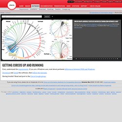
Being able to see the patterns in these changes across samples and patients is important. In the review article End-joining, Translocations and Cancer, Bunting and Nussenzweig demonstrate how compositing the genome circularly adds value and clarity to the presentation. Bunting SF, Nussenzweig A 2013 End-joining, translocations and cancer Nat Rev Cancer Răzvan Musăloiu-E. explored the Linux file system and used Circos to relate the systems (disk-based, optical mediums, flash-based, network-based, cluster-based, memory-based, ancient) to kernel symbols.
Jonathan Feinberg (IBM) created this perfectly circular wordle for me, using content from the Circos site. Visualizing large networks is hard. Circular data tracks naturally support display of information at various resolutions. First, understand the requirements. Download and install the software, then follow the tutorials. Having trouble? Main Page - GLOW Visualization. ToolDatabase. All of our data journalism in one spreadsheet. Data journalism and visualisation from the Guardian Illustration: Lisa Villani for the Guardian Today we have a list of all the data journalism produced here on the Guardian datablog.
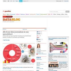
You can see what's been popular and get easy access to the data we have curated as this list shows each datablog post's associated spreadsheets, authors, the number of comments and retweets. By sorting the blog posts by the number of retweets, we can see that Iraq War Logs formed the base of our most retweeted post, followed by a recent post from David McCandless on fish stocks. Sorting by comments shows that the Fukushima nuclear power plant updates were the subject of the greatest discussion, closely followed by Every Doctor Who villain since 1963. The list shows that in two years we have covered a huge range of data sets. The British government have been publishing more detailed spending data than any of their predecessors, and this has not escaped our attention.
Create Line Charts. Online Graphing. SlickBoard > Draw. Spreadsheets to HTML Tables Tool. DojoX DataChart. Try the VIDI Wizard: Build and Embed Visualizations. Visual programming for R. Online Charts Builder. Hohli Online Charts Builder New version: Try new version of Charts Builder, it based on new Google Charts API Load From Image URL:

Organisation for Economic Co-operation and Development. The R Project. Choosel. Online Charts Builder. Examples. Enjoy these sample visualizations built with Protovis.
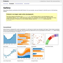
For any example, use your browser to view the source or the backing dataset. Protovis is no longer under active development.The final release of Protovis was v3.3.1 (4.7 MB). The Protovis team is now developing a new visualization library, D3.js, with improved support for animation and interaction. D3 builds on many of the concepts in Protovis; for more details, please read the introduction and browse the examples. Conventional While Protovis is designed for custom visualization, it is still easy to create many standard chart types. Area Charts Bar & Column Charts Scatterplots Pie & Donut Charts Line & Step Charts Stacked Charts Grouped Charts Custom Many charting libraries provide stock chart designs, but offer only limited customization; Protovis excels at custom visualization design through a concise representation and precise control over graphical marks.
Anderson’s Flowers Becker’s Barley Bertin’s Hotel Streamgraphs Sparklines. Working with data in protovis. For the past year or so I have been dabbling with protovis.
I don’t have a heavy CS background but protovis is supposedly easy to pick up for people like me, who are vaguely aware that computers can make calculations but who need to check the manual for the most mundane programming instructions. I found was while it’s reasonnably easy to modify the most basic examples to make stuff happen, it is much harder to understand or adapt the more complex ones, let alone to create a fairly complex visualization. The stumbling block for me was the use of the method data.
Data is used to feed all the other protovis methods with, well, data. In the simplest examples, the data which is passed is very plain and simple and so easy to understand. So I started documenting my struggle with data, first for my own use, and eventually realized I could share what I learned. I split this tutorial in 5 parts. To make the best use of this material, it would be helpful to know a bit about protovis. JavaScript InfoVis Toolkit. Tree Visualization. Wondergraphs. Datawrapper ist ein Projekt der ABZV. Number Picture - Crowd-Sourcing New Ways For People To Visualize Data.