
9 Ways You Can Improve Your Infographic Pitches to Blogs & Websites. Over the past year, I’ve worked on approximately 20 different infographics for a single client. One of the most frustrating things about the process has been the unevenness of the response. Even if we do everything seemingly right, an infographic might not take off. After a string of disappointing infographics, I decided to go back over every step and figure out what we had missed. After fixing the way we work with our design firm (hint: for best results, compile your own research and craft your infographic’s storyline before handing it off), we revamped our outreach process.
Infographics are a unique type of content. InfoGraphic Designs: Overview, Examples and Best Practices. Information graphics or infographics are visual representations of information, data or knowledge.

These graphics are used where complex information needs to be explained quickly and clearly, such as in signs, maps, journalism, technical writing, and education. They are also used extensively as tools by computer scientists, mathematicians, and statisticians to ease the process of developing and communicating conceptual information. They can present a rich amount of information without intimidating you. Or sometimes they intimidate you, but make the digesting of the information much more bearable.
Here in this article below, we are going to discuss best practices for designing infographics followed by some examples which might help you learn a thing or two. You may be interested in the following related articles as well. Feel free to join us and you are always welcome to share your thoughts that our readers may find helpful. Don’t forget to and follow us on Twitter — for recent updates. Create cool infographics - Tutorials. 10 of My Favorite Infographics. Infographics also know as information graphics are visual representations of knowledge or data.

The infogrpahics can give small or complex amounts of information quickly for a reader to look at. Examples of these graphics can be seen on signs, maps, electrical schematics and almost anything you want to use a infographic. If you can write it then it might be possible to create an infographic. In the past mostly scientists, mathematicians, and technical users created symbols and put them together so people could easily and quickly read these graphic maps of knowledge.
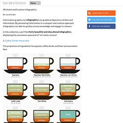
40 Useful and Creative Infographics. Six Revisions Menu Main Categories CSS HTML JavaScript Web Design WordPress Web Development Design Inspiration UX Design UI Design Freebies Tutorials Tools Links About Contact Advertise RSS Twitter Facebook 40 Useful and Creative Infographics.

The 7 ½ Steps to Successful Infographics. You know when you’ve been doing something for a long time and it gets ingrained?

For me, that’s infographics. I’ve created a lot of chartage over the last 20 years Take a look: Here’s me when I started at the New York Times, where I was a graphics editor. I worked there for 15 years, on all the news desks, with the investigative team, and ran the biz section graphics desk. The Anatomy Of An Infographic: 5 Steps To Create A Powerful Visual. Information is very powerful but for the most bit it is bland and unimaginative.

Infographics channel information in a visually pleasing, instantly understandable manner, making it not only powerful, but extremely beautiful. Once used predominantly to make maps more approachable, scientific charts less daunting and as key learning tools for children, inforgraphics have now permeated all aspects of the modern world. I designed a couple of infographics back in college, the need arising especially around the time Soccer World Cup fever spiked. It was a fun process representing the different groups, predicting winners in each group at each stage and creating a mock pairing of teams that would clash all the way leading upto the finals. I was a devout Argentinian supporter at the time. Infographics can appear daunting to some with the sheer amount of data they present, but designed in the right manner and step by step, they can actually be one of the most fun things you will ever create. 10 Tips for (journalists) Designing Infographics.
This article was originally published on “Digital Newsgathering”, a class blog for Journalism 226 at San Francisco State University, Instructor: Staci Baird.

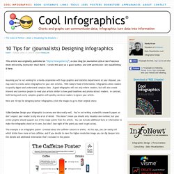
I wrote this post as a guest author, and with permission I am republishing it here. Assuming you’re not working for a media corporation with huge graphics and statistics departments at your disposal, you may want to create some infographics for your own articles. With today’s flood of information, infographics allow readers to quickly digest and understand complex data. A good infographic will not only inform readers, but will also create interest and convince people to read your article similar to how good headlines and photos attract readers. In contrast, both boring and overly complex graphics will quickly convince readers to ignore your article. Here are 10 tips for designing better infographics (click the images to go to their original sites): How To Create Outstanding Infographics.
In this tutorial you will learn that data doesn't have to be boring, it can be beautiful!

Learn how to use various graph tools, illustration techniques and typography to make an accurate and inspiring infographic in Adobe Illustrator. Start by using the Rectangle Tool (M) to draw a shape. Give it a subtle radial gradient too. The entire design is based on a grid of four columns. To make the columns first select the rectangle and drag a guide onto the centre of the shape. Condense the shape so it fits within the left-most guide and centre guide. Move the shape over to the right and add another guide to the centre here. Using the Rectangle Tool (M) draw a thin white box on the centre line that will be the width of the gap between the columns. Repeat the process for the other columns with your final result being below.