
KewlStuff. The Need to Complete.
3 UX Ideas to Learn from Picplum (YC S11)) 3 UX Ideas to Learn from Picplum (YC S11) Picplum is a pretty cool startup.
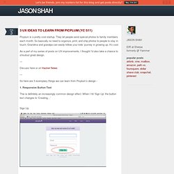
They let people send special photos to family members each month. So basically no need to organize, print, and ship photos to people to stay in touch. Grandma and grandpa can easily follow your kids’ journey in growing up. It’s cool. As a part of my series of posts on UX improvements, I thought I’d also take a chance to shoutout great design. Discuss here or on Hacker News So here are 3 exemplary things we can learn from Picplum’s design - 1. This is definitely an increasingly common design effect. Sign Up Creating… This matters. It also is still a novel UX thing. 2. Picplum wants you to focus. Picplum makes everything about this interface about you either clicking that big green button or dragging photos in. 3. Credits are interesting. Moreover, I like the $ aspect. Do you think there are other awesome design choices Picplum has made?
5 Simple Tips To Help You Increase User Sign Ups. There are plenty of simple things you can do on your website that can increase your signups, whether it’s for something like a free newsletter or a paid subscription service.
Most don’t require any kind of technical or coding knowledge. And some can make a huge difference in the number of conversions you get. The five simple actions here can all be done in a matter of minutes. When you break them down to their most basic ideas, it comes down to removing psychological barriers and offering better reasons to sign up. Keep those two ideas in mind whenever you’re working on a signup page: Does this make it easier to sign up?
If the answer is yes, then you’re likely going to see an increase in your conversions. 1. The call to action is the single most important element of any signup page. Make sure that your call to action is differentiated from the rest of your page. Test your call to action, too. 2. The best signup forms include no more than the absolute bare-minimum required information. How to Design the Best Navigation Bar for Your Website. Daniel Alves is the design director for the small business web design division at the digital marketing and web design company 352 Media Group.
The navigation bar is the most important design element on a website. Not only does it guide your users to pages beyond the homepage, but it’s also the singular tool to give users a sense of orientation. With this in mind, it’s important to adhere to time-tested design and usability conventions. Doing so will give your users a comfortable and easy reference point to fully engage with your content.
Despite the necessity of an accessible navigation bar, usability studies on navigation across the web aren’t positive. So how do you ensure that your users are able to quickly and easily find the information they need? The Basics. What are some UX best practices for user account cancellation. 10 UI Ideas to Learn from Gumroad) 10 UI Ideas to Learn from Gumroad Gumroad is an exciting new startup that lets anyone sell digital content with just a link.

It was founded by the prolific Sahil Lavingia. Sahil has designed a number of useful apps, ranging from Pinterest in the early days, to Turntable, to Crate, to Caltrainer, etc. He’s got a keen eye for design, so why not learn from him and his work? This is how the Gumroad home page looks, un-dissected. And here is the dissected version, with the 10 things we’ll learn - Let’s get started - 1.
This top bar has become increasingly common. When we visit sites, a split second is used to subconsciously say “Oh, these are the colors we’re using here. Note that Sahil has picked energetic colors. 2. A lot of logos have very little to do with the name or product of a company. But others have plenty to do with the name of the company/product. Also, it is not easy to make a well-styled logo or favicon that integrates multiple colors smoothly the way that the Gumroad logo does.