
Our Vision. MDI educates and unites those who want to harness the power of mobile for good MDI is an Open Data portal for the developing world mobile industry.
We believe that open access to high quality data will improve business decision making, increase total investment from both the commercial mobile industry and the development sector and accelerate economic, environmental and social impact from mobile solutions. A challenge facing mobile industry stakeholders in the developing world is the lack of publicly available data and analysis to support their business decision making and to clarify the socio-economic impact of mobile. MDI will fill this information gap and will aggregate and host data from multiple sources such as the World Bank, UN, member operators and from vendors and development organisations. There are nearly five billion mobile connections in the developing world, increasing by 18 per second.
iOS Mobile Patterns Library. Important: If you like what we do, please consider supporting our site with a donation. pttrns NYT Now Walkthroughs.
5 Things to Know When Designing for iOS. Based on our experience creating great iOS apps, we’ve come up with a list of 5 things we believe designers should keep in mind while conceptualizing interfaces for iOS.
While the focus of this article is only on iOS apps, much of the advice here translates directly to other mobile platforms. 1. Understand Your Medium This seems obvious, but designing apps instead of websites actually represents a huge shift in mindsets. Apps aren’t websites and shouldn’t be designed like them, either. PHP Mobile Detect - lightweight PHP class for detecting mobile devices. Detect Mobile Browsers - Open source mobile phone detection. Mobile browser detected.
Mozilla/5.0 (X11; Linux x86_64; rv:24.0) Gecko/20100101 Firefox/24.0 Download Scripts. Junior - A front-end framework for building HTML5 mobile apps with a native look and feel. A front-end framework for building HTML5 mobile apps with a native look and feel.
CSS3 Transitions optimized for mobile performance. Swipable carousels using flickable.js. Integration with backbone.js views and routers. Ready to Go Mo? Multi-Screen Resources Skip to content Make Your Website Work Across Multiple Devices.
Features. Email on Mobile Devices. A Guide to Mobile Emulators. In a previous article, I put forward a three-point plan for testing mobile Web sites.
One of the points involved the use of emulators for first-pass device testing. This article concentrates on configuring emulators for mobile site testing (it also highlights emulators that can be used to test mobile applications too). It outlines the different types of emulator available, the best ones to use, and the various ways in which they can be used. For the uninitiated, an emulator is a software program that aims to replicate the functions of a specific piece of hardware or software. About Device-Specific Testing Desktop Web developers have it relatively easy – build in support for four or five browsers, and it’s job done. The simple answer is – you can’t. Pixel Perfect Responsive Design Testing Tool.
List of displays by pixel density. Safari HTML Reference: Supported Meta Tags. Discussion Use the viewport meta key to improve the presentation of your web content on iOS.
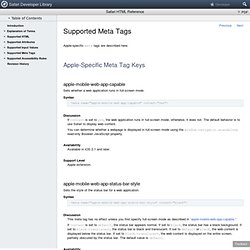
Typically, you use the viewport meta tag to set the width and initial scale of the viewport. For example, if your webpage is narrower than 980 pixels, then you should set the width of the viewport to fit your web content. If you are designing a Safari on iOS-specific web application, you should set the width to the width of the device. Table 1 describes the properties supported by the viewport meta key and their default values. CSS Device Adaptation. Abstract This specification provides a way for an author to specify, in CSS, the size, zoom factor, and orientation of the viewport that is used as the base for the initial containing block.
Status of this document. Filamentgroup/Southstreet. CSS Flexible Box Layout Module. Abstract The specification describes a CSS box model optimized for user interface design.

In the flex layout model, the children of a flex container can be laid out in any direction, and can “flex” their sizes, either growing to fill unused space or shrinking to avoid overflowing the parent. Both horizontal and vertical alignment of the children can be easily manipulated. Nesting of these boxes (horizontal inside vertical, or vertical inside horizontal) can be used to build layouts in two dimensions.
CSS is a language for describing the rendering of structured documents (such as HTML and XML) on screen, on paper, in speech, etc. Status of this document This section describes the status of this document at the time of its publication. Publication as a Last Call Working Draft does not imply endorsement by the W3C Membership. Mobile Matrices · h5bp/mobile-boilerplate Wiki. This is an attempt to compile a list of relevant specifications for all modern smart phones and mobile internet devices.
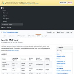
It is primarily for a quick reference sheet when trying to target a specific platform with CSS media queries. Apple: Motorola: Samsung: Palm: Heroku Mobile. Heroku has a strong tradition with open source projects. Engineers have dedicated countless hours to the projects that developers count on every day. Open Source Software is in our DNA. Speaking personally, I’m passionate about building tools like AFNetworking and cupertino, in order to help developers build insanely great experiences for mobile devices. It’s with great pleasure that I introduce something new I’ve been working on: The Windows Blog. Ensuring that your site works great on Windows Phone 8 is easier than ever, thanks to extensive HTML5 support in Internet Explorer 10. You might currently target WebKit on a site specifically optimized to support iOS or Android.
Now, it’s very easy to adapt a WebKit-optimized site to also support IE10. This means you’ll have less code to maintain and you’ll give your customers a better experience. M.dot - Create a mobile website from your iPhone. Fixed Positioning in Mobile Browsers. Fixed positioned elements (typically headers or footers) are extremely common conventions for native mobile platforms, so naturally fixed elements found their way into mobile browsers.
Web designers are used to fixing elements to the window using CSS’s position: fixed, however, in the land of mobile browsers, support for fixed positioning is far less universal and is way more quirky. Mobile Rich Media Ad Interface Definitions (MRAID) Executive Summary As rich media display advertising in mobile applications and on the mobile web has become more popular over the last several years, various innovative companies have accepted the challenge of creating an ecosystem for mobile ad serving. Innovation in mobile rich media ad serving has led to many exciting possibilities for content publishers and advertisers, but it has also created inefficiencies that often delay and inhibit the optimal monetization of content. Multi-Touch for your Desktop Browser. Mobile Website Gallery.
iOS UI Patterns. Using jPanelMenu with jRespond. Using jRespond with jPanelMenu Responsive design is an amazing revolution in our industry. It’s changing every part of our process — definition, planning, design, development, and beyond. But, as we all know, design is only one part of the equation. Responsive behavior is a big thing that no one is talking about, but everyone needs to be. I’ve tried a few different things to accomplish this, but the best thing I’ve found is jRespond.
Mobile Web Application Best Practices. Free Mobile Performance Testing with Akamai's Mobitest. Mobile Patterns - Recently Added. Think Mobile First. WURFL - Mobile Device Database by ScientiaMobile. The Fastest Mobile Prototyping - Codiqa. PhoneGap.