
Designing for the New Fold: Web Design Post Monitorism. Designing for the ’fold’ has long been a priority for many Web Designers, but with so many devices capable of displaying your website, how on earth do you know where it is?
Should we be worried? This article asks how important the ’fold’ actually is, the variables at play, changing browsing habits and what you can do about it. The Death of the Fold is upon us, at last! Browsing the World Wide Web is no longer a task confined to desktop computers. Mobile browsing seems to be increasing day by day and many more devices such as Internet-ready televisions are becoming readily available. But what does that really mean? Because the traditional “screen” that people view the web through has undergone an explosion of variety… we can no longer expect web-surfers to be on something close to a 19″ monitor with a resolution somewhere between 1024×768 and 1280×700. Before we get ahead of ourselves though, let’s kick off this article with a trip back to the old school though... Web responsive & E-Commerce, un seul site pour tous les devices ? Design generator for mobile with jquery. Skeleton: Beautiful Boilerplate for Responsive, Mobile-Friendly Development.
What Is It?

Skeleton is a small collection of CSS files that can help you rapidly develop sites that look beautiful at any size, be it a 17" laptop screen or an iPhone. Skeleton is built on three core principles: Responsive Grid Down To Mobile Skeleton has a familiar, lightweight 960 grid as its base, but elegantly scales down to downsized browser windows, tablets, mobile phones (in landscape and portrait). Go ahead, resize this page! Fast to Start Skeleton is a tool for rapid development.
Style Agnostic Skeleton is not a UI framework. The Grid Skeleton's base grid is a variation of the 960 grid system. One Eleven Two Ten Three Nine Four Eight Five Seven Six Code Example Typography The typography of Skeleton is designed to create a strong hierarchy with basic styles. Heading <h3> Liste des resolutions suivant appareils mobile. Landscape @media (max-device-width: 1024px) and (orientation: landscape) { } Portrait @media (max-device-width: 600px) and (orientation: portrait) { }
Resolutions standards suivant materiels Tel portable. If you think responsive's simple, I feel bad for you son.
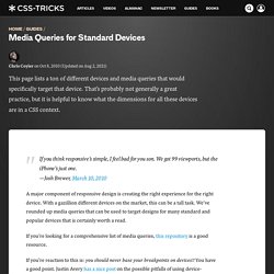
We got 99 viewports, but the iPhone's just one. —Josh Brewer, March 10, 2010 A major component of responsive design is creating the right experience for the right device. With a gazillion different devices on the market, this can be a tall task. We've rounded up media queries that can be used to target designs for many standard and popular devices that is certainly worth a read.
If you're looking for a comprehensive list of media queries, this repository is a good resource. If you're reaction to this is: you should never base your breakpoints on devices!! Phones and Handhelds iPhones Galaxy Phones Google Pixel HTC Phones Nexus Phones Windows Phone Tablets iPads Galaxy Tablets Nexus Tablets Kindle Fire Laptops Media Queries for laptops are a bit of a juggernaut.
Wearables Yes, we're going there. Apple Watch. Évaluer son Responsive Web Design avec Screenfly. Qu'est-ce que le Responsive Web Design ?

Internet s'affranchit progressivement des ordinateurs "classiques", la multiplication des supports d'accès au "Réseau" durant ces cinq dernières années le souligne plutôt bien (tablettes, smartphones, télévision…) Si ces terminaux remplissent tous une même fonction, accéder aux services d'Internet, leurs caractéristiques sont différentes, notamment en ce qui concerne la résolution de leur écran.
Dès lors une question d'ergonomie du Web se pose : comment assurer la compatibilité d'un site avec ces différents terminaux ? Notes to an Agency Starting Their First Responsive Web Project. This past week I talked with a design agency who was about to embark upon their first responsive web design project. It sounded rather app-like. They were interested in hearing about my experiences, what to expect, what the process is like or could be like, what the deliverables should be, things to watch out for, and things like that. This is what we talked about: The "mobile first" philosophy is a great fit particularly for web apps getting a fresh start.
Designing first for a small screen means making the tough decisions about what is most important and what can be cut.As you scale up in screen width from there, consider loading in any additional content you need dynamically. Share On. Responsive Web Design Techniques, Tools and Design Strategies. Advertisement Today, too many websites are still inaccessible.
In our new book Inclusive Design Patterns, we explore how to craft flexible front-end design patterns and make future-proof and accessible interfaces without extra effort. Hardcover, 312 pages. Get the book now! Back in January, we published an article on responsive design, Responsive Web Design: What It Is and How to Use It1. To that end, we’ve compiled this round-up of resources for creating responsive website designs. Bmobile signe la première campagne d’emailing web responsive de La Redoute. Responsive. Responsive Design.