
Outils de cartographie. Logiciels/applications. Mind Mapping, cartes heuristiques, mindmap, prezi. OUTILS - TECHNO. Data Journalisme. Le datajournalisme en 10 sites. Data Visualization with TREEMAPPER. Analysing huge datasets can be a problem sometimes.
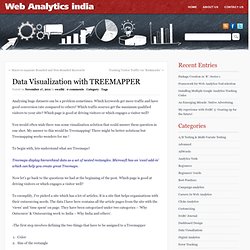
Which keywords get more traffic and have good conversion rate compared to others? Which traffic sources get the maximum qualified visitors to your site? Which page is good at driving visitors or which engages a visitor well? You would often wish there was some visualization solution that could answer these question in one shot. My answer to this would be Treemapping! To begin with, lets understand what are Treemaps? Treemaps display hierarchical data as a set of nested rectangles. Now let’s go back to the questions we had at the beginning of the post. To exemplify, I’ve picked a site which has a lot of articles.
-The first step involves defining the two things that have to be assigned to a Treemapper ColorSize of the rectangle -Here I am using ‘Color’ as the outcome or a conversion metric (e.g. Data visualization DIY - Our Top Tools. Data visualization DIY: Our Top Tools Figure 102.
The Wikileaks war logs (The Guardian) Searchable map template - Derek Eder. 6 Great Interactive Data Visualization Tools (Part 1) Websites are loaded with eye candy these days — from slick user interfaces to interactive maps to cool photo slideshows — all achieved without Flash, just HTML, CSS and Javascript.
And these technologies are free, open and can be utilized in essentially every current web-browsing device. While it’s tempting to just jump in and add the latest cool feature to your site, you have to first make sure it’s a good fit for your users and your brand. In this 2-part series, I’m going to focus on the rapidly changing world of interactive tools for data visualization, or dataviz. These tools are especially useful for nonprofits and financial organizations whose brands rely on sharing metrics to deliver impact and value. Recently, many exciting HTML/CSS/Javascript-based data visualization tools have emerged.
In working with clients, we’ve researched and used numerous technologies for interactive charting. 1. jQuery Visualize 2. 3. Data journalism. Retour sur la formation Datajournalism et Traitement des données. Les vendredi 26 et samedi 27 octobre 2012, l’association Libertic accueillait à la cantine numérique nantaise et avec le soutien de Nantes Métropole , Caroline Goulard de Dataveyes afin d’initier une vingtaine de participants aux principes de datajournalism et traitement de données. Cette formation avait notamment pour objectif de répondre aux questions suivantes : Qu’est-ce que le datajournalism ? Comment extraire une donnée ? Données fleuries, une veille hebdomadaire de datajournalisme. En vedette.

How to teach/learn data journalism: Tools vs programming/coding. Understanding data journalism: Overview of resources, tools and topics. (U.S.
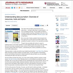
Census Bureau) The notion that journalism should become more data-driven — and get a little closer to social science — is not a completely new idea. The journalistic sub-field of computer-assisted reporting, embodied in the work of the Investigative Reporters and Editors’ NICAR program, has a long history. But a new suite of widely available Internet-based tools has made such a social science-journalism hybrid a real possibility for greater numbers of non-specialist journalists. Though many journalists will continue to report in traditional ways, for all media members it is worth getting familiar with some of the new tools. “Data journalism is really just another way of gathering information,” says Steve Doig, Arizona State University journalism professor and data expert.
Harvard political scientist Gary King, one of the world’s leading academic scholars on data issues, has said he believes that “ultimately there is no line between journalists and social scientists. Data Tools - Data Journalism Blog. 6 Great Interactive Data Visualization Tools (Part 2) Welcome back for the second part of my series on interactive data visualization (dataviz) tools.
In Part 1, we covered three cool tools for visualizing charts and graphs and many other data types on a webpage. In part two, we take a look at three more tools that are a bit more complex but have some incredible data visualization capabilities. 4. Simile Exhibit Exhibit is a very robust and customizable offering. Visualization Types Supported: Line Graphs, Maps, Scatter Plots, Multi-Filterable Lists, Timelines, Timeplots and more…with widgets! Flexible & Powerful Approach to Design I really like the approach of Exhibit, where data is presented through a “lens” – an HTML template shell that elements are placed into. Strong Filtering/Sorting/Search Letting users filter your data by any number of criteria is incredibly useful, and turns your information from static content into a real interactive feature. Widgets! 5. 6. Wow, D3.js is cool! D3 isn’t really like the others. Junk Charts. This post is part 2 of an appreciation of the chart project by Google Newslab, advised by Alberto Cairo, on the gender and racial diversity of the newsroom.
Part 1 can be read here. In the previous discussion, I left out the following scatter bubble plot. This plot is available in two versions, one for gender and one for race. The key question being asked is whether the leadership in the newsroom is more or less diverse than the rest of the staff. The story appears to be a happy one: in many newsrooms, the leadership roughly reflects the staff in terms of gender distribution (even though both parts of the whole compare disfavorably to the gender ratio in the neighborhoods, as we saw in the previous post.) Unfortunately, there are a few execution problems with this scatter plot. First, take a look at the vertical axis labels on the right side. I find this decision confounding. The horizontal axis?