
Cristian Vasile - Prints, Posters, Canvas Prints, Framed Prints, Metal Prints, Acrylic Prints, Greeting Cards, and iPhone Cases. Jack Hagley // Graphic Design // Infographics. Work - Obscura. DIGITAL idea. Abstract Wall - kuflex.com. Клиент: Microsoft Год: 2013 Место: Центр Современной Культуры "Гараж", Москва Задача: показать связь между искусством и современными технологиями в рамках пресс-конференции "IT как культурное явление", организованной Центром «Гараж» и компанией Microsoft.

Решение. Вдохновением для создания этого проекта для нас стали полотна художников-абстракционистов начала ХХ века. Проект Abstract Wall рожден на стыке образов авангардного искусства, современного танца и цифровых интерактивных технологий. В основу идеи инсталляции заложено высказывание Василия Кандинского, который назвал художника "рукой", приводящей в вибрацию человеческую душу. Повторно инсталляция-перформанс была представлена на выставке Digital Weekend в пространстве Troika Multispace, Москва, 2013. W3FI. Three degrees of separation: breaking down the NSA's 'hops' surveillance method. Jason Davies - Freelance Data Visualisation. I Love Bad Girls with Cake! MFG Labs. Dataviz. 4. 3. 2. 1. Where Does My Tweet Go? JESS3_BrianSolis_ConversationPrism4_WEB_2880x1800.jpg (JPEG Image, 2880 × 1800 pixels) - Scaled (35%)
Ideas history. Update: Graph has now been made interactive.
I was originally put onto network visualisation by Simon Raper by his fantastic post graphing the history of philosophy. Microsoft Showroom Berlin. Client: Microsoft Deutschland GmbH location: Unter den Linden 17, Berlin date: 07.11.2013 As a new branch office, Microsoft established a center located directly in the heart of Germanys capital city.
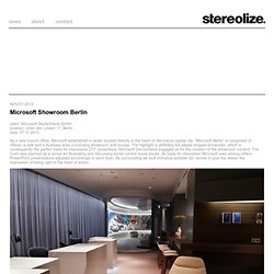
“Microsoft Berlin” is composed of offices, a café and a business area comprising showroom and lounge. The highlight is definitely the ellipse-shaped showroom, which is consequently the perfect basis for impressive 270° projections. Microsoft Deutschland engaged us for the creation of the showroom content. The room was planned as a venue for illustrating and discussing some current social issues. The Future of Money. 7 Data Viz Sites to Inspire Your Creative Eye. In the age of data overload, "big data" and "data visualization" are major buzzwords, and they'll likely grow even bigger as we gather more information on a daily basis.
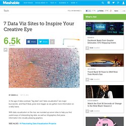
With data visualization on the rise, we rounded up seven sites to help you find useful ways of interpreting big data, as well as infographics that parse information into visually pleasing graphics. These sites range from aggregation blogs to how-tos to tools that allow you to create your own visualizations. Check out the list, and let us know in the comments below what your favorite site is for data visualizations. Many Eyes. Infographics & Data Visualization. Information aesthetics - Data Visualization & Information Design. The 3D Trajectories of the Tennis Ball during the Final ATP Matches. Corona Perspectives [coronaperspectives.com] developed by advertising agency JWT Spain and web development studio Espada y Santa Cruz provides an interactive and 3D perspective of all the tennis ball trajectories during 3 past ATP tennis matches.
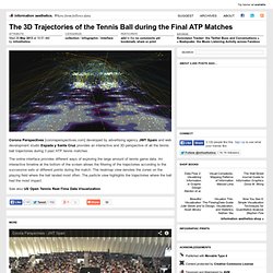
The online interface provides different ways of exploring the large amount of tennis game data. An interactive timeline at the bottom of the screen allows the filtering of the trajectories according to the successive sets or different points during the match. The heatmap view denotes the zones on the playing field where the ball landed most often. The particle view highlights the trajectories where the ball had the most impact. A visual exploration on mapping complex networks. Chart Porn. Data Visualization, Infographics, and Statistics. Information Is Beautiful. BibViz Project - Bible Contradictions, Misogyny, Violence, Inaccuracies. The Future of Money. Graphs Of Wikipedia: Influential Thinkers. Graphs Of Wikipedia: Influential Thinkers. The internet is big — very big. One such way to investigate all of this free online content is through graphs.
The network visualisations by Simon Raper in his fantastic post about graphing the history of philosophy is one example of how to exploit such data. Let’s take this a step further and create a series of graphs using everyone on Wikipedia. Using subsets of this dataset (authors, actors, sports players etc.), we can investigate sub-networks within the larger dataset. In the next series of posts, I will present a few of my findings in each of these sub-networks. OII Network Visualisation Example. Exploring Alternatives. Commons Memes. << Outline View >> Back to Bubble View This is a work in progress.
For the past couple of years I have collated and curated the possibilities, concepts, alternatives that people striving for a 'better world' were working on and talking about in various social network groups dedicated to sustainability, commons, new economy. Additions or changes are welcome here. The goal I thought of for the map is to make it easier: For change agents, activists, innovators, community & social entrepreneurs to recognize which spot or niche they occupy or wish to occupy within the possibility/action space so they can assert their position and adjust their action and discourse in relation to an overarching purpose and what is 'around' them. The map is definitely meant to be a learning tool. For the moment this is a curated map. Archiv » Impuls Bauhaus.
Ausstellung und Forschungsplattform // Den Architekten, Künstlern und Designern des Bauhauses gelang es einen eigenen Geist und eine unverwechselbare Handschrift zu prägen.
iTOL: Interactive Tree Of Life. ConnectedPRC.