
Visual programming. Ideas, issues, knowledge, data - visualized! Visual Thinking.
For Seed by Jonathan Harris. Simulations. Code Art. Marketing Visualization. Visualizing Music. Examples of great visualizations. Visual words. Visualization tools. Social Visualization. Data Visualization Software. Mind Maps. Far Out: The Most Psychedelic Images in Science. Official site of the giant screen IMAX film. Aesthetics the nature of beauty. WORKS > ABSTRACTSCAPE3 > ABSTRACTSCAPE3_INTERACTIVE. Information aesthetics - Information Visualization & Visual Comm. Visualization Methods Periodic Table. Datavisualisation. [ uncontrol ] Gapminder.org - For a fact based world view.
Visual Complexity. Processing 1.0. Ideas, issues, concepts, subjects - v. Interactive Visualizations for Text Exploration. Using SVG to navigate large collections of unstructured documents visualization, svg, widget, toolkit, javascript, ecmascript Mr Seth T. RaphaelSoftware ResearcherNational Institute for Technology and Liberal Education 5 Court Street, Middlebury,VT 05753 USA raphael@nitle.org Seth Raphael is currently pursuing a Masters at MIT. Seth's interests lie in pushing the way computers are used and understood. The task of navigating large unstructured collections of documents to find information that is relevant, related, or connected to a topic can be very difficult.
Information visualization is a growing and relevant field. 1. 1. The task of navigating large unstructured collections of documents to find information that is relevant, related, or connected to a topic can be very difficult. The use of dynamically generated representative graphics allows users of the NSE to understand a collection of documents in a new way. 2. 2.1 Clusters Visualization can help facilitate this task greatly. 3. Many Eyes. 3rd Party Digg Development. Digg Oracle The Digg Oracle is a Google Gears tool that indexes your Digg history and allows you to sort, search, and filter stories you have voted on in the past.
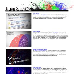
It uses a local SQLite database to store and parse the data, so after a one-time sync with Digg's servers, the tool does not have to connect to the internet to perform the searching. Venn Friends Type in your Digg user name, and you will see a Venn Diagram of your friends and fans. People who you have added as a friend are on the left, people who have added you as a friend are on the right, and mutual friendships show up in the middle. Wheel of Upcoming Stories The Wheel of Upcoming Stories is a Flash visualization of recently submitted Digg stories. Digg Heat Map The Digg Heat Map was based on the same data as my previous maps of the Digg community. Data Visualization: Modern Approaches. About The Author Vitaly Friedman loves beautiful content and doesn’t like to give in easily.
When he is not writing or speaking at a conference, he’s most probably running … More about Vitaly Friedman … Data presentation can be beautiful, elegant and descriptive. There is a variety of conventional ways to visualize data - tables, histograms, pie charts and bar graphs are being used every day, in every project and on every possible occasion. However, to convey a message to your readers effectively, sometimes you need more than just a simple pie chart of your results.
Data presentation can be beautiful, elegant and descriptive. Delicious what's hot. KartOO : The First Interface Mapping Metasearch Engine. HINT.FM / Fernanda Viegas & Martin Wattenberg. Infographic of the Day: The "Hype Cycle" of Computer-I. How to Find the Right Chart Type for your Numeric Data.
22 Feb 2016 Charts help you visualize numeric data in a graphical format but the problem is there are just too many types of charts to choose from.
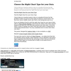
This diagram will help you pick the right chart for your data type. couch mode print story Charts help you visualize numeric data in a graphical format but the problem is there are just too many types of charts to choose from. You have bar charts, bubble charts, pie charts, line histograms and so on. If you are finding it hard to pick the right chart type for your type of data, refer to chart chooser diagram. The poster, designed by Andrew Abela, is also available as a PDF.
Related: Create Graphs Online with Google Charts You may also want to check out Chart Chooser – an online tools that lets you shortlist charts visually. Comments are closed but if you want to respond, please send me an email or tweet.