
World Population Density Interactive Map. Visualising Population Density Across the Globe This exploratory map shows data from the fantastic Global Human Settlement Layer (GHSL) produced by the European Commission.
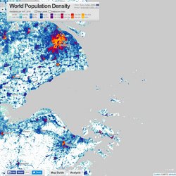
Integrating huge volumes of satellite data with national census data, the GHSL has applications for a wide range of research and policy related to urban growth, development and sustainability, and is available as open data. The dataset encourages understanding of the complex hierarchy of human settlement, rather than making simple rural-urban divisions. Some introductory highlights are discussed here with links for further information. Megaregions and Diverse Urban Forms In the early 20th century, geographers like Patrick Geddes observed how rail and road networks were allowing rapidly growing cities to fuse together into vast sprawling conurbations.
The GHSL data shows how widespread urban megaregions have become. Density and Development Traces of Ancient Civilisations Links to Find Out More- Euro. Interactive Statistics. Six billion tweets. Afrique du Sud. A Cartography of the Anthropocene. The Anthropocene: A primer.
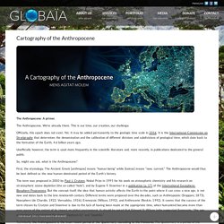
The Anthropocene. We’re already there. This is our time, our creation, our challenge. Officially, this epoch does not exist. Yet. Unofficially however, the term is used more frequently in the scientific literature and, more recently, in publications dedicated to the general public. So, might you ask, what is the Anthropocene?
Google Earth Library. By topomatt, on January 14th, 2011 Edujoser has a website dedicated to European castles, and has created a collection of placemarks showing the locations of 100s of castles in Italy.
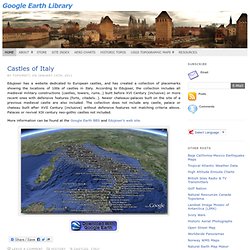
According to Edujoser, the collection includes all medieval military constructions (castles, towers, ruins…) built before XVI Century (inclusive) or more recent ones with defensive features (forts, citadels…). Newer chateaux-palaces built on the site of a previous medieval castle are also included. The collection does not include any castle, palace or chateau built after XVII Century (inclusive) without defensive features not matching criteria above.
Palaces or revival XIX century neo-gothic castles not included. More information can be found at the Google Earth BBS and Edujoser’s web site. By topomatt, on January 12th, 2011 Gerardo64 at the Google Earth BBS has created a file containing global overlays of several datasets available from the NOAA Environmental Visualization Laboratory. NASA Earth Observatory. Cartes géographiques gratuites, cartes muettes gratuites, cartes vierges gratuites, fonds de cartes gratuits. Hobo-Dyer Projection - ODT. The Hobo-Dyer Projection (HDP) takes its place among important map projections.
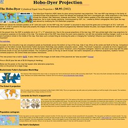
This new HDP map belongs to the family of Cylindrical Equal Area projections in which the latitude and longitude lines form a rectangular grid. Other projections in this family include the Lambert, Gall, Behrmann, Edwards and Peters. The HDP retains qualities of the other equal area cylindrical projections, but is more visually satisfying. Commissioned by ODT, Inc., created by British cartographer, Mick Dyer, the map was derived by modifying the 1910 Behrmann projection. Behrmann placed the standard parallels at 30° north and south. At the present time, the HDP is available only in an 11" x 17" placemat size.
Fun activities. Included on this innovative map are comparison panels as thumbnails across the bottom (or top) of the map. This new product has a built-in quiz. Price is $8.95 (plus flat rate of $5.50 Shipping & Handling). Below are the panels on the map that explain other alternative projections. Ceriscope. Free Relief Layers for Google Maps.
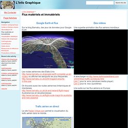
Flux matériels et immatériels (L'Info Graphique) Des vidéos Une superbe animation des flux aériens mondiaux:A télécharger ici: 1 pour le .wmv (windows media player)Lien 2 pour le .mov (quicktime)Une autre sur les flux aériens en Europe: Flux de données Ce site fournit une carte interactive des cables sous-marin: Le site New York Talk Exchange propose de magnifiques visualisations des échanges numériques entre New York et le reste du monde La société Télégeography semble disposer du monopole des cartes de flux sur les données téléphoniques et Internet Ces cartes murales et les rapports dont elles sont issues sont à un prix dissuasif.
L'Union internationale des Télécommunication a mis en place un outil cartographique mais sans possibilité de visualiser les flux de données Enfin, le groupe Tata propose une carte interactive des réseaux: La carte est l'oeuvre d'un infographiste très doué dont on peut consulter le blogfolio ici. Terres Interactives. SHOW?/WORLD - A New Way To Look At The World.