
Web page size and layout : Iteracy - web design and development partners in Cornwall. Most web pages follow a common set of sizes and layouts, which you'll recognise even if you aren't aware of them.
For example, did you know that nine out of the top ten most popular websites in the world use a fixed-width, centre-aligned design? Maybe you should too. Our article on web page size and layout breaks down web design into simple concepts, and helps you decide on a format for your website. To understand what the individual elements of a page are for, and why you need them, read our anatomy of a web page. Page width This is the first decision to make when designing a website.
Fixed Width Layouts Versus Liquid Layouts - CSS Web Layouts. How to Decide Which Design Style is Right for Your Site.

Examples. Layout. How to Center A Div with margin:auto in IE8. On the count of 3 everybody scream “MICROSOFT SUCKS AND I HATE INTERNET EXPLODER”. 1, 2, 3, go. note: Newer post has solutions for centering in IE9 I’ve been working on revamping my Sticky Footer code for IE8 compatibility when I ran into a little bug of sorts.
If you are using margin:0 auto; to center a div it will cause problems in IE8 if the parent element has either no width already set, or you’ve not set text alignment to center for that parent div, or you are using the wrong doc type declaration. These are the three fixes I know of; Width:100% Set your containing element to width:100%; so then your centered div inside of that one will actually center. CSS Swag: Multi-Column Lists. One of the minor holy grails of XHTML and CSS is to produce a single, semantically logical ordered list that wraps into vertical columns.
The ideal situation, in my view, would be a single XHTML list whose wrapping is controlled entirely by CSS. Further, the wrapped list should tolerate text resizing (easily accomplished by styling everything in ems). CSS and the browsers that support it don’t yet provide us with “vertical wrap,” so we have to augment basic list markup with additional attributes and styling rules to achieve the effect. IE7-/Win: Disappearing position:absolute boxes near to floats and clears. In the following test cases a relative positioned box contains, in the source code: an absolutely positioned box (with top:7px; left:50px)a floata clear (not always present)a static box (not always present) In IE7-/Win, depending on the source order of these contained elements and sometimes on other factors like the hasLayout status of the clear and the width of the float, the absolutely positioned box may disappear.
Before any case the contained elements and their source order are stated, as well as the result. Notes: The relative container has a fixed width, so it has hasLayout. Computers: Data Formats: Style Sheets: CSS: Examples: Layout. Creating a CSS layout from scratch. Interactive Layout Diagram. /* Position Is Everything */ — Modern browser bugs explained in detail! CSS Float Theory. Barely Fitz and CSS Positioning in Ten Steps. 1. position:static The default positioning for all elements is position:static, which means the element is not positioned and occurs where it normally would in the document.
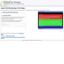
Normally you wouldn't specify this unless you needed to override a positioning that had been previously set. 2. position:relative If you specify position:relative, then you can use top or bottom, and left or right to move the element relative to where it would normally occur in the document. Let's move div-1 down 20 pixels, and to the left 40 pixels: Notice the space where div-1 normally would have been if we had not moved it: now it is an empty space. It appears that position:relative is not very useful, but it will perform an important task later in this tutorial. The difference between "The Flow" and "Positioning" for Web Pages. Fixed positioning - Anne’s Weblog. Layers, absolute and relative positioning and floating elements.
Path // → → CSS LAYOUT One of the major benefits of using CSS is that you’re no longer forced to lay your sites out in tables.
The layout possibilities of CSS give you complete control over the positions and dimensions of all page elements. If you’ve tried laying out a page with tables, you have probably been irritated in the past by the inability of your browser to render your page exactly as you had wanted. Table structures aren’t the most flexible of page layout devices, as they weren’t really designed for this purpose. Now however, with some reliable browser support in the current generation of browsers, you have a new and much improved option. This page was last updated on 2012-08-21 Working with divs The <div> element is well-suited to take over from tables as a layout tool.
The div tag has few attributes of its own (save for align="left | right | center"), with all of its formatting applied through stylesheets. <div id="navigation">...navigation links... Floating Elements. CSS Zen Garden. Visual formatting model. 9.1 Introduction to the visual formatting model This chapter and the next describe the visual formatting model: how user agents process the document tree for visual media.
In the visual formatting model, each element in the document tree generates zero or more boxes according to the box model. The layout of these boxes is governed by: box dimensions and type. positioning scheme (normal flow, float, and absolute positioning). relationships between elements in the document tree.external information (e.g., viewport size, intrinsic dimensions of images, etc.). The properties defined in this chapter and the next apply to both continuous media and paged media. The visual formatting model does not specify all aspects of formatting (e.g., it does not specify a letter-spacing algorithm). 9.1.1 The viewport User agents for continuous media generally offer users a viewport (a window or other viewing area on the screen) through which users consult a document. 9.1.2 Containing blocks.