
Incredilby Detailed Map Shows Race, Segregation Across America In Beautiful Color (PHOTOS) Segregation as pointillism?
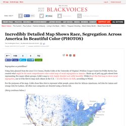
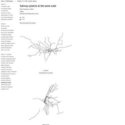
Using data gleaned from the 2010 U.S. Census, Dustin Cable at the University of Virginia’s Weldon Cooper Center for Public Service has created what might be the most comprehensive color-coded map of racial segregation in America. Made up of 308,745,538 colored dots representing five major ethnic groups, Cable's map is vivid, highly detailed and oddly beautiful. Information graphics in context on Behance. Map Porn. Sightsmap. World subways at scale. Athens Attiko Metro.
World map of Flickr and Twitter locations. Worldometers. Transparency: The Most Dangerous Cities for Walking - Transparency - GOOD. Internet Statistics & Social Media Usage. 13 of the Year's Best Infographics [Slideshow] Ideas, issues, knowledge, data - visualized! Worldmapper: The world as you've never seen it before.
A visual exploration on mapping complex networks. The Geotaggers' World Atlas : un album. Race and ethnicity.