
10 Tips for (journalists) Designing Infographics. This article was originally published on “Digital Newsgathering”, a class blog for Journalism 226 at San Francisco State University, Instructor: Staci Baird.
I wrote this post as a guest author, and with permission I am republishing it here. Assuming you’re not working for a media corporation with huge graphics and statistics departments at your disposal, you may want to create some infographics for your own articles. The Anatomy Of An Infographic: 5 Steps To Create A Powerful Visual. Information is very powerful but for the most bit it is bland and unimaginative.

Infographics channel information in a visually pleasing, instantly understandable manner, making it not only powerful, but extremely beautiful. Once used predominantly to make maps more approachable, scientific charts less daunting and as key learning tools for children, inforgraphics have now permeated all aspects of the modern world. I designed a couple of infographics back in college, the need arising especially around the time Soccer World Cup fever spiked. The 7 ½ Steps to Successful Infographics. You know when you’ve been doing something for a long time and it gets ingrained?
For me, that’s infographics. I’ve created a lot of chartage over the last 20 years Take a look: Here’s me when I started at the New York Times, where I was a graphics editor. I worked there for 15 years, on all the news desks, with the investigative team, and ran the biz section graphics desk. The middle i.d. is my stint at Fortune Magazine, where I was the Infographics director and got to work with the awesome folks at CNNMoney.com (I’m fading!).
Anyway, when Nishant from MIX asked me to write about what I do, it was kind of arresting, like the time that Montana patrolman intercepted my husband doing 94 on a long stretch of highway. So here I am, pulling over. 1. Where does one procure an idea? Usually they’re found in the shower. Don’t wake up with an idea? Our stories are driven by the news, so our graphics are framed by ‘what’s new’ and sometimes ‘what’s different’ and hopefully, ‘what’s relevant.’ 40 Useful and Creative Infographics. Six Revisions Menu Main Categories CSS HTML JavaScript Web Design WordPress Web Development Design Inspiration UX Design UI Design Freebies Tutorials Tools Links About Contact Advertise RSS Twitter Facebook 40 Useful and Creative Infographics By Jacob Gube Information graphics (or infographics) are graphical depictions of data and information.
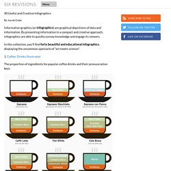
In this collection, you’ll find forty beautiful and educational infographics, displaying the uncommon spectacle of "art meets science". 1. The proportion of ingredients for popular coffee drinks and their pronunciation keys. 2. This infographic showcases the history of the Swine Flu, starting from 1976. 3. 4. 5. The top breweries and beers in the U.S. 6. 7. 389 Years Ago A rundown of the historic events in African-American culture.
10 of My Favorite Infographics. Infographics also know as information graphics are visual representations of knowledge or data.
The infogrpahics can give small or complex amounts of information quickly for a reader to look at. Examples of these graphics can be seen on signs, maps, electrical schematics and almost anything you want to use a infographic. If you can write it then it might be possible to create an infographic. In the past mostly scientists, mathematicians, and technical users created symbols and put them together so people could easily and quickly read these graphic maps of knowledge. Create cool infographics - Masterclass. InfoGraphic Designs: Overview, Examples and Best Practices.
Information graphics or infographics are visual representations of information, data or knowledge.
These graphics are used where complex information needs to be explained quickly and clearly, such as in signs, maps, journalism, technical writing, and education. They are also used extensively as tools by computer scientists, mathematicians, and statisticians to ease the process of developing and communicating conceptual information. They can present a rich amount of information without intimidating you. Or sometimes they intimidate you, but make the digesting of the information much more bearable. Here in this article below, we are going to discuss best practices for designing infographics followed by some examples which might help you learn a thing or two.
You may be interested in the following related articles as well. Feel free to join us and you are always welcome to share your thoughts that our readers may find helpful. Don’t forget to and follow us on Twitter — for recent updates. How To Create Outstanding Modern Infographics. In this tutorial you will learn that data doesn't have to be boring, it can be beautiful!

Learn how to use various graph tools, illustration techniques and typography to make an accurate and inspiring infographic in Adobe Illustrator. Start by using the Rectangle Tool (M) to draw a shape. Give it a subtle radial gradient too. The entire design is based on a grid of four columns.