background preloader

Visualizations

Facebook Twitter

Should data.gov Visualize? Probably Not. A few days ago, the Sunlight Labs blog put a post up, titled "Should data.gov Visualize? Probably Not" [sunlightlabs.com]. In terms of provoking you to read, I have copied their title for this post as well. Anyway, the post somehow caught my attention. The first reason against providing government-backed data visualizations is as follows: "We didn't just leave it out because we didn't think of it. The second even makes a connection between data visualization and "bells and whistles": "The second reason why government should avoid spending time on adding visualizations or other bells and whistles to Data.gov is because it actually hurts transparency. However, Sunlight Labs, which among other things, is very busy redesigning aiming to encourage the discussion about the design of the government transparency website data.gov (see some preliminary screenshots here), seem to have quickly backed down its initial viewpoint, at least in a post the following day.

Via VizWorld. See also: . 10 Best Data Visualization Projects of the Year – 2010. Data visualization and all things related continued its ascent this year with projects popping up all over the place. Some were good, and a lot were not so good. More than anything, I noticed a huge wave of big infographics this year. It was amusing at first, but then it kind of got out of hand when online education and insurance sites started to game the system. Although it's died down a lot ever since the new Digg launched.

That's what stuck out in my mind initially as I thought about the top projects of the year. Then I went through the archives. One of the major themes for 2010 was using data not just for analysis or business intelligence, but for telling stories. So here are the top 10 visualization projects of the year, listed from bottom to top. 10. Scott Manley of the Armagh Observatory visualized 30 years of asteroid discoveries. 9. 8. This weekender by Matt McKeon of the IBM Visual Communication Lab explored the changes of Facebook privacy policies over the years. 7. 6. 5. 4. Data Visualization: Who are today's leading data visualization companies. Gapminder: Unveiling the beauty of statistics for a fact based world view. - Gapminder.org.

Gov 2.0 for Providers of Official Statistics. Information Graphics. The Don’ts of Infographic Design. Written by Amy Balliett of Killer Infographics, the post in question is basically tips for how to create linkbait that doesn't work. Or at least I hope it doesn't. Let's take it from the top. Infographics are visual representations of information, or "data viz" as the cool kids call it these days. The term "data viz" comes from "data visualization," which implies that sets of data will be displayed in a unique way that can be seen, rather than read. I'm not going to get into the semantics. That's for people who are smarter (and cooler) than me, but the obsession with a visually unique result is overdone.

Sure, you want your graphic to be compelling, but that comes from the data or the information. Next up, which refers to the graphic above: What’s wrong with this infographic? What? Most run-of-the-mill infographics take a few data points and make it look like a lot with big things. It gets worse. Two alternatives to the above are offered. I hope you didn't answer graph A. Business - Megan McArdle - Ending the Infographic Plague. Now that Obama's dog has won the War on Christmas, or something, it's time to get down to a war that really matters: the war on terrible, lying infographics, which have become endemic in the blogosphere, and constantly threaten to break out into epidemic or even pandemic status.

The reservoir of this disease of erroneous infographics is internet marketers who don't care whether the information in their graphics is right ... just so long as you link it. As a Christmas present to, well, everyone, I'm issuing a plea to bloggers to help stop this plague in its track. Below the break, a tour of some of the more egregious examples, and some thoughts on why they've become so prevalent. For those of you who can't sit through all that boring writing, however, I will first deliver my message in--ahem! --a more visual format: Remember this gem? Terrifying! Except, er, no. And who could forget this stunner? What is wrong with our values?! What is wrong with this infographic? Infographics – the Long and the Short of It – Defining the [infographic]

A New and Important Content Marketing Tool: The Video Infographic. 9 Powerful Free Infographic Tools To Create Your Own Infographics - DATA VISUALIZATION. Piktochart. Why "Infographic Thinking" Is The Future, Not A Fad. We get a lot of infographic pitches. Almost all of them suck. Why? Because while they may well be "information plus graphics," they often lack what designer Francesco Franchi calls "infographic thinking. " This isn’t just "how to make some numbers and vector graphics look clever together. " It’s a narrative language--it’s "representation plus interpretation to develop an idea," to quote Franchi.

He’s the art director of IL (Intelligence in Lifestyle), the monthly magazine of Il Sole 24 ORE, one of Italy’s top financial newspapers, and if you look at his work, you quickly get the sense that he knows what the #*(@ he’s talking about. He lays out his thoughts on "infographic thinking" in this video podcast from Gestalten: Franchi issues a lot of wisdom we’ve heard before--"If we don’t have content, we can’t have design," "You have to be informative but also entertain the reader," etc.

[via Stellar Interesting; Image: Jakub Krechowicz/Shutterstock] Day-in-the-internet.jpg (800×7247) Kill This Infographic (infographic) | Journalism in the Age of Data. In the words of Terrell Owens, get your popcorn ready, because this video (below) is awesome. 
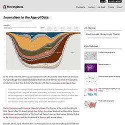
During his Knight Journalism fellowship at Stanford, Geoff McGhee interviewed visualization trendsetters on how they deal and what they do with data in Journalism in the Age of Data: Journalists are coping with the rising information flood by borrowing data visualization techniques from computer scientists, researchers and artists. Some newsrooms are already beginning to retool their staffs and systems to prepare for a future in which data becomes a medium. But how do we communicate with data, how can traditional narratives be fused with sophisticated, interactive information displays?

Martin Wattenberg and Fernanda Viègas kick things off with some of the work they did with IBM. Then it's Ben Fry from Fathom, then Jeffrey Heer from Stanford, and then Steve Duenes, Matt Ericson, and Amanda Cox of The New York Times. [datajournalism | Thanks, Josh] Period Table of Social Media. Infographics Are Broken. We Can Do Better. | Erick Schonfeld: TechStream. Infographics on the web are so bad and so broken. They are everywhere, yet few actually do a decent job of conveying information (click on the one at left to see what I mean).

Some even argue that they are ruining the Internet. They tend to be formulaic and overreaching, often cobbling together too much information instead of focusing on the one or two nuggets that are truly useful. (How much better would most infographics be if they pulled out the most salient chart or set of stats and discarded the rest?) There are many reasons why they suck. I know we can do better, which is why I’ve applied for a grant from the Knight News Challenge on Data to build a data visualization platform to address some of these shortcomings (please like it or reblog it on Tumblr). As I note in my Knight News application: Infographics are very popular on the web, but most of them aren’t very good. And yet people love them because humans are visual creatures. Infographics are the scourge of the Internet. Correlation or Causation? Layar Creator - Welcome to Interactive Print. Eulerian Video Magnification.

Banner slider Many seemingly static scenes contain subtle changes that are invisible to the naked human eye. However, it is possible to pull out these small changes from videos through the use of algorithms we have developed. We give a way to visualize these small changes by amplifying them and we present algorithms to pull out interesting signals from these videos, such as the human pulse, sound from vibrating objects and the motion of hot air.

Videos Software and Code Eulerian Video Magnification code Matlab code and executables implementing Eulerian video processing for amplifying color and motion changes. Phase Based Video Motion Processing code Matlab code for implementing the new and improved phase-based motion magnification pipeline. Videoscope Web interface for motion and color magnification. Publications (Magnifying Motion and Color Changes) Publications (Analysis of Small Motions) People Faculty: Students, Postdocs and Affiliates: Collaborators: Edward H. Talks. Sauber cutaway car > F1 News > Grandprix.com. InformationDataProcessVisualization. Livehoods – Use-based urban analytics. In conceptualizing and exploring the city we rely a range of smaller areas—neighbourhoods, boroughs, wards and districts—in order to make urban space intelligible. While we can readily discuss how neighbourhoods are shaped by physical geography (topography, adjacency to lakes or rivers, etc.), ordinance (zoning, access to public transit) and economics (real estate prices, average resident income), machine learning does not really spring to mind when we are considering how we might define ‘a neighbourhood’.

Livehoods is a new project hatched within the School of Computer Science at Carnegie Mellon University that leverages 18 million Foursquare check-ins to draft up new urban ‘activity zones’ based on the patterns of frequent visitors. The venture essentially asks how does a location-based service reflect our sense of place within the city? Livehoods.org | School of Computer Science at Carnegie Mellon University. m4cpnwEe0A1qb2cg0o1_1280.jpg (1280×853) Create Infographics | Data Visualization Tools | Visual.ly. Data visualisation DIY: our top tools | News. What data visualisation tools are out there on the web that are easy to use - and free? Here on the Datablog and Datastore we try to do as much as possible using the internet's powerful free options.

That may sound a little disingenuous, in that we obviously have access to the Guardian's amazing Graphics and interactive teams for those pieces where we have a little more time - such as this map of public spending (created using Adobe Illustrator) or this Twitter riots interactive. But for our day-to-day work, we often use tools that anyone can - and create graphics that anyone else can too.

So, what do we use? Google fusion tables This online database and mapping tool has become our default for producing quick and detailed maps, especially those where you need to zoom in. The main advantage is the flexibility - you can can upload a kml file of regional borders, say - and then merge that with a data table. This excellent tutorial by Google's Kathryn Hurley is a great place to start.

Datamarket. Subversive Cartographies. What are subversive cartographies? This issue is addressed a series of presentations organized by Chris Perkins (University of Manchester) and Jörn Seemann (Louisiana State University) for the upcoming 2008 Association of American Geographers meeting (Boston, April 15-19 2008). “To be subversive, is to wish to overthrow, destroy or undermine the principles of established orders. As such subversive cartographies offer alternative representations to established social and political norms.

Maps are no longer cast as mirrors of reality, instead they are increasingly conceived as diverse ways of thinking, perceiving and representing space and place which express values, world-views and emotions. Maps are no longer part of an elite discourse: they can empower, mystify, and enchant. Subversive Cartographies 1: Papers emphasizing the role of the aesthetic in the construction of alternative and artistic mappings. Lynch Debord Denis Wood, Independent Scholar Discussant: Vincent J. Robert Plutchik's "Wheel of Emotions" Nightingale’s Rose. January 9, 2008, 4:06 pm By Henry Woodbury Two ways of reading the word area — its general vs. its mathematical meaning — leads to confusion in this otherwise superb article on Charts in the Economist.

The chart in question is Florence Nightingale’s “Diagram of the Causes of Mortality in the Army of the East.” The data is plotted by month in 30-degree wedges. In each month, red represents deaths by injury, blue death by disease, and black death by other causes: The Economist explains how to interpret the diagram: As with today’s pie charts, the area of each wedge is proportional to the figure it stands for, but it is the radius of each slice (the distance from the common centre to the outer edge) rather than the angle that is altered to achieve this. Herein lies the confusion.

Our Creative Director, Piotr Kaczmarek, recalibrated Nightingale’s chart to correct this error. This is better: a stacked bar chart that introduces a scale (!) Comments Thanks for the clarification. Yeaaa Post a Comment. What David Lynch Can Do With a 100-Year-Old Camera and 52 Seconds of Film. About ChartsBin.com. What is ChartsBin? ChartsBin is a web-based data visualization tool that will allow everyone to quickly and easily create rich interactive visualizations with their own data. You can then share your interactive visualizations with others by embedding them in websites, blogs or sharing via Facebook or Twitter.

We're focused on building the most exciting and engaging destination for statisticians, and computer scientists in the world. Who is ChartsBin for? This site would find love among those who like stats and graphs; for anyone who wishes to see the boring research data in a refreshing way. What makes ChartsBin different? Create interactive visualizations online instantly! Additionally, you can download compiled dataset (CSV, XLS, SQL). Where We've Been Featured and Mentioned We're honored to have been reviewed/featured/mentioned recently in the following media: Thanks ChartsBin is proudly powered by open source software. The Best Tools for Visualization. Visualization is a technique to graphically represent sets of data.

When data is large or abstract, visualization can help make the data easier to read or understand. There are visualization tools for search, music, networks, online communities, and almost anything else you can think of. Whether you want a desktop application or a web-based tool, there are many specific tools are available on the web that let you visualize all kinds of data. Here are some of the best: Visualize Social Networks Last.Forward: Thanks to Last.fm's new widget gallery, you can now explore a wide selection of extras to extend your Last.fm experience. Last Forward Friends Sociomap: Friends Sociomap is another Last.fm tools that generates a map of the music compatibility between you and your Last.fm friends. Fidg't: Fidg't is a desktop application that gives you a way to view your networks tagging habits. Fidg't The Digg Tools: One more: Digg Radar.

YouTube: Visualize Music Musicovery Last.fm music visual tools: Amazon. Am I an Alcoholic? – Alcohol Abuse Facts | Screening for Mental Health. Gamers Get Girls | Visual.ly. Most guys aren’t grinding away at their Level 45 Battle Mage in order to meet the ladies. But online gaming across the board is becoming more mainstream, and lots of people spend lots of time in virtual worlds — men and women alike. Show More. Dossier | Life of a Hashtag. Wind Map.