

Gradient Buttons with Hover Effects. Easing Linear Gradients. By Andreas Larsen On easing, gradients, postcss Linear gradients are easy to create in CSS and are extremely useful.

As we'll go through in this article, we can make them visually much smoother by creating them with non-linear gradients. Well, non-linear in the easing sense, anyway! Here's an example that shows how harsh a standard linear-gradient() can be compared to how smooth we can make it by easing it: Il buono (the good): Smooth gradients in CSS that blends into their context.Il cattivo (the bad): No text protection (bad accessibility).Il brutto (the ugly): Standard linear gradients with sharp edges. In this article, we'll focus on how we can turn Il brutto into Il buono. The Frustrating Sharp Edges of background: linear-gradient() Lately, I've been fiddling with gradients at work.
I started looking into creating consistently more visually appealing gradients. Inspiration: Math and Physics. Blog - generating color palettes with deep learning. Colormind is a color palette generator, go to the homepage to try it out.
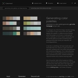
As a designer one of the first things I do when starting a new project is to get a sense of the color palette. Making color palettes is a difficult process because while most people can tell when a combination of colors is pleasing, it's hard to explain exactly why. It's thus doubly difficult to produce something that's pleasing and fits with certain pre-requisites, like branding guidelines. In fact this is something I still have trouble with, and more often than not I resort to a "guess and check" approach, sampling colors from online color generators and sometimes photography.
Color Tool - Material Design. Fresh Background Gradients. Fluid Paint. Color Supply. COLOR OF THE YEAR 2017 - Greenery. A refreshing and revitalizing shade, Greenery is symbolic of new beginnings.
Greenery is a fresh and zesty yellow-green shade that evokes the first days of spring when nature’s greens revive, restore and renew. Illustrative of flourishing foliage and the lushness of the great outdoors, the fortifying attributes of Greenery signals consumers to take a deep breath, oxygenate and reinvigorate. Greenery is nature’s neutral. The more submerged people are in modern life, the greater their innate craving to immerse themselves in the physical beauty and inherent unity of the natural world. This shift is reflected by the proliferation of all things expressive of Greenery in daily lives through urban planning, architecture, lifestyle and design choices globally. A life-affirming shade, Greenery is also emblematic of the pursuit of personal passions and vitality. 8 Color Scheme Trends in Mobile App Design. Color schemes are an ever-changing, ever-evolving aspect of mobile app design.

Over the past years, we have seen a shift in trends from heavy use of colors throughout mobile app elements, to more minimal use of color, with much more focused palettes being used. As well as this, there has been a move towards using more white space alongside high contrast, experimental colors. The last year or two has also seen subtle colors introduced for shadows, replacing their traditional grayscale counterparts that were previously so common. Gradients have also made their way back into mobile apps, this time using high-contrast complimentary colors to introduce a bold and visually impactful style to the user interface.
Open Color. Tobias van Schneider › ColorClaim – Color Inspiration. There are many ways to use it.
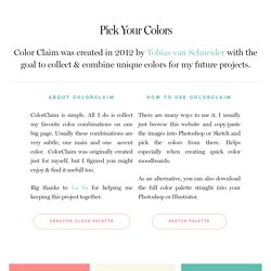
I usually just browse this website and copy/paste the images into Photoshop or Sketch and pick the colors from there. Open Color. A Simple Web Developer's Guide To Color. In this article, Laura Elizabeth shares a simple color workflow that you can use in your next web project.
I’ve never been a fan of color theory. I think it’s because I’ve always been a bit hopeless at it. I’d love to be able to sit there, color wheel in hand, and pick out complementary, split-complementary and triad color schemes, impressing all of my friends, family and clients in the process. But the theory has always eluded me, and, truthfully, I’ve never found it useful when trying to use color in my projects. Social Colors. Glossary of Color Terms. Chromaticity: Think about a color's "purity" when describing its "chromaticity" or "CHROMA".
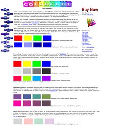
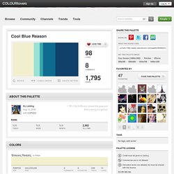
This property of color tells us how pure a hue is. That means there is no white, black, or gray present in a color that has high chroma. These colors will appear very vivid and well, ... pure. This concept is related to and often confused with saturation. However, we will continue to use these terms separately because they refer to distinct situations, as explained here. High Chroma - very shiny, vivid Low Chroma - achromatic, no hue. Cool Blue Reason. Loves Comments Views 1,795 COLOURlovers viewed this page and think Liebling is a genius.
Today Week Month. How to Earn Trust Without Social Proof. I hear this all the time.

Whether I’m writing copy for a digital agency, SaaS startup or even an established business who hasn’t ever thought to collect feedback from customers, a lack of third-party proof is a problem that’s WAY more common than I’d like it to be. That’s because few things are more effective for improving conversion rates than being able to show testimonials, reviews, client lists and places you’ve been featured. This kind of outside proof lends immediate credibility to your claims and gives your leads a chance to hear from people who’ve bought what you’re offering – hopefully, people like them.
So what do you do if you have NONE of those things, but still want customers to trust you? In this quick post, I’m going to explore four things you can do to make a connection with customers and get them to trust you, even if you can’t show them social proof. A tool for creating more cohesive color schemes. Webdesign : le dégradé reprend du pouvoir !
Stylify Me - Online Style Guide Generator. Photo Color Palettes by COLOURlovers. Color Me Curious. Tendance web : 30 web designs avec un dégradé de couleurs. The Art of Color Coordination. Colors affect us in countless ways—mentally and physically, consciously and subconsciously.

Flat UI Colors. Gradient Text. CSS Gradient Generator. Color Thief. Coolors - The super fast color schemes generator! Colour Contrast Analyser (CCA) Features WCAG 2.1 compliance indicatorsSeveral ways to set colours: raw text entry (accepts any valid CSS colour format), RGB sliders, colour picker (Windows and macOS only)Support for alpha transparency on foreground coloursColour blindness simulator Support and development For questions concerning the Colour Contrast Analyser (CCA), or to report bugs, suggest improvements, and contribute to the code, see the Colour Contrast Analyser (CCA) repository.
Previous versions The current version of the Colour Contrast Analyser (CCA) has been rebuilt from the ground up using Electron. This program is distributed in the hope that it will be useful, but WITHOUT ANY WARRANTY; without even the implied warranty of MERCHANTABILITY or FITNESS FOR A PARTICULAR PURPOSE. Créer facilement une palette de couleurs accessibles. L'accessibilité des couleurs et les contraintes liées au contraste ont souvent mauvaise presse auprès des designers. Certains craignent que les contraintes d’accessibilité des couleurs limitent leur palette et par la même occasion leur créativité.
D’autres pensent (à tort) que l’accessibilité des couleurs n’est réservée qu’à une infime partie de la population atteinte de handicaps visuels comme le daltonisme, hors de la cible de leur site. Voici un petit tutoriel, pas à pas, pour créer une palette de couleurs accessible, sans avoir pour autant à brider sa créativité. Cet article est une traduction de mon article en anglais Tips to Create an Accessible and Contrasted Color Palette. Paletton - The Color Scheme Designer. Color me pretty: 10 Color tools for your web design project - The Hive. Web design is all about visuals, and colors pay a key role in how people react to your work. Colors affect a person’s mood and outlook, they act as a symbol of what you represent, and are an important part of brand identity.
We’ve compiled a list of our top ten color tools along with a reason as to why we love them so much! 1.Coolers This one’s a fun one! It allows you to pick out different colors from a range and then match up other colors in order to create a palette. 2. Sometimes in order to decide if the color you’re looking for works or not you might want to see it as an image. 3. ColorBrewer: Color Advice for Maps. #3399aa hex color. In a RGB color space, hex #3399aa is composed of 20% red, 60% green and 66.7% blue. Whereas in a CMYK color space, it is composed of 70% cyan, 10% magenta, 0% yellow and 33.3% black.
It has a hue angle of 188.6 degrees, a saturation of 53.8% and a lightness of 43.3%. #3399aa color hex could be obtained by blending #66ffff with #003355. Shade. Comment créer un Logo Mémorable. En tant qu’entrepreneur, nous nous sommes tous posés cette question : « Comment créer un Logo Mémorable ? » Avez-vous déjà remarqué que les meilleurs logos ne possèdent pas une signification au premier coup d’oeil ? Analysons ensemble plusieurs logos de marques connues, afin de comprendre le choix final… Ce qui rend un logo mémorable est surtout le choix de la couleur, puis une combinaison magique entre un message subliminale, la police de caractère, la forme et l’agencement.
Choisir les couleurs pour un site web. Lors de la création d'un site web, une des premières étapes dans le processus est la réalisation d’une maquette. Color CC.