Logiciels

TwitterFacebook
Get flash to fully experience Pearltrees

Data visualisation overview | Visualise management data for improved business performance

Data visualisation is the process of presenting data in graphical formats to enhance the viewers understanding of the meaning of the data. 
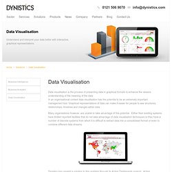
In an organisational context data visualisation has the potential to be an extremely important management tool. Graphical representations of data can make it easier for people to see structures, relationships, timelines and changes within data. Many organisations however, are unable to take advantage of this potential. Either their existing systems have limited reported facilities that do not take advantage of data visualisation techniques or they have a number of discrete systems from which it is difficult to extract data into a consolidated format or even to combine different data streams. Dynistics has created a solution to this problem through its Active Dashboards product. http://www.dynistics.com/Data_Visualisation.aspx#
http://www-958.ibm.com/software/data/cognos/manyeyes/

Many Eyes

Try out the newest version of IBM Many Eyes! New site design and layout Find visualization by category and industry New visualization expertise and thought leadership section Expertise on the Expert Eyes blog Learn best practices to create beautiful, effective visualizations New, innovative visualizations from the visualizations experts of IBM Research New visualization options
http://www.begraphic.com/download.html

Download "BeGraphic Lite Edition" | begraphic.com

To improve BeGraphic in 2013, we transform the old "Version1 Lite" into the new "V2 Free". This new free version is included in the "Version2 Pro", allowing you to try the upper functions during one month withing paying nothing. After the first 30 days, the "Version2 Pro" will automatically turn down into the "V2 free" (without ready-to-use graphics). Version2 Pro's ready-to-use graphics will include plug-ins such as packaged maps, Waterfall / Bridge chart, Gantt chart... Registration form Asterisks ( * ) indicates mandatory fields to receive the download instruction.
1 Easy Set Up / Fast Implementation Traditional Reporting & BI software typically take months to set up. Zoho Reports being a SAAS BI solution, you can get started in days saving huge time & effort. 2 Easy to Use Drag & Drop Reporting Zoho Reports spreadsheet-like interface and very intuitive drag-and-drop based reports designer, makes it very easy to learn & use. 3 Highly Collaborative Sharing, collaboration and publishing are in-built, with complete control on the permissions that you grant to your users.

Online Reporting and Business Intelligence Service: Zoho Reports

https://www.zoho.com/reports/

About Impure

Bestiario , a Barcelona Spain based start-up, has been exploring and inventing new interactive visualization paradigms over the past 5 years. The result of this effort is the creation of IMPURE. Impure is a visual programming language aimed to gather, process and visualize information. With impure is possible to obtain information from very different sources; from user owned data to diverse feeds in internet, including social media data, real time or historical financial information, images, news, search queries and many more. Impure is a tool to be in touch with data around internet, to deeply understand it. Within a modular logic interface you can quickly link information to operators, controls and visualization methods, bringing all the power of the comprehension of information and knowledge to the not programmers that want to work with information in a professional way. http://www.impure.com/about_impure.php