

Could data save newspapers? 01 November 2011 · By Kylie Davis The news that the world is entering a new era of “Big Data” is likely to offend many die hard traditionalists in newsrooms, who are still enraged by the Internet making the word “content” a synonym for journalism.

But how much better could newsmedia companies be if they really looked at the data they report on each and every day? The world is entering a new era of “Big Data” according to a new McKinsey report which claims that businesses that can get their heads around how to harness the constant flow of information are winning the race of profit and competition. The news is likely to offend many die hard traditionalists in newsrooms, who are still enraged by the Internet making the word “content” a synonym for journalism. OpenDataSoft Solution - Open Data User Publisher Role. Open Data Challenge. Future Forum James Ball.
PS. Data Journalisme Ile de la Réunion ?? Open data : de la transparence démocratique au développement économique - romaingiscard sur LePost.fr (17:31) Publié parromaingiscard post non vérifié par la rédaction 05/09/2011 à 17h27 - mis à jour le 05/09/2011 à 17h32 | vues | réactions L'open data on en parle souvent (dernièrement en Conseil des ministres), mais peu connaissent les implications de cette tendance mêlant transparence démocratique et vertus de l'économie numérique.
Journalism in the Age of Data: A Video Report on Data Visualization by Geoff McGhee. Visualizing.org. 7 Essential Books on Data Visualization & Computational Art. By Maria Popova What 12 million human emotions have to do with civilian air traffic and the order of the universe.
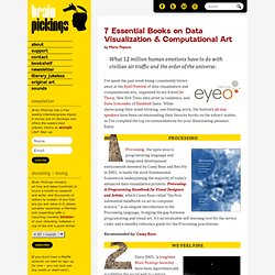
I’ve spent the past week being consistently blown away at the EyeO Festival of data visualization and computational arts, organized by my friend Jer Thorp, New York Times data artist in residence, and Dave Schroeder of Flashbelt fame. While showcasing their mind-blowing, eye-blasting work, the festival’s all-star speakers have been recommending their favorite books on the subject matter, so I’ve compiled the top recommendations for your illuminating pleasure. Enjoy. Visualize This: How to Tell Stories with Data. By Maria Popova How to turn numbers into stories, or what pattern-recognition has to do with the evolution of journalism.
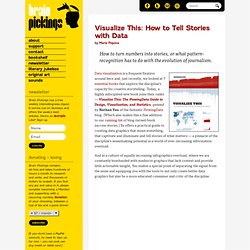
Data visualization is a frequent fixation around here and, just recently, we looked at 7 essential books that explore the discipline’s capacity for creative storytelling. Today, a highly anticipated new book joins their ranks — Visualize This: The FlowingData Guide to Design, Visualization, and Statistics, penned by Nathan Yau of the fantastic FlowingData blog. (Which also makes this a fine addition to our running list of blog-turned-book success stories.) Yu offers a practical guide to creating data graphics that mean something, that captivate and illuminate and tell stories of what matters — a pinnacle of the discipline’s sensemaking potential in a world of ever-increasing information overload.
For a historical perspective on infographics, be sure to see the story of Otto Neurath’s Isotype. Donating = Loving Brain Pickings has a free weekly newsletter. Share on Tumblr. Ernst Haeckel. Un article de Wikipédia, l'encyclopédie libre. Ernst Hæckel Ernst Haeckel en 1860. Color as Data: Visualizing Color Composition. By Maria Popova Abstracting glossy magazines, or what pie charts have to do with the Mona Lisa.
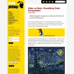
We love data visualization and color. So what happens when you apply the former to the latter, visualizing color composition like you would any data set? Today, we look at three projects that take the color composition of familiar cultural artifacts and break it down visually. Computational artist Mario Klingemann, a.k.a. The pie charts represent the distribution of dominant colors within a circle area.
FORM+CODE: Eye and Brain Candy for the Digital Age. By Maria Popova Computational aesthetics, or what typography has to do with Yoko Ono and Richard Dawkins.
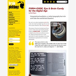
Yes, we’re on a data visualization spree this week, but today’s spotlight taps into an even more niche obsession: data viz book candy. This season, Princeton Architectural Press, curator of the smart and visually gripping, brings us FORM+CODE — an ambitious, in-depth look at the use of software across art, design and illustration for a wide spectrum of creative disciplines, from data visualization to generative art to motion typography. The nature of form in the digital age is trapped in the invisible realm of code. Form+Code makes that world visible to the community that stands to gain the most from it: artists and designers.” ~ John Maeda.
Mapping European Stereotypes. By Maria Popova Geopolitical cartography is all about an objective view of the world’s political conventions.

But there’s nothing politically correct in Bulgarian-born, London-based designer Yanko Tsvetkov‘s Mapping Stereotypes project — a series of amusing, often tragicomically true maps of Europe based on various subjective perceptions and ideologies. NBC News' Education Nation Challenge. Visualize the Economics of Higher Graduation Rates Graduating from high school means better job prospects and higher earning potential for individuals, but what does it mean for the community or country as a whole?
In partnership with NBC News' Education Nation, and using data from the Alliance for Excellent Education, Visualizing.org challenges you to visualize the projected benefits and economic ripple effects that would result from improving America’s graduation rates. Add your voice to the debate by participating: the 2011 Education Nation Summit will help bring your work to elected officials, educators, and business leaders. The Alliance for Excellent Education has produced a new data set that projects the future economic benefits resulting from reducing the dropout rate now. Including indicators such as additional spending, tax revenue, home sales, and more, this data offers a detailed look at the long term effects of increased graduation in hundreds of communities across the US. Highcharts - Interactive JavaScript charts for your webpage. Data Journalism : par où commencer (Part. 1/2) Ce guide en deux parties présente des éléments de réponse aux développeurs et journalistes désireux de se lancer dans le monde du Data-Journalism .
Pas question ici de produire un cours de programmation ou de base de données, ma démarche est plus celle d’un retour d’expérience sur les caractéristiques très précises de ce métier. Pour commencer, cette première partie s’adresse aux développeurs (mais ne partez pas, je serai doux). Vous vous en doutez peut-être déjà, il ne suffit pas de savoir coder pour faire du Data Journalism dans de bonnes conditions. Outre des techniques, certes singulières et indispensables, en visualisation de données et data-mining, le développeur qui veut se frotter aux journalistes doit avant tout recueillir des qualités humaines auxquelles son métier ne l’a pas préparé. 1. WEBJOURNALISME. 11 jobs d’un nouveau genre qui prouvent que le journalisme a de l’avenir. Datavisualization. Golden Section Graphics. Open Data Challenge on Datavisualization. European public bodies produce thousands upon thousands of datasets every year – about everything from how our tax money is spent to the quality of the air we breathe.

With the Open Data Challenge, the Open Knowledge Foundation and the Open Forum Academy are challenging designers, developers, journalists and researchers to come up with something useful, valuable or interesting using open public data. Everybody from the EU can submit an idea, app, visualization or dataset to the competition between 5th April and 5th June. The winners will be announced in mid June at the European Digital Assembly in Brussels. Introduction to Linked Open Data for Visualization Creators on Datavisualization. Introduction to Linked Open Data for Visualization Creators Last week ReadWriteWeb asked: “Is Linked Data Gaining Acceptance?”
Our answer: definitely yes. Projects like DBPedia, a community effort to structure the information from Wikipedia and provide it as Linked Open Data, have come a long way and work really well. For example, you can search for all scientists born in Zürich, Switzerland. Faceted Wikipedia Search. Welcome to PublicData.eu - Europe's Public Data - publicdata.eu.
List of European Open Data Catalogues at lod2.okfn.org. Suisse Open Data Initiative. 11.5040 - Potentiel des données publiques ouvertes en Suisse - Curia Vista - Base de données d'entreprise - L'Assemblée fédérale - Le Parlement suisse. Eingereichter Text 1.

En Suisse aussi, l´Open Government Data a le vent en poupe. La conférence opendata.ch 2011 a été ouverte par Edith Graf-Litscher, conseillère nationale et co-présidente du Groupe parlementaire pour une informatique durable et par Andreas Kellerhals, directeur des Archives fédérales suisses, l’office qui accueillait les invités dans ses murs. C’est ensuite Nigel Shadbolt, professeur à l’Université de Southampton et membre du Public Sector Transparency Board UK qui a pris la parole. Open government data gathers momentum in Switzerland. The opendata.ch 2011 conference was inaugurated by Edith Graf-Litscher, National Councillor and Co-Chair of the Parliamentarian Group for Digital Sustainability, and Andreas Kellerhals, Director of the Swiss Federal Archives.
The opening address was given by Nigel Shadbolt, Professor at the University of Southampton and member of the UK’s Public Sector Transparency Board. Switzerland is no longer a white spot on the OGD map. The following guest post is by Cécile Aschwanden and André Golliez, from itopia. They are members of the OKF’s Working Group on Open Government Data. Most people in Switzerland (including politicians) still do not know what Open Government Data is all about – but now the OGD virus has reached Switzerland and the discussion has been launched.
The first OGD conference hosted by the Swiss Federal Archives – a perfect venue for this event – had many more attendees than expected (around 150). Politicians, high ranking bureaucrats, journalists, scientists, and entrepreneurs gave presentations in the morning and took part in the many workshops in the afternoon. Jeremy Stucky wrote a summary of all the presentations and workshops, which can be found here. Swiss Open Systems User Group: Home. All too much. Data, data everywhere. WHEN the Sloan Digital Sky Survey started work in 2000, its telescope in New Mexico collected more data in its first few weeks than had been amassed in the entire history of astronomy. Now, a decade later, its archive contains a whopping 140 terabytes of information. A successor, the Large Synoptic Survey Telescope, due to come on stream in Chile in 2016, will acquire that quantity of data every five days.
Such astronomical amounts of information can be found closer to Earth too. Wal-Mart, a retail giant, handles more than 1m customer transactions every hour, feeding databases estimated at more than 2.5 petabytes—the equivalent of 167 times the books in America's Library of Congress (see article for an explanation of how data are quantified). Facebook, a social-networking website, is home to 40 billion photos. All these examples tell the same story: that the world contains an unimaginably vast amount of digital information which is getting ever vaster ever more rapidly.
Dross into gold. The data deluge.