
Full-width pinned layouts with flexbox. One good way to learn a new technology is to take something made with the existing methods and try to recreate it with the new thing.
Take flexbox, for example. Philip Walton showed us with his “Solved by Flexbox” demos that flexbox can make a lot of the layouts that were possible but painful with traditional CSS2 methods a lot easier to create and more flexible to different content and user scenarios. I want to walk you through a similar sort of design challenge: taking an existing layout, converting it to flexbox, and then seeing how flexbox can take it to the next level. My inspiration for a layout to convert came from Dan Mall’s write-up of his Crayola web site redesign—specifically, the responsive screenshots stretching across the full-width of the viewport, displaying how the layout could adapt from tiny to huge.
Démos CSS3. Animate.css. Necolas/normalize.css. Magic Animations CSS3. Grains of Sand Web Design. Custom Login Form Styling. Basic Ready-to-Use CSS Styles. Heading Set Styling with CSS. We choose to go to the moon.
We choose to go to the moon in this decade and do the other things, not because they are easy, but because they are hard, because that goal will serve to organize and measure the best of our energies and skills, because that challenge is one that we are willing to accept, one we are unwilling to postpone, and one which we intend to win, and the others, too. This is a simple title of level 2 The surface is fine and powdery.
I can kick it up loosely with my toe. It does adhere in fine layers, like powdered charcoal, to the sole and sides of my boots. Another one First, I believe that this nation should commit itself to achieving the goal, before this decade is out, of landing a man on the moon and returning him safely to the earth. Fullscreen Layout with Page Transitions. A simple responsive layout with some fancy page transitions.
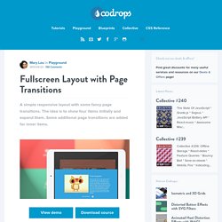
The idea is to show four items initially and expand them. Some additional page transitions are added for inner items. View demo Download source Today we’d like to share an experimental responsive layout with you. Initially, the layout shows four flexible boxes. A Collection of Page Transitions. A showcase collection of various page transition effects using CSS animations.
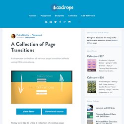
View demo Download source Today we’d like to share a collection of creative page transitions with you. We’ve put together a couple of animations that could be applied to “pages” for creating interesting navigation effects when revealing a new page. While some effects are very simplistic, i.e. a simple slide movement, others make use of perspective and 3d transforms to create some depth and dynamics.
Please note that this is just for showcasing some interesting effects and for inspiration. The CSS animations are divided into different sets, depending on what they do. Please note: this only works as intended in browsers that support the respective CSS properties. For showcasing the page transitions, we’ve used the following structure: SmartAdmin - Responsive WebApp. Announcements!
Please close the default WrapBootstrap iFrame when viewing from IECheck out SmartAdmin Bug Tracker for all reported issues and wish listsVersion 1.4 now comes with Pure HTML Version, Advanced PHP Version with custom functions and AngularJS Version (to help you get started)! If you have already purchased SmartAdmin you can redownload all future updates, at no extra cost, by visiting this link: SmartAdmin WebApp - goes beyond the ordinary admin template. Super Cool Responsive Menu Designs. HTLM/CSS. Responsive Web Design: Layouts and Media Queries.
With the growing number of Smartphone produced in the last three years and the diversity of screen sizes it’s practically impossible to ignore users that browse on a mobile device.
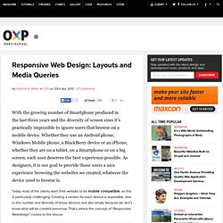
Whether they use an Android phone, Windows Mobile phone, a BlackBerry device or an iPhone, whether they are on a tablet, on a Smartphone or on a big screen, each user deserves the best experience possible. As designers, it is our goal to provide those users a nice experience browsing the websites we created, whatever the device used to browse is. Today most of the clients want their website to be mobile compatible, so this is particularly challenging. Creating a version for each device is impossible, due to the number and diversity of those devices, but also simply because we don’t know what will be created tomorrow.
That’s where the concept of “Responsive Webdesign” comes to the rescue. jQuery Circulate. Prereqs Requires the jQuery Library as well as the Easing plugin.
Foundation: The Most Advanced Responsive Front-end Framework from ZURB. Box-shadow property vs. drop-shadow filter: a complete comparison. Sass - Syntactically Awesome Stylesheets. Compass Documentation. Ingrid – a fluid CSS layout system. Free CSS Drop-Down Menu Framework - LWIS.NET.
Description Free CSS Drop-Down Menu Framework was first released back in June, 2008.
Since then it has struck the audiences with its perfect cross browser performance and wide variety of drop-down menu transformations and themes. As the internet changes this project remains a steady advocate of purely CSS driven solutions. Modular, with themes. Not only HTML is separated from CSS, but even CSS definitions are categorized into structural and thematic types. Frequently Asked Questions. LESS « The Dynamic Stylesheet language. When can I use... Support tables for HTML5, CSS3, etc.