
Huge Collection of Low Poly Art Backgrounds (500 Vertices) Responsive Images in WordPress with Cloudinary, Part 2. Sponsored On In Part 1 of this series, I provided some background on responsive images, describing how you can add srcset and sizes attributes to an img element to serve appropriately sized image files to users of a website based on the size and capabilities of their browser and device.
I also shared how WordPress used its native image resizing functionality to implement srcset and sizes automatically and how you can use an external image service like Cloudinary to extend the native implementation that WordPress provides. #Article Series: In this installment, I go into more detail about how image resizing in WordPress works. Hero Patterns - Repeatable SVG Background Patterns. Erstellen von Bildelementen aus Ebenen in Photoshop. Search All the GIFs & Make Your Own Animated GIF.
Responsive Image Hinting: Using the w Descriptor. I must open this article with a confession: for a long time the HTML5 responsive images w descriptor and sizes attribute left me deeply confused.
The art-directed uses of the <picture> element were obvious, and image-resolution switching with srcset and the x descriptor had clear benefits, but when it came to the complex, comma-seperated syntax of sizes and w, I was flummoxed. Articles and specifications only deepened the mystery: what on earth were these things for, and why would I want to use them?
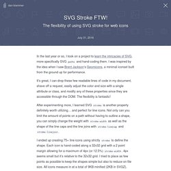
After thinking through the issues for some time, and attending a few conference sessions, I started to comprehend why w and sizes were so important, and how they might be used… an understanding I hope to share in this and following articles. Too Much of A Good Thing Let’s start with an assumption: you want to deliver the best, highest resolution, optimised bitmap image appropriate for the screen that your site is being viewed on. Bildformate-jpg-gif-png. SVG Stroke FTW! — The flexibility of using SVG stroke for web icons. In the last year or so, I took on a project to learn the intricacies of SVG, more specifically SVG paths and hand-coding them.
I was inspired by the idea when I saw Brent Jackson’s Geomicons, a minimal iconset built from the ground up for performance. It’s great, I can drop these few readable lines of code in my document, shave off a request, easily adjust the color and size with a single attribute or class, and modify any of these properties since they are accessible through the DOM.
The flexibility is fantastic! After experimenting more, I learned SVG stroke is another property definitely worth utilizing… and perfect for line icons. Not only can you limit the amount of points on a path without having to outline a shape, you can simply change the weight with stroke-width as well as the shape of the line caps and the line joins with stroke-linecap and stroke-linejoin. I ended up creating 75+ line icons using strictly stroke to define the shape. Background Segment Effect. A background image segment effect as seen on Filippo Bello's Portfolio, employing the CSS clip property and powered by anime.js.
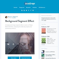
View demo Download source Today we’d like to share a little decorative effect with you that we’ve encountered on Filippo Bello’s Portfolio, maybe you’ve seen it. It’s a really neat way to add some jazz to background images. The idea is to replicate boxes from a background with the same background image and make these boxes move in perspective towards the viewer. Adding a fitting shadow and some parallax makes all this look quite interesting. Automating Art Direction With The Responsive Image Breakpoints Generator.
Four years ago, Jason Grigsby asked a surprisingly difficult question: How do you pick responsive image breakpoints?
1. A year later, he had an answer2: Ideally, we’d set responsive image performance budgets to achieve “sensible jumps in file size.” Cloudinary built a tool3 that implements this idea, and the response from the community was universal: “Great! Now, what else can it do?” Today, we have an answer: art direction! Hero Patterns. 10 golden rules for responsive SVGs. The many advantages of SVG – including infinitely scalable vector images, small file sizes and direct integration with the DOM – make it a natural fit for responsive web design.
Despite the SVG specification being a decade old, it's relatively recent support in many browsers and tools means there are still a number of tricks, loopholes and gotchas that catch out even experienced web designers and developers. Here, I've summarised the most important of these as 10 golden rules. 01. Set up your tools correctly Just as a craftsman sharpens his tools before beginning work, anyone working with SVG must set their applications up to deliver vector format in the most efficient and optimised method possible.
First, unless there are compelling reasons to do otherwise, set measurements to 'pixels' in your vector tool. Don't make the canvas area any larger than it needs to be. At the same time, don't crop the canvas area to the exact edges of elements. 02. 03. 04. . 05. The CSS: 06. 07. 08. Tag: 09.