
This is the Most Detailed Map to Date of Our Place in the Universe. The world’s languages, in 7 maps and charts. These seven maps and charts, visualized by The Washington Post, will help you understand how diverse other parts of the world are in terms of languages. 1.
Some continents have more languages than others Not all continents are equally diverse in the number of spoken languages. Whereas Asia leads the statistics with 2,301 languages, Africa follows closely with 2,138. The Island of Knowledge: How to Live with Mystery in a Culture Obsessed with ... By Maria Popova “We strive toward knowledge, always more knowledge, but must understand that we are, and will remain, surrounded by mystery.”
“Our human definition of ‘everything’ gives us, at best, a tiny penlight to help us with our wanderings,” Benjamen Walker offered in an episode of his excellent Theory of Everything podcast as we shared a conversation about illumination and the art of discovery. Thirty years earlier, Carl Sagan had captured this idea in his masterwork Varieties of Scientific Experience, where he asserted: “If we ever reach the point where we think we thoroughly understand who we are and where we came from, we will have failed.” This must be what Rilke, too, had at heart when he exhorted us to live the questions.
And yet if there is one common denominator across the entire history of human culture, it is the insatiable hunger to know the unknowable — that is, to know everything, and to know it with certainty, which is itself the enemy of the human spirit. Our Favorite Maps of 2013. The digital maps we loved in 2013 didn't simply illustrate novel or useful information (how people travel, where they live, what it means to live without much money).
They did it in ways we'd never seen before, manipulating time, dimensions, perspective, even the atmosphere. These maps weren't just interesting in content; they were innovative in design. Mapping the World's Problems. SAN FRANCISCO — Nearly a decade ago, an environmental group in Brazil grew concerned that government data and maps about Amazon deforestation were out of date and hard to view.
The group, Imazon, decided to create its own monitoring tools, using information from satellites. Imazon’s efforts caught the attention of , the search engine giant. Now, monthly reports on the Brazilian Amazon are produced through Google Earth Engine, a technology platform within the company. HarperCollins omits Israel from school atlas. HarperCollins, one of the world's largest publishing houses, sells English-language atlases to schools in the Middle East that omit Israel.
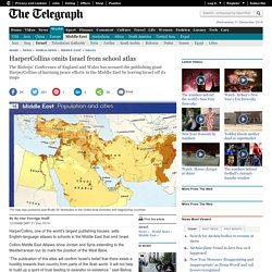
Collins Middle East Atlases show Jordan and Syria extending to the Mediterranean but do mark the position of the West Bank. “The publication of this atlas will confirm Israel’s belief that there exists a hostility towards their country from parts of the Arab world. New data-visualisations: The quick and the dead. How digital maps are changing the way we understand our world. The way we use maps is changing.
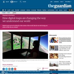
The way we think of the city is changing. The way we think of, interact with and navigate the streets, alleys, boulevards, roads, parks, lanes, hills, cracks and gutters is going through a seismic shift, not because the landscape has changed, but because of little black rectangles in our pockets. Apps such as Google Maps and Citymapper “smooth out the machine,” says Mike Duggan, researcher in Cultural Geography at Royal Holloway. Duggan has been researching how digital technologies change our experiences of everyday places, and one of the main things he’s noticed is the way new technology continues to smooth out the machine that billions of us navigate every day – the city. “There’s a long history in ‘smoothing out the city’ via technology,” says Duggan.
Maps of London's bus journeys. Photo by Dan Kitwood/Getty Images This article originally appeared in Business Insider.
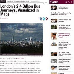
In 2013, Londoners took 2.4 billion bus journeys. They were prescribed 116 million items by doctors, and found themselves joined by more than 1,750,000 American tourists. 15 Maps That Don't Explain the Middle East at All. The Atlantic/Nick Danforth Violent upheaval in the Middle East has recently spawned all manner of maps purporting to explain how the region got this way.
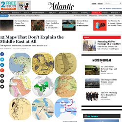
Here, instead, are 15 maps that don’t claim as much. Or rather, they do not seek, like many other maps, to capture some fixed set of core facts about the region. Instead, these maps provide a more fluid perspective on the Middle East, often by showing what didn’t happen as opposed to what did. But for all these maps don’t show, they do illustrate one thing: the sobering fact that no one map—or even set of maps—can ever explain the region’s complex history and politics. Mullered and 61 other words for beaten at sport.
23 June 2014Last updated at 20:25 ET Defeat is a word sport fans are all too familiar with.

Why are there so many different words for being beaten, asks slang lexicographer Jonathon Green. Dictionary-making moves on and no-one's perfect, but it is interesting to see that defeat, the word at which we might first look, does not cover sport. Or not in the still unrevised entry as included in the late 19th Century Oxford English Dictionary. Defeat, which stems from French defaire (literally "unmake") is recorded in 1435 meaning "ruin" or "destroy". Counterterrorism and the English Language- verbal maps. The New York Times is finally calling torture by its name.
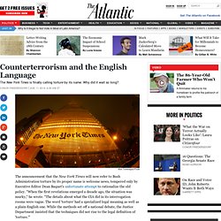
Why did it wait so long? Alex Torrenegra/Flickr The announcement that the New York Times will now refer to Bush Administration torture by its proper name is welcome news, tempered only by Executive Editor Dean Baquet's unfortunate attempt to rationalize the old policy. "When the first revelations emerged a decade ago, the situation was murky," he wrote. This map will change how you see the world. A new map has the power to completely change how we view the world. From the Gall-Peters’ projection that made us question Mercator’s previously-dominant version, to WorldMapper’s beautiful data representations. Equally, the map above stirs up the imagination to make us ponder how the world would look if countries with the biggest populations were matched with a corresponding land area.
JPalmz, the amateur cartographer who created the map, explained to i100: “All of the data is publicity available on Wikipedia, I just wanted to make it more visually presentable. “It’s been mentioned in some newspapers in Germany and a television show in Japan. Can you believe that? Science Graphic of the Week: NOAA's Highest-Res Weather Forecast Yet Is Also ... This image, made with NOAA’s newest weather model, shows ground temperature readings at a 2 mile resolution. Each pixel is shaded according to the temperature, ranging from 113 degrees F (the brightest yellow) to freezing (white). This colorful map of ground temperature shows the tapestry of American weather on September 30. Undeniably beautiful, it owes its rich color gradient to a powerful new scientific tool for modeling the weather for incredibly small chunks of both time and space.
After five years of work, NOAA unveiled the new model, called High Resolution Rapid Refresh (HRRR), on September 30. Like its predecessor, HRRR will update every hour.