
Accordian tabs. Unique tiny circle img carousel. Magazine theme layout. Card grids. Flexbox and grid. Google design. Touch in command prompt nul. Img slide. Slick img slide tutorial. Css3 animations. Side-nav expand. 20 Useful CSS Snippets for Responsive Menus. Responsive web design has been around for years but it’s still undergoing tremendous improvement.
Not all designers have caught onto this technique and others who have are working hard to build it out further. Although responsivity should be applied to every part of a layout, the navigation menu is one area that deserves extra attention. The following responsive code snippets are perfect for any type of layout. You’ll find vertical and horizontal navs with dropdowns and slideouts and all kinds of animation effects. Responsive design is an emerging technique with cool new trends every year. Related article: Introduction to CSS3 Animation CSS-Only Dark Menu By John Urbank I love the striped border and dark color scheme paired with this menu.
Bootstrap sass variables. Free javascript books. To do 9/28. Materialdesign lite. Responsive. Transitions - Materialize. Parallax component - UIkit documentation. Animate CSS properties depending on the scroll position of the document.
Usage To apply this component, add the data-uk-parallax attribute to a container element. Add an option with the desired animation target value for each CSS property you want to animate. Lorem ipsum dolor sit amet, consectetur adipisicing elit, sed do eiusmod tempor incididunt ut labore et dolore magna aliqua. Markup Options UIkit provides a number of options that you can add to the data-uk-parallax attribute: NOTE You can basically animate any CSS property that has a single value, like width and height, by adding it to the attribute. Start and stop values Properties are always animated from the current value to the target value which you set in the option.
NOTE Some properties, like colors, require a start and a stop value! Markup Nested animation Using different animations for nested elements is a simple task. Example Target Option.
Top 21 Best Free CSS3 Frameworks for Web Development 2016. Cascading Style Sheets (CSS) is what gives the web its cozy looks.
Writing plain HTML is a thing of a very distant past, and the language itself (CSS) has advanced so much in the recent years that it’s impossible to imagine what the web would look like without it. In the early days, much of webs styling could be achieved through HTML usage, while nowadays both HTML5 and CSS3 work closely together to achieve startling results in web design, application design, and in some cases even software design.
It’s an evolving styling language. Web designer communities such as CodePen have enabled for designers and creative artists to understand more the full capacity of CSS3 features, and each day hundreds of new and inspirational concepts are being added to the CodePen community for indulging, exploring, and reusing within others own projects; tune in the Radio Station (Podcast) to get a weekly update on all the best stuff happening in the world of style sheets. Material Framework. Gulp, SASS, Bourbon, Neat & BrowserSync Boilerplate. I found myself creating this particular dev environment set up multiple times and decided to save myself some time by creating a boilerplate.

Here are the list of libraries & frameworks we will be including: This post assumes that you have npm and Gulp installed globally. Let's get into the step-by-step tutorial on how I created this. npm Within your project folder, let's initialize npm: $ npm init. Responsive Web Design in Sass: Using media queries in Sass 3.2. In Responsive Web Design in Sass Part 2 I wrote about using media queries in Sass 3.1.
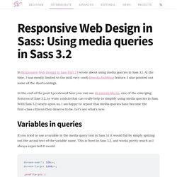
At the time, I was mostly limited to the (still very cool) @media bubbling feature. I also pointed out some of the shortcomings. At the end of the post I previewed how you can use @content blocks, one of the emerging features of Sass 3.2, to write a mixin that can really help to simplify using media queries in Sass. The Sass Way. Responsive Web Design in Sass Part 2: Media queries in Sass. In part one we talked about how Sass can help with fluid layouts and images.
Now we'll turn our attention to the new kid in town. Media queries are the tool that takes a design from fluid to truly responsive. I Resisted Fluid Layouts (too) Fluid or elastic layouts allow your site's content to grow and shrink to fit the screen, so that solves the problem right? OK. Normalize.css: Make browsers render all elements more consistently. Breakpoint. 16 really useful responsive web design tutorials. Responsive web design is still massively popular form of web design, but it can be daunting if you have limited or no experience.
Thankfully, we've rounded up these really useful tutorials to help you from day one. From dealing with typography and video, through imagery and layout to the technicalities of using JavaScript on your responsive sites, you'll be a pro before you know it. How to create flexible layouts with Susy and Breakpoint. Creating responsive layouts can be challenging because of the maths involved, so it's common for designers to turn to frameworks and/or Sass to simplify the process.
A lot of frameworks are based on a 12-column grid, but a responsive site doesn't always fit into this structure. Here, I'll show you how to use two Sass extensions to create truly flexible layout that transcends the 12-column grid. The problem Designing responsive layouts can be tough, as it involves calculating the width of containers, rows, columns and gutters at different breakpoints. Frameworks can help by creating presets for common breakpoints. Breakpoint. The Practical Guide to Becoming a Professional Web Developer. CSS Reference. Tutorials Archives. Blueprints Archives. NavNav - 90+ Responsive Navigation Bar Menu Tutorials, Examples, and Demos (CSS, jQuery, JavaScript) Best Front-end frameworks to try in 2016 - Hashnode. How To Pick a Frontend Web Framework. 15 Interesting Frontend Libraries And Plugins For March 2016. Danny Markov In this article we’ve gathered for you a collection of 15 awesome JavaScript and CSS libraries.
Each one of them presents different solutions to common frontend tasks and can be of great help to both beginner and advanced developers. Check them out, you might find the perfect tool for your next project! Hamburgers Hamburgers is a collection of over 20 hamburger menu buttons. Loaders This is a great resource containing a selection of well-designed, CSS-only loaders.
Grd Grd, as it’s name suggests, is all about building grid layouts. Godaddy. You can delete files and folders from directories in the File Manager.
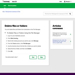
To Delete Files or Folders Using the File Manager Log in to your GoDaddy account.Click Web Hosting.Next to the hosting account you want to use, click Manage.From the Tools section, click File Manager.Use the directory tree to find the file or folder you want to delete. Select the file or folder, and then click Delete. Click OK. FileZilla: FTP settings to upload your website. Postimage.org — free image hosting / image upload — Postimage.org. Host Images on Dropbox. How do I display images from Google Drive on a website? Godaddy. 960 Grid System. Bourbon - Documentation.
The animation mixin supports comma separated lists of values, which allows different transitions for individual properties to be described in a single style rule. Each value in the list corresponds to the value at that same position in the other properties. box:hover { // Animation shorthand works the same as the CSS3 animation shorthand @include animation(scale 1.0s ease-in, slide 2.0s ease); // The above outputs the same CSS as using independent, granular mixins. Documentation. The animation mixin supports comma separated lists of values, which allows different transitions for individual properties to be described in a single style rule. Each value in the list corresponds to the value at that same position in the other properties. box:hover { // Animation shorthand works the same as the CSS3 animation shorthand @include animation(scale 1.0s ease-in, slide 2.0s ease); // The above outputs the same CSS as using independent, granular mixins.
@include animation-name(scale, slide); @include animation-duration(2s); @include animation-timing-function(ease); @include animation-iteration-count(infinite);} Demo. The Design Blog - Design Inspiration. Smashing Magazine – For Professional Web Designers and Developers. Fonts, typefaces and all things typographical — I love Typography (ILT) How Much Should I Charge? Untitled.