
Ggstatsplot/README.md at master · IndrajeetPatil/ggstatsplot. Machine Learning Results in R: one plot to rule them all! To automate the process of modeling selection and evaluate the results with visualization, I have created some functions into my personal library and today I’m sharing the codes with you.

I run them to evaluate and compare Machine Learning models as fast and easily as possible. Currently, they are designed to evaluate binary classification models results. Before we start, let me show you the final outcome so you know what we are trying to achieve here with just a simple R function: So, let’s start! The results object. Advanced tips and tricks with data.table – andrew brooks. Tips and tricks learned along the way This is mostly a running list of data.table tricks that took me a while to figure out either by digging into the official documentation, adapting StackOverflow posts, or more often than not, experimenting for hours.
I’d like to persist these discoveries somewhere with more memory than my head (hello internet) so I can reuse them after my mental memory forgets them. A less organized and concise addition to DataCamp’s sweet cheat sheet for the basics. GgExtra: R package for adding marginal histograms to ggplot2. My first CRAN package, ggExtra, contains several functions to enhance ggplot2, with the most important one being ggExtra::ggMarginal() - a function that finally allows easily adding marginal density plots or histograms to scatterplots.
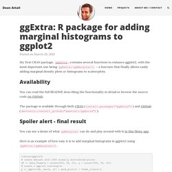
Availability You can read the full README describing the functionality in detail or browse the source code on GitHub. The package is available through both CRAN (install.packages("ggExtra")) and GitHub (devtools::install_github("daattali/ggExtra")). Spoiler alert - final result You can see a demo of what ggMarginal can do and play around with it in this Shiny app. Data Analysis in R, the data.table Way. Lomb-Scargle periodogram for unevenly sampled time series. In the natural sciences, it is common to have incomplete or unevenly sampled time series for a given variable.
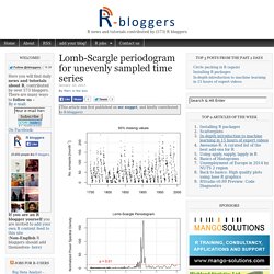
Determining cycles in such series is not directly possible with methods such as Fast Fourier Transform (FFT) and may require some degree of interpolation to fill in gaps. An alternative is the Lomb-Scargle method (or least-squares spectral analysis, LSSA), which estimates a frequency spectrum based on a least squares fit of sinusoid. The above figure shows a Lomb-Scargle periodogram of a time series of sunspot activity (1749-1997) with 50% of monthly values missing.
As expected (link1, link2), the periodogram displays a a highly significant maximum peak at a frequency of ~11 years. The function comes from a nice set of functions that I found here: An accompanying paper focusing on its application to time series of gene expression can be found here. Below is a comparison to an FFT of the full time series. R: Estimate Spectral Density of an Irregularly Sampled Time... Description The most commonly used method of computing the spectrum on unevenly spaced time series is periodogram analysis, see Lomb (1975) and Scargle (1982).
The Lomb-Scargle method for unevenly spaced data is known to be a powerful tool to find, and test significance of, weak perriodic signals. The Lomb-Scargle periodogram possesses the same statistical properties of standard power spectra. Knitr: Elegant, flexible and fast dynamic report generation with R. Overview The knitr package was designed to be a transparent engine for dynamic report generation with R, solve some long-standing problems in Sweave, and combine features in other add-on packages into one package (knitr ≈ Sweave + cacheSweave + pgfSweave + weaver + animation::saveLatex + R2HTML::RweaveHTML + highlight::HighlightWeaveLatex + 0.2 * brew + 0.1 * SweaveListingUtils + more).
This package is developed on GitHub; for installation instructions and FAQ’s, see README. This website serves as the full documentation of knitr, and you can find the main manual, the graphics manual and other demos / examples here. For a more organized reference, see the knitr book. Motivation One of the difficulties with extending Sweave is we have to copy a large amount of code from the utils package (the file SweaveDrivers.R has more than 700 lines of R code), and this is what the two packages mentioned above have done. Programming with R. Introduction to R. Www.ime.usp.br/~pavan/pdf/MAE0330-PCA-R-2013. Computing and visualizing PCA in R. Following my introduction to PCA, I will demonstrate how to apply and visualize PCA in R.
There are many packages and functions that can apply PCA in R. In this post I will use the function prcomp from the stats package. I will also show how to visualize PCA in R using Base R graphics. However, my favorite visualization function for PCA is ggbiplot, which is implemented by Vince Q. Vu and available on github. Computing the Principal Components (PC) I will use the classical iris dataset for the demonstration. We will apply PCA to the four continuous variables and use the categorical variable to visualize the PCs later. Since skewness and the magnitude of the variables influence the resulting PCs, it is good practice to apply skewness transformation, center and scale the variables prior to the application of PCA. Analyzing the results The prcomp function returns an object of class prcomp, which have some methods available.
The summary method describe the importance of the PCs. References: ColorBrewer: Color Advice for Maps. Index. ggplot2 0.9.3.1. Geoms Geoms, short for geometric objects, describe the type of plot you will produce. geom_abline(geom_hline, geom_vline) Lines: horizontal, vertical, and specified by slope and intercept.
Technical Tidbits From Spatial Analysis & Data Science. Even the most experienced R users need help creating elegant graphics.
The ggplot2 library is a phenomenal tool for creating graphics in R but even after many years of near-daily use we still need to refer to our Cheat Sheet. Up until now, we’ve kept these key tidbits on a local PDF. Plotting distributions (ggplot2) Problem You want to plot a distribution of data.
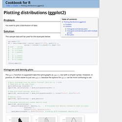
Solution This sample data will be used for the examples below: Geom_histogram. ggplot2 0.9.3.1. Set.seed(5689) movies <- movies[sample(nrow(movies), 1000), ] # Simple examples qplot(rating, data=movies, geom="histogram") stat_bin: binwidth defaulted to range/30. Use 'binwidth = x' to adjust this.Warning message: position_stack requires constant width: output may be incorrect qplot(rating, data=movies, weight=votes, geom="histogram")
Ggplot2: Cheatsheet for Visualizing Distributions. In the third and last of the ggplot series, this post will go over interesting ways to visualize the distribution of your data.