
Why Do We Visualize Quantitative Data? We visualize quantitative data to perform three fundamental tasks in an effort to achieve three essential goals: These three tasks are so fundamental to data visualization, I’ve long used them to define the term, as follows: Data visualization is the use of visual representations to explore, make sense of, and communicate data.
But why is it that we must sometimes use graphical displays to perform these tasks rather than other forms of representation? Why not always express values as numbers in tables? Why express them visually rather than audibly? Despite this essential reason for visualizing data, people often do it for reasons that are misguided. Myth #1: We visualize data because some people are visual learners. While it is true that some people have greater visual thinking abilities than others and that some people have a greater interest in images than others, all people with normal perceptual abilities are predominantly visual. 1. 2. 3.
Difficult, isn’t it? 4. Take care, The Era of Visual Mediation. Data Visualisation References. Harvard Data Science. What Does Big Data Look Like? Visualization Is Key for Humans. Storytelling with Data. Feb. 28, 2013 This is a condensed version of my opening keynote at the Tapestry Conference, which was held yesterday in Nashville’s beautiful Union Station Hotel.
I’m writing this from memory so at best it will only be an approximation of what I said. Thanks to all the organizers and attendees for a great event. Raw. Turning The Absurdity And Hilarity Of Everyday Life Into Charts. A lot of us started highly specific blogs in the late 2000s that have since gone defunct.
Too often, a single joke that seemed funny after a few whiskeys got a bit tired after a few months of basking in our own cleverness. An old personal favorite was Nad Shot. It’s a meticulous collection of comic book characters being struck in the testicles. Nad Shot died a horrible, groin-related death in early 2009. Luckily, a much more clever, often more funny blog is still going strong: Indexed. “In Internet years, the blog is about a thousand years old,” creator Jessica Hagy tells me. 60 Great Visualizations of 2012. 2012 has been a great year for all kinds of data visualizations.
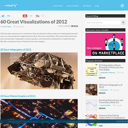
Data owners are realizing that the best way to communicate the insights buried in their data is by visualizing it. This means there have been tons of great static infographics, motion graphics, and interactive visualizations created this year. Data Visualization Software. Infographics - The Power of Visual Storytelling. How to use FF Chartwell. Primarily suitable for Adobe Creative Suite, FF Chartwell for print uses OpenType ligatures to transform strings of numbers automatically into charts.

The data remains in a text box, allowing for easy updates and styling. It’s really simple to use; you just type a series of numbers like: ‘10+13+37+40’, turn on Stylistic Alternates or Stylistic Set 1 and a graph is automatically created. To help get you started using FF Chartwell we’ve created this video tutorial and here are some simple steps: ONE — Firstly always make sure the letter spacing is set to “0” (zero) TWO — Using the values 0-100, type the values, then use “+” to combine them into one chart.
Review: Designing Data Visualizations on Datavisualization. In a recent chat with Jérôme Cukier about the state of visualization related literature, he mentioned Julie Steele and Noah Iliinsky’s new book “Designing Data Visualizations” published by O’Reilly.

Jérôme noted that it would be a good primer for people who are already working with data and looking for guidance about making their work more accessible. I thought of another group of people who might find themselves overwhelmed by the amount of choices they have to make while working on visualizations: designers with little knowledge about visual perception and how to apply its’ principles to their work. After reading it from cover to cover in just a few hours I can highly agree with Jérôme’s recommendation. Julie and Noah manage to introduce the basics of visualization in a very accessible and comprehensible way.
Furthermore, the slim format and of the book makes it a great read for your next flight or train ride. What the book taught me. Prints. The Atlas of Economic Complexity. 10 Tips for Designing Better Infographics. Infographics have been around for ages but in recent years they’ve really come into the spotlight as an almost irresistible way to communicate complex scenarios and information.
KISSmetrics Web Analytics - Event Tracking, A/B Testing and Conversion Funnel Software. The Role of Colors in Culture: the Interactive Version. Recovering from information overload - McKinsey Quarterly - Organization - Talent. For all the benefits of the information technology and communications revolution, it has a well-known dark side: information overload and its close cousin, attention fragmentation.
These scourges hit CEOs and their colleagues in the C-suite particularly hard because senior executives so badly need uninterrupted time to synthesize information from many different sources, reflect on its implications for the organization, apply judgment, make trade-offs, and arrive at good decisions. The importance of reserving chunks of time for reflection, and the difficulty of doing so, have been themes in management writing for decades. Look no further than Peter Drucker’s 1967 classic, The Effective Executive, which emphasized that “most of the tasks of the executive require, for minimum effectiveness, a fairly large quantum of time.” Yet they are devilishly difficult to implement, and getting more so all the time. Better solutions exist, and they aren’t rocket science. Big Data : la nécessité d’un débat. Il nous a semblé intéressant de traduire, de façon collaborative (via Framapad), l’essai original que viennent de publier danah boyd et Kate Crawford présentant « Six provocations au sujet du phénomène des Big Data ».Ces chercheuses, orientées vers l’ethnographie des usages des technologies de communication, s’interrogent – en toute connaissance de cause [cf. cette étude sur les tweets des révolutions tunisiennes et égyptiennes à laquelle a participé danah boyd]- sur les limites épistémologiques, méthodologiques, mais aussi éthiques des Big Data : champ d’études qui s’ouvre aujourd’hui sur la base des énormes jeux de données que fournit internet, en particulier celles générées par l’activité des usagers des sites de réseaux sociaux, que seuls des systèmes informatiques ont la capacité de collecter et de traiter.
MyData : renverser la relation consommateur, concrètement. Par Daniel Kaplan le 20/09/11 | 14 commentaires | 5,961 lectures | Impression En 2010, dans l’ouvrage Informatique, Libertés, Identités, nous posions la question : “Que pourrais-je accomplir, moi, si je disposais, sous une forme réellement exploitable, des informations sur mes trajets et mes communications des années passées ?
Pas seulement pour contrôler ce que d’autres en font, mais pour les utiliser à mes propres fins ?”
Business Intelligence. Blogs. Compagnies. Data Visualization and Infographics Resources - Smashing Magazine. Advertisement Data visualizations and infographics can make complex datasets easier to understand and comprehend. By creating a graphical represenatation of data and statistics, complicated concepts and information can make more sense in less time. Many visualizations focus on representing a specific set of data or statistical information. Others focus on less-concrete topics, providing a visual representation of abstract concepts. Generally speaking, the first type appear more like graphs or charts and the latter are often more creative and imaginative.
But visualizations and infographics can be used poorly, too. Also consider our previous articles:
InfoDesignPatterns.com. Infodesign.pdf (Objet application/pdf) Graphic presentation. Best examples. References &Theory. Data journalism.