
Complete list of Font Awesome icons with their CSS content values. April 2017 Updated to Font-Awesome 4.7.0 Font Awesome is a web font containing all the icons from the Twitter Bootstrap framework, and now many more.
Whilst the implementation in Bootstrap is designed to be used with the <i> element (Bootstrap v2), you may find yourself wanting to use these icons on other elements. To do so, you'll need to use the following CSS on the desired element, and then substitute in the content value for the relevant icon. Position. In order to make more complex layouts, we need to discuss the position property.
It has a bunch of possible values, and their names make no sense and are impossible to remember. Let's go through them one by one, but maybe you should bookmark this page too. static. 2015's most common CSS Resets to copy/paste, with documentation / tutorials.
Sticky footer. Take Control of the Box Model with Box-sizing. I get asked a lot about the CSS box-sizing property, especially from beginning designers and developers who’ve dealt with broken layouts and misaligned grids.
The CSS box model can be a little deceiving and tricky to work with at times, so first, it’s important to understand how it works in order to better appreciate the wonders of box-sizing. In this article, we’ll go over a few important things to know about the box model, like how it affects defining accurate fixed and fluid sizes, then learn how to tame it with the new box-sizing feature. The Traditional Box Model The “traditional” CSS box model, once implemented in Netscape 4 and IE 4-5, counted borders and padding as part of the width and height of a box, which at the time did not match the W3C’s standard. So when browsers started moving closer to standards compliance, it threw a monkey wrench into the development process.
Looking back, the “IE box model” might have been something early versions of IE got right from the beginning. Box-Sizing: The Secret to Simple CSS Layouts. (Photograph from Flickr user Rachel Kramer) Box-sizing is a CSS property that makes CSS layouts work intuitively.
If you’ve been working with CSS for any period of time, you know that using properties like width, padding, and border can be confusing. CSS3 gradient generator - 3 colors - GRADCOLOR. CSS3 gradient generator FAQ This tool is easy to use and get various gradients results (size,colors,positions...)You get the html and css code to put on your webpage (on your stylesheet).
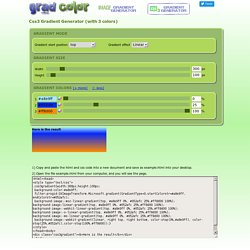
CSS3 is very useful to create nice area with gradient, it doesn't use pictures, just css (Cascading Style Sheets). Actually not all browers support css3 gradient but some of recent browser support it :(Firefox,Chrome,Safari,Opera 11.10...) Internet explorer (from version 5.5 to version 9) will use this css to display gradient : filter:progid:DXImageTransform.Microsoft.gradient(.....) ;(IE5.5 to IE9) That you could see into the css code when you generate a gradient.It uses a start color and end color that is respectively the #1 color and the #2 color (selected).
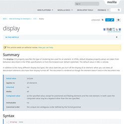
Border Radius CSS Generator. Vertical align anything with just 3 lines of CSS. With just 3 lines of CSS (excluding vendor prefixes) we can with the help of transform: translateY vertically center whatever we want, even if we don’t know its height.
The CSS property transform is usally used for rotating and scaling elements, but with its translateY function we can now vertically align elements. Usually this must be done with absolute positioning or setting line-heights, but these require you to either know the height of the element or only works on single-line text etc.
Vertical align anything with just 3 lines of CSS. CSS Properties Reference. Display. Summary The display CSS property specifies the type of rendering box used for an element.
In HTML, default display property values are taken from behaviors described in the HTML specifications or from the browser/user default stylesheet. The default value in XML is inline. In addition to the many different display box types, the value none lets you turn off the display of an element; when you use none, all descendant elements also have their display turned off. Färgscheman. Färgregel.
Sizing with CSS3's vw and vh units. CSS3 introduces a few new units.
(Oh wait, I've said that before.) So, you've heard about px, pt, em, and the fancy new rem. Let's look at a couple more: vw and vh. Often times, there are certain elements within our design that we'd like to ensure can fit into the viewport in their entirety. Normally, we'd have to use JavaScript to do this. CSS: centering things. See also the index of all tips.
Centering lines of text. Facebook Color Palette. Centering in CSS: A Complete Guide. Centering things in CSS is the poster child of CSS complaining. Why does it have to be so hard? They jeer. I think the issue isn't that it's difficult to do, but in that there so many different ways of doing it, depending on the situation, it's hard to know which to reach for.
So let's make it a decision tree and hopefully make it easier. The Shapes of CSS. CSS is capable of making all sorts of shapes. Squares and rectangles are easy, as they are the natural shapes of the web. Add a width and height and you have the exact size rectangle you need. Quick Reminder About File Paths. Whenever I have a problem with an image "not showing up" on a web page, the first thing I do is take a close look at the file path that references that image. HTML, CSS, & jQuery Menus. Löp 5 km i sträck om 12 veckor. Untitled. Topic: making logo be in the middle of the nav bar.
Hi there, Thanks for writing in! This isn’t a default feature offered by X, but it could be possible with custom development. But regretfully, it will fall beyond the scope of support we can provide as this requires good deal of code changes. However, the similar layout can be achieved if you add your logo inside a menu item and style it accordingly. So, in order to achieve that, please follow these instructions: Step 1: Add a 4th menu item and give it a class of logo-menu-item and your website’s URL (see: Note: if the CSS Classes option isn’t visible in your menu item, enable it under Screen Options (see: Php - How Can I Center the Logo in the Navigation Menu? Clippy — CSS clip-path maker.
CSS Circles. A while back I shared a clever technique for creating triangles with only CSS. Over the past year, I've found CSS triangles incredibly effective, especially when looking to create tooltips or design elements with a likewise pointer pattern. There's another common shape that's easy to create, and that is the circle. Using border-radius, you can create wonderful CSS circles. Setting the border-radius of each side of an element to 50% will create the circle display at any size:
Vhim. Take Control of the Box Model with Box-sizing. * { box-sizing: border-box } FTW - Paul Irish. One of my least favorite parts about layout with CSS is the relationship of width and padding. You’re busy defining widths to match your grid or general column proportions, then down the line you start to add in text, which necessitates defining padding for those boxes. And ‘lo and behold, you now are subtracting pixels from your original width so the box doesn’t expand. Meet the Pseudo Class Selectors. Box Sizing.